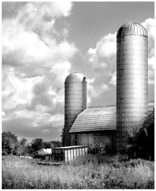
This was a High contrast challenge and I feel you could of done a few things that would of helped improve the picture. First you have a wonderful sky to work with and a subject that is very eye pleasing. I have looked at the histogram from your picture and you have a lot of mid-tones with very little shadows recorded. I feel if you would of did some dodge and burn in the sky to bring out some of the shadows it would of increased your contrast and made the sky POP.
Your subject is very appealing to look at but I feel some detail are lacking due to processing. Not bad - but enough to make me wonder what process you used instead of enjoying the subject. So the process became somewhat distracting. The foreground grass could of used a bit of sharpening or burn to gain some detail if possible.
The preference of B&W here was a good one and overall I think you have a good picture. But when the process used is on the thought of the viewer more than the subject or total photograph then the process can become a distraction and I believe that happened here.
Your composition is good along with the lighting. I hope you still have the original because I feel (possibly) a different tweaking in processing could render you a wonder photograph.
I hope you find this critique helpful. I have also looked at you portfolio and I am impressed with some of you photographs. Keep up the good work.
This looks more like it has gothic glow rather than high contrast. There are lots and lots of midtones here (grass, sky, barn wall). I like the composition though, but can't rate it high for not fitting the challenge well. Look at your histogram and see if I'm wrong about the midtones.
Very nice image. There is a nice crispness to much of the photograph and the black & white does give it instant contrast to some extent. I find the subject matter to be of great interest as for some reason - possibly your post processing? - it looks almost as if the silos were placed in the picture, as if they don't belong there, even though its clear they do. Strange but interesting. I gave a 6.
For some reason, this photo reminds me of that album cover with a silver alien visitor on it (from the 70s). Can't remember the name, but I'll look for it. As for the photo...nice job in composing this shot. And I like the amount of contrast.
The processing on this shot is really outstanding. I don't know how you got it to be soft and detailed and contrasting, but you did. Very appealing composition and subject too.





 Add photograph to your favorites
 Add photographer to your favorites


 Photographer found comment helpful.


