SHOOTING:
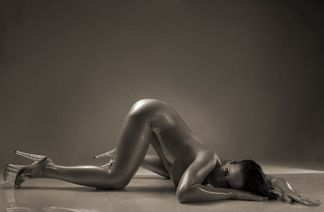
- sunflower oil on the model's body.
- 4 foot softbox to backlight, left, behind model.
- 2 foot softbox on ground level, out of screen right, behind model.
- 4 foot reflector, right, front of model
- white studio. Large plexiglass on floor.
POST-PROCESS:
- crop
- spot edit: removal of 4 foot softbox, which was in the shot behind the leg on the left.
- Channel Mixer to convert to b&w.
- Saturation/Colorize - sepia
- burning of background, burning model's left leg
- dodging some skin highlights and reflections; dodging white of eyes.
- a bit of neat image.
- smart sharpen
Disqualification Details
Cloning, dodging, burning, etc. to improve your photo or remove imperfections or minor distracting elements, etc. is acceptable. However, using any editing tools to duplicate, create, or move major elements of your photograph is not permitted.
Statistics
Views since voting: 23210 Views during voting: 2210 Comments: 115 Favorites: 20 (view)
Those outtakes are simply amazing, brilliant indeed. Her skin tone vs the black and the blue really make it come together. What is on her body though?
Thank you for the shooting details, its great to have some professional reference.
Disqualified!!!! I'm sooo sorry Martin. It was a great shot, but I'm afraid I have to agree with the SC on this one. Hey... does this mean I beat you? ;-)
Disqualification or no disqualification....this image was one of my favourites to win. And I still think it deserves to win. Fantastic image and model.
Quite provocative but with so much polish and such great attention to detail that the trait of experience is apparant. Congratulations on your top ten finish.
Thanks everyone for the great comments and Bravo to the winners.
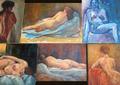
Here are some of my outtakes:
And the following outtake is the one I originally submitted for this challenge...
But then I realized how much similar it was to grigrigirl's winner shot of Nude II
and I decided to remove my entry. When I shot it, the similarity with grigrigirl's shot was not intentional. But grigrigirl was the first to introduce it on DPC and won a ribbon with it, so out of respect for her and because I didn't want people to think I copied her, I deliberatly chose another entry to submit for NUDE III. And while I was at it, I decided to go "the DrJones way" , if you know what I mean. LOL!
Again, congrats to the winners. Fierce competition! ;-) And see you at NUDE IV! ;-)
I honestly thought this would of picked up a ribbon! To me it is fantastic and I gave it a 10! Well done on your top 10 finish though! Added to my favourites!
the left leg should be positioned differently with the knee somewhat lower , the shoe protrudes oddly , nice light on the eye - as far as the title goes : personally , I find the curves less dangerous than the heels
Her pose looks uncomfortable, but depending on how long she spends in the stripper shoes, that could actually be a comfortable posture. Perfect lighting and composition.
Welcome back, Bianca. Always a great subject. Unfortunately the image does not create any emotion with me, I find it rather sterile, a plastic look. Also the fingers on the left hand look extremely long in this position., angled towards the camera. ( Still compared to many other images in this challenge of course an outstanding image.)
A technically masterful but alas conceptually cheesy nude study. Fabulous lighting and really superb photography in every respect but one; I just can't get past that bad taste factor. 7
looks like the work of DrJOnes, though I wouldn't say that I claim it is. The radial gradient in the background is well done and aids the eye flow through the picture nicely. Good dodging work on the eyes too.
One of the most polished and proffesinal images in the challenge,apart from the buned out hilight on the models butt this is an image I come back to/ 10
definatly top 5 pic.
I personally dislike hotspots and think this one could do without them, plus I´m not all that keen about the pose and the face beeing only partly lit even though its not supposed to play a big role in the pic.
good luck
What I like is the pose and the exposure (highlight on her buttock, lower leg and wrist excluded), the way her eyes are excluded from the shadow on the lower part of her face. It is just that the tone is to even, too much of the same and I'm a little bit unsure about the position of the left leg. 8
If it wasn't for the relatively un-prominent breasts, this could be a Dr. Jones... This way, I'd say it's a pretty good fine arts type of shot. However, the composition could be better, a little more balanced in the subject-background ratio, maybe. If I'd had more foreground in the setup, I would have tried to play with the reflection a little more and maybe added a tad more light to her face, so at least her right eye was lit well.
I think that upon hearing there was going to be a Nude III challenge, we all started thinking, "What will DrJOnes enter?" Well, I think I've found it! Congrats in advance for your sure-to-be ribbon! :)
Strong and very focused lighting, which gives a very powerfull feeling over the model. Composition is inviting if perharps a little bit claustrophobic on the sides. The body's reflection gives a unique look and goes well with the whites of the model's eyes, which in turn are very bright and... scary? ;) One thing i don't like so much is the reflection from the plexiglass on the far left, breaking a bit of the uniformity of the composition. I would've liked a frame to go with this shot as well! Overall, very good and unique mastery of the lighting! Thumbs up to photographer and Model! 9
I like the level of unreality the photographer acheived with the makeup styling in this picture, but at the same time it turns me off combined with the pose. I would guess more full blooded male members really enjoy this. Technique wise, the shoe and back leg should be placed futher back to separate them from the front leg. There is a line under the front shoe that, imo, should be cloned out to create a full smooth surface. Other than that, you're da dr.
Ahhh the good doctor returns. This is immensely stylish. I think it's a better photo than your last nude entry (soft sun) but probably won't score quite as highly given it's edgier nature. The glistening body works really well with the reflective perspex floor. 9
A wonderful b/w study with outstanding tonal values. The facial expression is very aptly portrayed to give it that zest. The stylish shoes and the oil may work against this challenge, but nonetheless the overall effect is very adroitly executed. Bumping up.
Beautiful silver look. I love the gradiant light on the back drop. The light reflections on her body are awsome. She looks like she's lightly oiled up, that creates wonderful skin tones. Model is absolutely gorgeous. 10!
I think I know whose shot this is... Unmistakeable style and shoes. If I'm wrong, then please take it as a compliment, because it's meant as one. Very seductive pose and pleasing tones. Perfect lighting. Beautiful job. Bumping up.
Not crazy about her "pose", or the apparent "seam" in the backdrop behind her, but your lighting, exposure and black and white treatment of your model are just stunning. 9
Wow.
Amazing. I find seeing the edge of the perspex under the shoe and behind the model distracts from an otherwise great image.
Love the effect of the oil on the body.
well, clearly the sexiest shot of the bunch. i think the shot is pretty much perfect, aside from that trailing (light?) from the bottom right hand side across the middle of the shot.
Excellent capture. Technically flawless as far as I can see. My only comment is I'm not to fond of the position of the left leg. I feel like it should either be extended more, or the right knee shuold be lifted slightly to see more of the leg. Completely nit-picky, I apologize. Anyways, wonderful picture and one of the my favorites
Very shiney skin! I like the bg color and how it complements the skin tones. Of course anyone wearing those shoes gets an extra few points. Nice lighting. I think seeing both eyes might be interesting. Very nice photo.
The lighting is nice, and I like the way the shadows define her body, but other than that, I really don't care too much for this photo. The pose looks really awkward and uncomfortable - not at all a natural pose. The composition makes it feel top-heavy to me - more of the floor would have given us a little bit of reflection to balance out the photo. And the shoes just remind me of the bad porno flicks my ex-husband used to watch.
I love the negative space, the symmetry, the centered focal point, the angles (the heel of the right shoe points you directly to her face, as do her fingers of her left hand), the way her right arm frames her face, the lines of this are classic, appear to be studied and overall, just great, the inverted "v" of her torso and right thigh is marvelous. I would love to know how the lighting was set up. Original, erotic, and beautiful. Good luck to you. 10.
I like the highlights created from the body oil (?), as it gives some extra interest to the shot. I like the background and positioning of the pose in the frame. I wish there was a little extra light on her face, but maybe just lighting her right eye was meant to give some mystery. The high heels are a little distracting to me but are not a real big deal.
Gotta be DrJOnes.... great shot, but you knew that didn't you ;-) One tiny picky thing though.... the "ray" of light on the far right just above the floor is just a tad distracting.
I like this shot, only thing that niggles me is the hot spot on her butt LOL and I am thinking I would have liked to see the far leg with the knee a bit futher back and the foot bent upwards? Good luck
This shot, in my opinion, is the most pornographic of the batch. The pose and heels are very suggestive. Still, the lighting is incredible and I can't ignore this. It's a 10, but I doubt I'd hang it on the wall in a museum...
I think this is female power at its best... very sleak, sexy and provacative. Her body is in a unique placing and it really catches the eye. The BW works and the texture is right on! Great capture.
The light on her derriere and arm are nice. I think I'd have liked her a bit more prone with more light detailing the curves. I think the plastic shoes detract just a bit. Just my preference. Masterfully articulated.
This is one of those images that needs to be seen BIG...bill board big. Sometimes I really hate the 640 pixel limit...I feel like there is so much in this image that is not being seen due to this size limit. I keep wanting to see more of the skin "texture" and some of the other subtle nuances that I know are probably there but just aren't visible at this tiny size.
Perfect title for this image. Beautiful model, who knows how to pose. Great eyes! Very nice lighting, especially the background which, even though it is nearly the same color and shade as the model, is lit just perfectly to accent her body. The only thing I would have changed is I would have lost the shoes...but that just me. This is a very "dangerous" pictures that will certainly be added to my favorites. Nicely done, and good luck. <9>
My choice for the red ribbon. I had a hard time picking up the second place, but I think that this one deserves it. Nice lighting, a beautiful composition that hides enough to provoke the mind to imagine unseen parts. The 1 pt deduction from the maximum score comes from the reflection of the right shoe. The reflection would be fine if there was more of it showing in the image. This way, the glass shoe is the only thing vividly reflected, and it subtracts from the image IMO.
Bumpig up to 9.
i'm not a fan of this kind of nude - but im not the sort to hold it against you ;)
The crop seems a little tight and i have two things that distract my eye from the model - the triangular section of white on the backdrop and the reflected light glare on the floor from (i guess) her leg.
Those shoes are too much! But the gloss on her skin and the shoes go very well together. With the striking pose and spot-on lighting, you probably have a winner here.





 Add photograph to your favorites
 Add photographer to your favorites


 Photographer found comment helpful.


