| Author | Thread |
Comments Made During the Challenge  |
|
|
05/12/2002 08:43:00 PM |
|
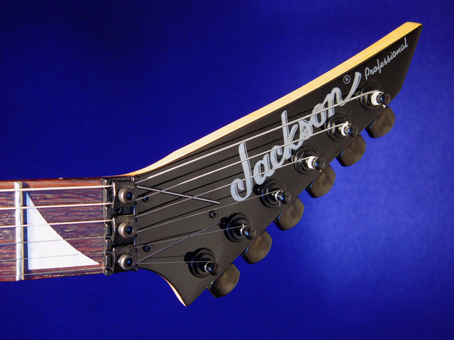
Nice background, weird angle. I think the whole guitar needs to be in view to really sell it. |
|
|
|
05/12/2002 08:08:00 PM |
|
Well? Does Jackson only make THAT part of the guitar? I find myself wanting to strain to see what the rest of the guitar looks like, if this was your intention - A+ :) good clarity, good lighting!! |
|
|
|
05/12/2002 05:56:00 PM |
|
Looks to me like you are selling guitars. Good job. |
|
|
|
05/12/2002 03:20:00 PM |
|
How do you get the blue background? I like it. |
|
|
|
05/11/2002 06:25:00 PM |
A nice shot of an important functional difference in this brand (are those fine-tuning screws above the nut?) but not the overall design.
If I were doing the whole ad (I've done more design than photography), I'd probably use the two nice spaces you left to composite-in tiny images of the whole guitar (front/back/side) -- this is a very good base image. |
|
|
|
05/10/2002 11:00:00 AM |
|
Nice shot but I would like to see the whole product rather than the headstock. |
|
|
|
05/10/2002 01:48:00 AM |
|
Nice and clear. Slight blue cast on the fretboard. Maybe a more interesting angle? |
|
|
|
05/09/2002 03:30:00 PM |
|
picture is neat but boring. could have made better use of the angles in the product |
|
|
|
05/09/2002 02:44:00 PM |
|
Very effective. I like the way the light gets brighter to the right of the guitar. |
|
|
|
05/08/2002 09:49:00 PM |
|
|
|
05/08/2002 07:57:00 AM |
|
right on. im a musician too. i play ibz and gibson. good technical pic. |
|
|
|
05/08/2002 06:07:00 AM |
|
Great shot love the clarity, one of my highest ratings |
|
|
|
05/07/2002 11:49:00 PM |
|
|
|
05/07/2002 09:05:00 PM |
|
Nice crisp shot. Bordering on being over sharpened? There appears to be a blue cast introduced on the subject from either the lighting, post processing, or a reflection? Good effort though. |
|
|
|
05/07/2002 07:51:00 PM |
|
beautiful color and good composition, would love to see a little more light on the label and a bit sharper focus, but all in al a nice shot |
|
|
|
05/07/2002 02:57:00 AM |
|
I really like this one. The shapes are great, well framed, and the colour of the backdrop is daringly vivid :) I'm not sure how it sells the guitar, but it's a cool photograph. |
|
|
|
05/06/2002 11:05:00 PM |
|
nice photo. i would have liked to see the whole guitar though |
|
|
|
05/06/2002 07:40:00 PM |
|
Very nice. One suggestion - If the light were brighter on the part of the instrument with your client's name, and a bit darker in the scratched fret, you might sell more guitars with the ad. Still very good. |
|
|
|
05/06/2002 07:23:00 PM |
|
THERE's the guitar pic. I almost though for a second that someone wasn't going to do one...but no. |
|
|
|
05/06/2002 06:00:00 PM |
|
Nice lighting and composition. Well done! |
|
|
|
05/06/2002 05:34:00 PM |
|
|
|
05/06/2002 01:35:00 PM |
|
what is it with guitars every week |
|
|
|
05/06/2002 11:09:00 AM |
|
Good photo, quality advert, low "gotcha" value. Maybe the background could have more "interesting". Photo 10 Advert 9 total 9 |
|
|
|
05/06/2002 10:06:00 AM |
|
Maybe a tighter crop and some extra light around Jackson? It really doesn't tell me much or make me think they are special. It is a nice photo. |
|
|
|
05/06/2002 08:00:00 AM |
|
an ibanez would have been better.... |
|
|
|
05/06/2002 05:57:00 AM |
|
The lighting is perfect. The balance and colors just work. GREAT job ! |
|
|
|
05/06/2002 03:43:00 PM |
|
would have liked to see more of what I may buy, great contrasts |
|
Home -
Challenges -
Community -
League -
Photos -
Cameras -
Lenses -
Learn -
Help -
Terms of Use -
Privacy -
Top ^
DPChallenge, and website content and design, Copyright © 2001-2026 Challenging Technologies, LLC.
All digital photo copyrights belong to the photographers and may not be used without permission.
Current Server Time: 06/28/2026 02:38:50 AM EDT.