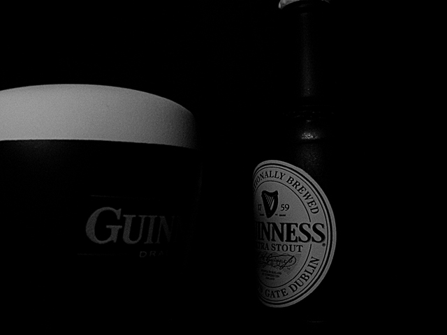
Thanks for your comments. My choice was not to let more light in, so the viewer's eye to "ask for more inside the darkness".
I tried more than 50 times to get this final shot. I used the b/w mode of my Nikon and there was not much processing except from a "brave" croping.
As many people didn't like darkness here, the photo finally was not competitive. But this is my first entry to DPC so I hope to be improved in future challenges.
It is most likely my monitor but this seems extremly dark. I do try to make sure all the bars are showing at the bottom of the page. They are showing right now but all I can see is half of the bottle label, the foam, and gui on the mug. Sorry. This would have been a wonderful picture.
Great concept...a bit dark overall...might've been good to highlight the head of the beer. Spend more time experimenting with the lighting. I picked up a cheap little halogen spot lamp from Home Depot that is adjustable in intensity and very handy for shots like this.
Perfect head on that pint. Love this shot with the deep shades, and the gradiant of Gui to NNess. Just detecting the top neck of the bottle is an nice touch. Cheers to a well executed shot.
Too dark to really make out any details and while that is sometimes a good thing, in this case IMO it is not. Maybe this was intentional and then I just don´t get it perhaps but if not you should check out your monitor.
darkness! clever alignment, though i would have liked to see the whites more clearly and crop down from the top a bit. i dont think the bottle cap helps anything





 Add photograph to your favorites
 Add photographer to your favorites


 Photographer found comment helpful.


