| Author | Thread |
Comments Made During the Challenge  |
|
|
11/22/2004 08:40:38 PM |
|
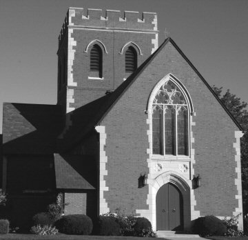
Very nice picture for black and white, really shows off the shadows and form of this church. It is a little low in contrast and more adjustment of the levels by making the highlights lighter and the shadows a bit darker might have really made this picture stand out in black and white. |
|
 Photographer found comment helpful. Photographer found comment helpful. |
|
|
11/20/2004 06:32:05 PM |
|
To make your shots bigger read in DPC under the tutorials how to prepare your photos for dpchallenge using photoshop. |
|
| Photographer found comment helpful. |
|
|
11/20/2004 01:19:05 PM |
|
I like the subject and the angle of this shot. I am sure you have heard alreay but this is a very small photo. The crop seems a bit tight. |
|
| Photographer found comment helpful. |
|
|
11/19/2004 03:02:02 AM |
|
This would have benefitted from being a larger size. the detail and contrast is mostly lost at this smaller size. |
|
| Photographer found comment helpful. |
|
|
11/18/2004 01:24:06 PM |
|
There are many detailed and interesting crops available on this building, but taking it as a whole, I think those points of interest are lost. The expansive brick face isn't inherently interesting to look at, yet it commands a significant amount of the frame. The same could be said for the sky. I'd go for an angle that accentuates the main door and window above it, leaving out the distracting elements. |
|
| Photographer found comment helpful. |
Home -
Challenges -
Community -
League -
Photos -
Cameras -
Lenses -
Learn -
Help -
Terms of Use -
Privacy -
Top ^
DPChallenge, and website content and design, Copyright © 2001-2026 Challenging Technologies, LLC.
All digital photo copyrights belong to the photographers and may not be used without permission.
Current Server Time: 06/28/2026 03:48:18 PM EDT.