| Author | Thread |
|
|
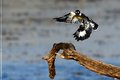
02/28/2013 12:11:05 PM · #301 |
Hoover, week 9

|
|
|
|
03/01/2013 09:14:45 PM · #302 |
 From an assignment for the newspaper. The Harlem Wizards came into town for a show. My assignment, shoot stuff that isn't about sports at a sporting event..... well OK. From an assignment for the newspaper. The Harlem Wizards came into town for a show. My assignment, shoot stuff that isn't about sports at a sporting event..... well OK.
This young man was brought out of the crowd and he was allowed to show his trick to the audience. So OK it wasn't his trick, but the Wizards told everyone it was, and they helped him spin a ball on top of his finger to the delight of the crowd and to much cheering that put a smile on his face.
Matt |
|
|
|
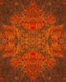
03/02/2013 05:37:56 AM · #303 |
8/52 Light painting.
 |
|
|
|
03/02/2013 07:07:25 AM · #304 |
08/52 of the wide angle of sorts series
 |
|
|
|
03/02/2013 11:14:19 AM · #305 |
|
|
|
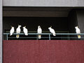
03/02/2013 12:10:23 PM · #306 |
Week 9 - Commuters
 |
|
|
|
03/02/2013 04:40:18 PM · #307 |
Week 5
 |
|
|
|
03/03/2013 10:50:48 AM · #308 |
Weeks 7 and 8
 and and 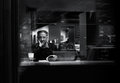 |
|
|
|
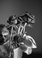
03/03/2013 04:53:11 PM · #309 |
Week 9 - Textures
 |
|
|
|
03/03/2013 07:45:08 PM · #310 |
Week 9 - Black and White
I should go back and do these with a different lens, trying for more sharpness. Lots of potential, I think - if you like such :)

Message edited by author 2013-03-03 19:45:26. |
|
|
|
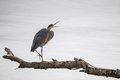
03/03/2013 09:35:22 PM · #311 |
Week 9 - In and Around Balboa Park
And two bonus entries. Still working on the experiment with the tennis ball, the ultrawide lens, and the extension tube.
  |
|
|
|
03/04/2013 01:35:23 AM · #312 |
Week 10 :) Either too many entries to get comments or last weeks entry was just not hot enough to warrant many comments:
...so I've upped my own game again with this :)
Message edited by author 2013-03-04 01:40:07. |
|
|
|
03/04/2013 02:49:16 AM · #313 |
I am actually a week behind and this image only makes the week because I did the pp this week. The actual pictures were taken in January.
...and just in case someone wonders, no, I don't feel particularly negative or in a bad place :-) - not at all actually. Its just unusual I think to have acces to a real lion skull and while I took some normal shots of it, I wanted to make more of the opportunity.
 |
|
|
|
03/04/2013 10:02:54 PM · #314 |
 Week 6 Week 6 |
|
|
|
03/04/2013 10:16:43 PM · #315 |
|
|
|
03/05/2013 01:10:43 AM · #316 |
Week 6
|
|
|
|
03/05/2013 03:18:34 PM · #317 |
So, I think I am back on track. Needed to do this before we start with TPL tomorrow ... can't wait - good luck everyone :-)
 |
|
|
|
03/05/2013 05:37:20 PM · #318 |

Low Light, Long Exposure #7 |
|
|
|
03/05/2013 10:10:03 PM · #319 |
|
|
|
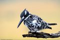
03/05/2013 10:41:19 PM · #320 |
I'm back after a hiatus from the thread...busy busy.
Here's week 6 with my new G5 and 200-600mm lens!
 |
|
|
|
03/06/2013 03:16:34 AM · #321 |
| Hi will be back soon been ill with a strained back and gastro enteritis not the best of things to have together spent 3 days in hospital and 4 drips later they decided i could come home. For the rcord fellow saffers caught in egoli (joburg) . |
|
|
|
03/06/2013 03:19:57 PM · #322 |
nam suggested a different crop on my horse.
I actually had looked at cropping it so the eye was on the 1/3s but personally I didn't like it much, because the neck got cut off and the eras are touching the top. It looked unbalanced to me. But here is a quick edit/crop, just curious what you think.

The reason I thought my original still worked was that the whole head was on the diagonal and that would "carry it" with the sharp line of the horse against the black.
I then thought that perhaps having the eye in the "right place" was really important, so I added some more BG and changed the crop just a little. Here the eye is perfectly on 1/3s. But even here I feel there is too much empty space at the bottom, especially bottom right and not enough on top. Thats just me, perhaps you feel it is better this way?
 |
|
|
|
03/06/2013 03:50:30 PM · #323 |
Originally posted by kasaba:
nam suggested a different crop on my horse.
I actually had looked at cropping it so the eye was on the 1/3s but personally I didn't like it much, because the neck got cut off and the eras are touching the top. It looked unbalanced to me. But here is a quick edit/crop, just curious what you think.
The reason I thought my original still worked was that the whole head was on the diagonal and that would "carry it" with the sharp line of the horse against the black.
I then thought that perhaps having the eye in the "right place" was really important, so I added some more BG and changed the crop just a little. Here the eye is perfectly on 1/3s. But even here I feel there is too much empty space at the bottom, especially bottom right and not enough on top. Thats just me, perhaps you feel it is better this way?
|
I think you are right on both of these - the narrower crop feels too tight and the other is, as you say, heavy on the bottom. As I said initially, I actually like the original crop but would like to see some alternatives. Thanks for taking the time and for posting these.
One last possibility. What if you keep the right and bottom of the first but add a bit to the top and left - IOW add to the left as you did in the 2nd revision but not to the bottom and add just a bit above the ears . . . Now I know this will move the eye off the horizontal Ro3's but it may not matter. This is really a beautiful portrait of a horse that I know means a lot to you so I think it's worth it to get exactly the balance that feels right to you. |
|
|
|
03/06/2013 07:43:55 PM · #324 |
Week 9

Message edited by author 2013-03-07 14:43:00. |
|
|
|
03/07/2013 01:44:13 PM · #325 |

Working on catching up on commenting. |
|
Home -
Challenges -
Community -
League -
Photos -
Cameras -
Lenses -
Learn -
Help -
Terms of Use -
Privacy -
Top ^
DPChallenge, and website content and design, Copyright © 2001-2026 Challenging Technologies, LLC.
All digital photo copyrights belong to the photographers and may not be used without permission.
Current Server Time: 01/02/2026 12:16:11 AM EST.


