| Author | Thread |
|
|
07/21/2006 01:49:45 PM · #1 |
| what kind of color combinations do you like to use in duotones, tritones and quadtones? |
|
|
|
07/21/2006 01:53:41 PM · #2 |
For a really nice Sepia look, I like to use a tritone of
Black, PANTONE 1215 C, and PANTONE 202 C.
 
Message edited by author 2006-07-21 14:04:02.
|
|
|
|
07/21/2006 01:56:08 PM · #3 |
Originally posted by fotomann_forever:
For a really nice Sepia look, I like to use a tritone of
Black, PANTONE 1215 C, and PANTONE 202 C. |
This may be a silly question, but what is "PANTONE 1215 C" and "PANTONE 202 C"? |
|
|
|
07/21/2006 02:02:13 PM · #4 |
Originally posted by BakerBug:
This may be a silly question, but what is "PANTONE 1215 C" and "PANTONE 202 C"? |
They are kind of brownish yellow and crimson red respectively. When you are choosing colors, you can use the Color libraries insted of the picker. Both of these colors are in the Pantone Solid Coated library.
Message edited by author 2006-07-21 14:05:21.
|
|
|
|
07/21/2006 02:17:00 PM · #5 |
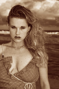
I use lots of them - but I always play around until I find something I like, then save them for future reference.
Aside from the colors that you can pick, you can really get lots of interesting results by playing with the curves. If you flip a curve for one of the colors horizontally (so it looks like \ instead of looking like /), then the white areas of your duotone will be that color, not white (some examples are below). That can give a duo/tri/quadtone image two colors, instead of just one base color, like you see in a more standard sepia. The curves dictate how the inks in the duo/tri/quadtone are applied to the pixels.
Look at Moodville's tutorial for some additional information.
 and and  are some examples where the duo/tri/quad are worked to give the image more than a single base color. are some examples where the duo/tri/quad are worked to give the image more than a single base color.
Basically, just mess around with it until you find something you like, then take notes.
|
|
|
|
07/21/2006 02:36:22 PM · #6 |
I like your applications Paul... nice work.
|
|
|
|
07/21/2006 02:42:46 PM · #7 |
| Moodville"s tutorial is great! Check out "Golden ice cubes" by Structor in the Perspective III challenge and Rikki"s "The fires of sunset from the other side of midnight" for some really great work. |
|
|
|
07/21/2006 09:05:05 PM · #8 |
|
|
|
07/22/2006 06:19:44 PM · #9 |
| Paul - I like your post, but even more I like your work. BTW, I like your take on Norman Rockwell. I wonder if BakerBug understands more about Pantone yet? |
|
|
|
07/22/2006 06:29:35 PM · #10 |
Thanks for your very detailed post Paul. I'm gonna have to try this out some.
|
|
Home -
Challenges -
Community -
League -
Photos -
Cameras -
Lenses -
Learn -
Help -
Terms of Use -
Privacy -
Top ^
DPChallenge, and website content and design, Copyright © 2001-2025 Challenging Technologies, LLC.
All digital photo copyrights belong to the photographers and may not be used without permission.
Current Server Time: 09/06/2025 10:38:50 AM EDT.


