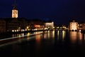
DPChallenge: A Digital Photography Contest You are not logged in. (log in or register
 
Browse Settings
Currently viewing:
Registered UserK3Master

Show comments:

Per page:

Order:

Comments:


Comments Made by K3Master
Pages:   ... [127] [128] [129] [130] [131] [132] [133] ... [147]
Showing 1291 - 1300 of ~1469
Image Comment
Cafe No More
09/07/2008 12:40:57 PM
Cafe No More
by SoulMan1978

Comment:
Unfortunate. Looks like it would have been a nifty little spot to eat. I like the attempt at a dramatic choice of perspective, but the bright light of the time of day doesn't really work with the subject that feels like it wants to be dark and moody.
Photographer found comment helpful.
Strix Nebulosa
09/07/2008 12:39:04 PM
Strix Nebulosa
by Ecce_Signum

Comment:
Not a big fan of the uber-contrasty selective desat here. The yellow looks incredibly unrealistic.
Photographer found comment helpful.
The New Marine
09/07/2008 12:38:32 PM
The New Marine
by Blue Moon

Comment:
a little harsh on the lighting, and it seems to suffer a touch from focus issues.
Photographer found comment helpful.
By The Dawn's Early Light
09/07/2008 12:37:57 PM
By The Dawn's Early Light
by jonfrommk

Comment:
lacks a little contrast and, by association, some sharpness in the shadows.

The sun's star effect is quite a nice little bonus.
Photographer found comment helpful.
Japanese Gardens
09/07/2008 12:36:58 PM
Japanese Gardens
by lwkimages

Comment:
Nice symmetry, although you've left more on the bottom than the top. Tricky lighting conditions too, but you've done pretty well. This shot begs for multi-exposure on a tripod and then done up in photomatix or similar for a nice HDR look. (not DPC legal, but would look great in a personal album)
Photographer found comment helpful.
Contemporary Mona Lisa
09/06/2008 03:26:01 PM
Contemporary Mona Lisa
by Alicia

Comment:
I miss having Nik. I like this.
Photographer found comment helpful.
Yawn.jpg
09/04/2008 10:00:05 PM
Yawn.jpg
by Lonni

Comment:
My preferences tend to go toward using a very diluted hue/saturation effect myself. I try and avoid overly warm portraiture unless there's a real reason to use it. (There rarely is in my experience. heh)

So yes, I like the suggestion to tone that down too.

I can't really add any more to what has been said except this: Never listen to family when taking photos, or deciding which ones to keep. They are always wrong. They have too much emotional investment in them. lol.
Photographer found comment helpful.
the Beginning and the End
09/04/2008 01:33:24 AM
the Beginning and the End1st Place
by SherwinJames

Comment:
Definitely deserved. One of my favorites of the challenge.
Photographer found comment helpful.
Water Traffic on River Limmat
09/03/2008 11:34:32 PM
Water Traffic on River Limmat
by Oich

Comment:
comments like "nice shot" and "nice capture" seem almost like the kiss of death.

One of the reasons is because it's the classic response to a shot that looks nice, but doesn't give the viewer any real reason to say anymore. In the world of the 5 second view as you click a button to vote, "nice shot" is akin to flipping through a Sears Catalogue and commenting "cool shoes" on a pair of shoes you'd never actually buy.

As for why this didn't do so well, there are probably a few factors that I can pick out myself. (Probably not an extensive list):

1. Lighting. The overall feel of this photo is too dark, when what I want to see is a little more light and detail. 20 seconds was probably just not long enough for a shot of this nature in this case.

2. Point of focus. The composition is a little off-centered, leaving us with the view of the dark water first, and then the buildings as a secondary scene. Most shots of this nature that do well generally give us a very strong point of focus, such as a building or landmark, with the darker water/sky being secondary.

3. Clarity. There isn't a lot of sharpness and detail in the buildings that we do see. Having those two things on DPC seem to be of almost absolute paramount. Especially in a scene like this which is seen over and over again.

4. Originality. This shot lacks some. With this kind of photo being so prominent, you'd better hope to bring something relatively new to the table to impress the voter. This shot really has nothing of the sort. Lacking that originality, you really need point #3 to become far more of a player.

5. Everything Above and More. A combination of all the points above, plus some I probably haven't touched on, need to come together to get the viewer to say a lot more than "nice shot". You need to make the viewer say "WOW!" That's why this placed where it did in all likelihood. It lacks the wow.
Photographer found comment helpful.
Flight of the Valkyrie
09/03/2008 10:31:12 PM
Flight of the Valkyrie
by LevT

Comment:
This is actually a better composition than your purple entry, but I'm really not liking the B&W conversion.
Photographer found comment helpful.
Pages:   ... [127] [128] [129] [130] [131] [132] [133] ... [147]
Showing 1291 - 1300 of ~1469


Home - Challenges - Community - League - Photos - Cameras - Lenses - Learn - Help - Terms of Use - Privacy - Top ^
DPChallenge, and website content and design, Copyright © 2001-2025 Challenging Technologies, LLC.
All digital photo copyrights belong to the photographers and may not be used without permission.
Current Server Time: 08/05/2025 02:06:48 AM EDT.