| Image |
Comment |
| 07/10/2005 09:45:14 AM |
Moth Abstractby glad2badadComment: Great detail on this and I like the colors and textures, you can see the inconsistency of the make up of the wing that you would not see this close. That said I thnk you might have gotten too close and showing a bit more of the pattern might have made a more colorful and inviting image as this looks a bit clinical as is. But I let the detail factor override some of that. |
 Photographer found comment helpful. Photographer found comment helpful. |
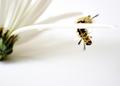
| 07/10/2005 09:42:06 AM |
Hangin' 10 ... or is it 8 ... 12???by jenesisComment: The detail on the subject is quite fine...I am not sure what the center of the flower adds to this though it does provide a base for the petal from which the subject is hanging. The straight horizontal composition is bit stagnant (sic) and you might have tried more of a CW angle so that the subject was more towards the lower right third. Very good exposure. |
| Photographer found comment helpful. |
| 07/10/2005 09:35:30 AM |
Remember Liberty on This Birthdayby fulgentComment: Really close...nice composition and the colors are fine. you got a bit of shadow on the lower third but when your are this close, I do not know how you might have avoided it. Excellent detail. |
| Photographer found comment helpful. |
| 07/10/2005 09:32:57 AM |
Valvesby TiNComment: The angle on this is very good compositionally though I think that it might have been cropped a bit less tight to see more of the tube on the right and less of the grate at top which not as interesting. That said I like the reflection of the grate on the top of the tubes very much. Different and good overall. |
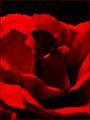
| 07/10/2005 09:29:48 AM |
This one is for youby hjolliComment: I like this as a rose abstract though I think more of the focus should have been in the middle instead of to the back of the flower. It is a bit murky too though I think brightening it might have lost some the shadows that help with the abstraction. |
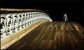
| 07/10/2005 09:11:59 AM |
The Journeyman by muur88Comment: I gave this a 9 because it had great leading lines. I have to agree with some that said the dark backgound look un-natural. I think the only thing that you really needed to get rid of was the glimpse of what appears to have been another person. The other changes to the bridge were fine. Regardless it is a great example of the challenge theme. Congrats on your blue! |
| Photographer found comment helpful. |
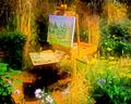
| 07/09/2005 11:00:22 PM |
Garden Paletteby banmornComment: Thanks PhotoRyno. I appreciate it. On another site that I participate on you can see the original image on all the images that are posted. It always fascinates me what people start with and what they end up with. Here is the original image just resized and slight USM:
 Message edited by author 2005-07-09 23:00:54. Message edited by author 2005-07-09 23:00:54. |
| 07/09/2005 09:08:53 PM |
|
| Photographer found comment helpful. |
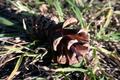
| 07/09/2005 09:06:14 PM |
Acornby justinbrookComment: Pinecone...a bit over exposed and te foucs is off. There is some shadow on much of the cone. You might have moved it left or right to avoid that and had a better chance of a good exposure. |
| Photographer found comment helpful. |
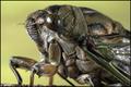
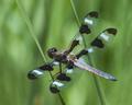
| 07/09/2005 09:03:56 PM |
Double Spanby bongoComment: Excellent detail on the dragon and great DOF. Like the composiiton as well as the color contrasts of the subject and the bacground. Great capture. |
| Photographer found comment helpful. |
Home -
Challenges -
Community -
League -
Photos -
Cameras -
Lenses -
Learn -
Help -
Terms of Use -
Privacy -
Top ^
DPChallenge, and website content and design, Copyright © 2001-2025 Challenging Technologies, LLC.
All digital photo copyrights belong to the photographers and may not be used without permission.
Current Server Time: 08/17/2025 05:03:21 PM EDT.