| Image |
Comment |
| 05/03/2002 02:10:00 PM |
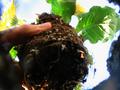
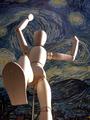
Planting Miss Daisyby SpeignerComment: I like the background very much. Wish the focus had been a little bit more on that thumb though and not the leaves. |
| 05/03/2002 02:01:00 PM |
|
| 04/30/2002 10:34:00 AM |
Upby i3ullseyeComment: I think a little too much emphasis on his crotch...stray plants off to the left. Vertical framing might have helped. |
| 05/01/2002 09:06:00 AM |
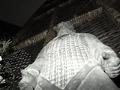
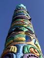
Stained Classby jmsetzlerComment: Why "class"? I like this photo a lot. The fact that the line that starts in the lower right corner and goes up to exactly the center at the top seems well thought out. I could wish that that corner was more in focus...don't know if it was an option to use a smaller aperture or not. |
| 04/30/2002 10:32:00 AM |
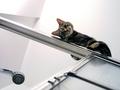
Get Me Down! by joebarComment: This really works well. The disembodied shower head and the door handle give it the context, without adding too many extra lines or color which might make the image too busy and take away from the kitten. And the expression on the face of the kitten is perfect. |
| 04/29/2002 09:32:00 AM |
|
 Photographer found comment helpful. Photographer found comment helpful. |
| 04/29/2002 09:44:00 AM |
Spirits In The Skyby ShiiizzzamComment: Interesting subject, no technical mistakes, but composition is lacking. Maybe if you could have gotten something in the foreground to indicate a sense of scale? |
| 04/29/2002 08:11:00 AM |
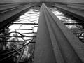
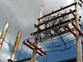
Power & Heatby jsgfComment: I like the rustiness, as it contrasts very well with the blue sky. It seems like it maybe could have been better composed - there are a lot of places where lines are cut off, yet it doesn't completely fill the frame. |
| 05/03/2002 02:06:00 PM |
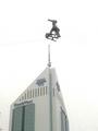
High Riserby nbward55Comment: Hard to tell if it was really foggy, or this is overexposed. I kind of wish that the thing on the wire wasn't so much straight above that antenna, dunno if that would have been possible. |
| 04/29/2002 12:53:00 PM |
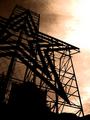
Evening Starby hokieComment: Interesting colors, interesting, intricate silhouette. Is it sepia-toned, or are these the real colors? I like it a lot. |
Home -
Challenges -
Community -
League -
Photos -
Cameras -
Lenses -
Learn -
Help -
Terms of Use -
Privacy -
Top ^
DPChallenge, and website content and design, Copyright © 2001-2025 Challenging Technologies, LLC.
All digital photo copyrights belong to the photographers and may not be used without permission.
Current Server Time: 08/25/2025 05:31:01 PM EDT.