|
|
| Image |
Comment |
| 12/11/2002 11:13:19 AM | Bloomingdales Candid 1by smellyfish1002Comment: This is an amazingly good candid shot, and the use of b&w is the perfect choice for this. The framing so that the background face echoes the main subject is either very well spotted, or incredibly good luck :o) Perhaps a touch more light on the jacket would have helped, but given that its a candid I know that you would have had little control over that. I am curious however as to what the background is, since the edges of it are very clean, and there appears to be a foldline down part of it... |  Photographer found comment helpful. Photographer found comment helpful. |
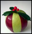
| 12/11/2002 10:59:06 AM | Christmas Appleby DougPazComment: Cleverly done :o) Perhaps a second light on the righthand side would help balance the image, and a slight adjustment on the crop so that the rightmost holly leaf isnt as close to the border might help too. | | Photographer found comment helpful. |
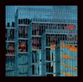
| 12/11/2002 10:38:06 AM | City Abstractby JakComment: I really like the lines of this shot, with the repetition of the frontage leading the eye from the upper left corner down across the shot. The colours in this shot contrast well, but the refleactions make it very unclear as to what exactly the orange & reds are caused by - fire? I'll have to wait until the results I guess :o)
One thing about the border - it feels like its overpowering the main body of the photo - I'd recommend a border only about half as wide as this one, at most. |
| 12/11/2002 10:28:48 AM | Primary Swirlsby CreativeFlyPhotoComment: Good choice of subject matter in this shot, but I feel that it has let down in several areas - the lighting is very bright and has blown out some of the highlights, the main surface and background are a bit distracting, and the marble with some interesting surface texture (the cracked-looking one in the middle) could have made a good central focal point, if placed closer to the front of the shot. | | Photographer found comment helpful. |
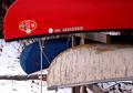
| 12/11/2002 10:25:32 AM | Something old, something new, something borrowed, something blue.by RiderGalComment: So which canoe/kayak is the borrowed one? :o) The clean red really stands out in this shot, and it contrasts well against the older-looking hulls. Composition wise, I'd have liked to see a little more of the blue hull, or perhaps a slightly wider or closer crop (depending on what you wanted to make the main subject), but I do like this crop. |
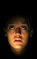
| 12/11/2002 10:09:46 AM | The Unknownby arnitComment: Great use of dramatic lighting, combined with the upward gaze, really adds interest to this shot, as does the use of negative space. However, I personally wouldn't have centred the shot so much, and would crop so that there isn't so much darkness below the face, emphasising the darkness above. The focus on the subject is good, and the lighting hasn't blown out anywhere, which is impressive. |
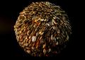
| 12/11/2002 10:03:42 AM | Tons of Seedsby RfariasComment: Did you make this yourself?? It's a very ususual subject, thats for sure :o) Considering that the seed casings are quite dark, perhaps a brighter background would have made the ball stand out more. As it is, the lighting is maybe a bit too yellowy, and puts much of the shot in shadow - another light from the righthand side might help balance this up a bit more. In addition, a squarer crop may help in this case. |
| 12/11/2002 09:58:46 AM | Flower Girlby SonifoComment: A good portrait shot, and the lighting is nicely even. I personally would have cropped the righthand side of this shot more, so that the child's head isn't as central, and perhaps brightened the shot a little more, but doing so without losing the textures would be tricky. | | Photographer found comment helpful. |
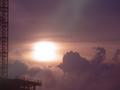
| 12/11/2002 09:54:16 AM | Up in the Cloudsby jab119Comment: The colours and textures of the sky & clouds in this shot are great, but its let down by the (slightly out of focus) building on the left, since it distracts rather than providing context. A different crop might also have avoided the greenish patch in the top-centre of the shot (lens-flare?). |
| 12/11/2002 09:50:25 AM | Dixie in Decemberby rll07Comment: Great focus and lighting, but its overpowered by the very bold border, negating the negative space affect of the spaces to the left and right of the dog. |
Home -
Challenges -
Community -
League -
Photos -
Cameras -
Lenses -
Learn -
Help -
Terms of Use -
Privacy -
Top ^
DPChallenge, and website content and design, Copyright © 2001-2025 Challenging Technologies, LLC.
All digital photo copyrights belong to the photographers and may not be used without permission.
Current Server Time: 08/21/2025 11:12:23 AM EDT.
|