| Author | Thread |
|
|
01/05/2003 07:39:27 PM |
|
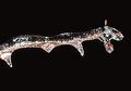
this has the makings of a good photo--i like the composition of the sky--the way the clouds bump up against the sun and then thin out at the top of the frame. reminds me of the sort of sky you see from an airplane. i just can't decide if i like the structure in the left hand corner--normally i would think it worked well for framing, but i really dont know if a sky shot needs any external framing--perhaps the position of the clouds would have worked just fine. the colors are nice, if a little too muted for my taste. the photo has a sort of ethereal quality to it which is nice. i think that if this was my picture--i would take the original, throw it in PS--crop out just the structure on left and bottom--fix the glare at the top and boost the levels a tad to make the colors stand out just a little more. not a whole lot of work for a really nice picture! good work. |
|
Comments Made During the Challenge  |
|
|
12/15/2002 08:22:07 AM |
|
I don't like the soft focus so well on this pic. - Inspzil |
|
|
|
12/14/2002 09:23:10 AM |
|
The focus seems a little soft in this photo. The image also seems somewhat washed out. I wonder how it would look if you focused clearly on the sillouette on the left, and bumped up the saturation a little. |
|
|
|
12/13/2002 12:19:57 AM |
|
The clouds and colours here are nice, but it needs post processing work on levels, curves etc. to really bring out the full range of tones. As it is, it's washed out and grey. The framing of the tower on the left is awkward, it either needs more of it there or to be cut out completely. The focus is soft, but that's not a bad thing when the subject is clouds. If it wasn't so washed out, the soft focus would work well (in my opinion). |
|
|
|
12/12/2002 01:16:58 PM |
|
Nice shot. Lovely colours. I had probably straightened it a little. Interesting to look at. |
|
|
|
12/12/2002 01:02:30 PM |
|
The distraction on the left really turns me off this pic. IMO, it needed to be either more fully in the shot, or better yet, fully out of it. The clouds and distorted sun are fairly nice, but not very striking. There's an odd greenish cast in the upper middle/right that doesn't look right/good, too. Sorry, 5 Swash |
|
|
|
12/12/2002 12:51:42 PM |
|
I love the colors and texture of the sky and cloud. My only comment is regarding the structure on the left. In my opinion, you need more of it, or it needs to be eliminated all together. Right now, it seems to me that being in the frame was an accident! Also, if it is going to be included, maybe have it in a little sharper focus so that it really stands out. |
|
|
|
12/12/2002 12:22:04 PM |
|
I'm wondering if this shot would have been stronger without the tower. It also appears that you shot this through a window. That being the case, it threw a reflection at the top center of the picture. Adjustments to the contrast might have made the foreground clouds pop of the page and give a nice contrast to the brightness of the sun. |
|
|
|
12/11/2002 08:51:29 PM |
|
I fail to see the point of the tower and platform in this picture. To me, for them to be in the shot, the top of tower should be visable (or some interesting feature) as well as some sky (clouds) on the left. I do like the colors, however, the sun is slightly too bright. |
|
|
|
12/11/2002 04:49:22 PM |
|
Personally I don't think this photo has any real oomph. I don't really see fabulous colors, or a very striking scene... just a very bland sun with a building in front. No offense or anything. This could be improved with a different crop perhaps? Maybe making it longer? I'm really not sure. Good try though. |
|
|
|
12/11/2002 02:38:03 PM |
|
I like the framing of the structure on the left and the perspective it gives to the photo. The The sun spot makes what is otherwise a very soft picture rather harsh though. = 6 |
|
|
|
12/11/2002 11:06:44 AM |
|
Good idea, however the image seems flat, the colour looks a bit soft, and the structure's alignment is a bit off. Just an opinion. |
|
|
|
12/11/2002 09:54:16 AM |
|
The colours and textures of the sky & clouds in this shot are great, but its let down by the (slightly out of focus) building on the left, since it distracts rather than providing context. A different crop might also have avoided the greenish patch in the top-centre of the shot (lens-flare?). |
|
|
|
12/11/2002 02:22:43 AM |
|
Colors are a bit muted, but still a very pretty shot. I really like the clouds. gives me a sense of calmness. the building/structure thing to the left is a good touch. give just enough of "something" to make this interesting. I wonder how this would look if you upped the saturation just a tad. just something to try. good luck in the chalelnge. |
|
|
|
12/10/2002 10:37:52 PM |
|
nice composition. i like the drilliing rig 'up in the clouds'. a little more contrast and color correction would improve this photo. very nice creativity. |
|
|
|
12/09/2002 05:47:25 PM |
|
Not crazy for the structure on the left here.....did we need that in the shot? .....Or maybe should of had more of it? The colors are fantastic and the sky is wonderful. The focus is soft for my liking. |
|
|
|
12/09/2002 11:20:20 AM |
|
Home -
Challenges -
Community -
League -
Photos -
Cameras -
Lenses -
Learn -
Help -
Terms of Use -
Privacy -
Top ^
DPChallenge, and website content and design, Copyright © 2001-2026 Challenging Technologies, LLC.
All digital photo copyrights belong to the photographers and may not be used without permission.
Current Server Time: 07/02/2026 11:28:44 AM EDT.