| Image |
Comment |
| 08/21/2002 03:26:00 PM |
|
 Photographer found comment helpful. Photographer found comment helpful. |
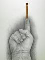
| 08/26/2002 02:53:00 PM |
Red and White by RemieComment: Thanks for the votes and the great and useful comments :) The white pencil blending into the white backgroud was intentional and I have been thinking about doing the same with the red one. I came to the conclusion that it couldn't be done without destroying the balance of the photo. By using extra lights there would be either shadows on both sides of the pencils (giving the photo a fake unnatural look) or hardly any shadows at all (taking the depth out of the photo). But that's just my personal thoughts. I did make an outtake with a black and a white pencil on which both pencils blend into the background, but it doesn't have the visual impact of this photo. |
| 08/26/2002 03:03:00 PM |
|
| 08/21/2002 03:39:00 PM |
Blacksheepby whobeeComment: Great idea and a very good composition. - Well done! |
| 08/22/2002 04:39:00 PM |
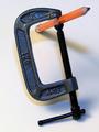
Pressure Pointby rll07Comment: Great idea, but most of the attention is drawn to the clamp itself though, not to the real point of interest. I think this could have been achieved by shifting everything downwards even though it would have cut off part of the clamp. Somehow, I also would like to see the pencil being really squeezed. |
| 08/15/2002 05:01:00 PM |
The Force Be With Youby karmatComment: It looks like he's doubting if he shoud go or not. You should have given him a laser-swords too :) Seriously, I like the strong composition of this photo and the way the blue colored bag stands out is superb. Besides that I like the way you showed the first schoolday a lot! The angle of the wall on the right is distrubing though. Maybe you should have framed/cropped the photo in such way that it would not be visable at all. That's the only reason I give it a 9 instead of a 10. |
| Photographer found comment helpful. |
| 08/12/2002 03:10:00 PM |
|
| 08/13/2002 03:18:00 PM |
|
| 08/15/2002 04:37:00 PM |
Bouquet for the drawing artistby sylkComment: I like this style of photography, so that's a bonus already :) Both the composition and colors are very attractive. At first sight, I thought the right part was to bright, but on second sight I think it isn't. If it wasn't for that brightness, the overall photo probably would look to flat. |
| 08/13/2002 03:15:00 PM |
|
Home -
Challenges -
Community -
League -
Photos -
Cameras -
Lenses -
Learn -
Help -
Terms of Use -
Privacy -
Top ^
DPChallenge, and website content and design, Copyright © 2001-2025 Challenging Technologies, LLC.
All digital photo copyrights belong to the photographers and may not be used without permission.
Current Server Time: 08/23/2025 09:16:42 PM EDT.