| Image |
Comment |
| 02/19/2004 07:15:02 AM |
Curiously Strongby omnibusComment: Intriguing - might make a good wallpaper. Your very muted b&w has some merit, though perhaps to bring out the quality of texture you might want to try setting black and white points further away from grey than this, to allow more graduation of light and shade throughout the image. |
 Photographer found comment helpful. Photographer found comment helpful. |
| 02/19/2004 07:13:27 AM |
Sweetby StevePaxComment: heavily saturated colour - to the extent that in the brightest area of the fruit it's begun to lose detail, and yet the overall image isn't very bright at all. The idea is good, and the execution not far off, but perhaps brightening the whole thing and then reducing the saturation to bring back those details would help graduate the light across the skin? Still, a good illustration of the smooth/shiny and pitted feel of orange skin. |
| Photographer found comment helpful. |
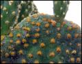
| 02/19/2004 07:11:15 AM |
Feather Soft Cactusby drgsoellComment: Not a good composition I'm afraid. Those shapes don't lead the eye anywhere, and the blown out sky attracts the eye by sheer force of its whiteness. It's difficult to say exactly where you think the main centre of interest is here, as there appears to be no one thing as a primary subject. The light is far too general to capture good texture. |
| Photographer found comment helpful. |
| 02/19/2004 07:09:04 AM |
Inconspicuous Smoothness of an iPodby XarthanComment: I think you needed a bit more fill-light to bring out the texture of the thing against the brightness of its own lights - that balance seems skewed in favour of the screen and buttons. It might just be a processing thing, but I have to really brighten my screen to see other than just one edge - and yes, my machine is calibrated. |
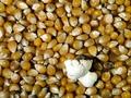
| 02/19/2004 07:07:18 AM |
First One Out!by drydocComment: Good lighting, though I think you are just a touch over-exposed on that bloom (it actually looks like a piece of paper screwed up). beyond that it's well poitioned within frame, and the texture of those seeds is well caught. The over-exposure loses you some level of detail and thus texture in the bloom itself, which is a shame as it is inevitably the main subject of this image. |
| Photographer found comment helpful. |
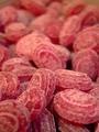
| 02/19/2004 07:05:20 AM |
The red one.......by totiComment: Very good detailing and feel within focus range. Your choice of shot is perhaps a touch too confused for a great image - such a choas of objects without ever finding one single point to hold the eye. Pretty good work, nevertheless. |
| Photographer found comment helpful. |
| 02/19/2004 07:03:54 AM |
Gearby LoudDogComment: Such direct light perhaps mutes the feel of this - making the shape of the whole thing rather more imprtant to the image than the feel of it. Slightly odd angle to choose, relegating that cut end of shaft so far out of frame. Good colour, but not in the end a convincing entry for me. |
| Photographer found comment helpful. |
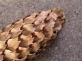
| 02/19/2004 07:02:02 AM |
Cone of Silenced Textureby MWittComment: Good subject, well isolated from background both in toning and focus. Fine detail not quite evident, but the texture still gets through. |
| Photographer found comment helpful. |
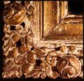
| 02/19/2004 06:19:59 AM |
Agedby HRoxasComment: Graphically wonderful - very intriguing. From a sense of blance, perhaps the roundels have been taken too far toward edge of frame, and the positioning of the edge of that frame within your frame is maybe too blatant, or perhaps simply too close not to feel constricted. There's an odd sense of not neing able to work out the three dimensionality of the wood, too. seems to dwell more on the shapes, and the composition than the texture - can't work out what's going on with the lighting - it seems to be coming from two different and opposed directions at the same time. |
| Photographer found comment helpful. |
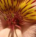
| 02/19/2004 06:16:04 AM |
Texture of Pollenby relbComment: The very finest detail seems slightly lost - like there was just a fraction of camera shake - it may be just a function of the light almost as much as focus or shake, but it doesn't quite have the immediacy of perfect detail. The sense of the dusting of pollen on the curves of the petals is well caught however. The yellowness of that top petal, and those black striations, perhaps compete too much with the stamen for attention. |
| Photographer found comment helpful. |
Home -
Challenges -
Community -
League -
Photos -
Cameras -
Lenses -
Learn -
Help -
Terms of Use -
Privacy -
Top ^
DPChallenge, and website content and design, Copyright © 2001-2025 Challenging Technologies, LLC.
All digital photo copyrights belong to the photographers and may not be used without permission.
Current Server Time: 06/23/2025 07:17:48 AM EDT.