| Author | Thread |
Comments Made During the Challenge  |
|
|
02/24/2004 10:32:36 AM |
|
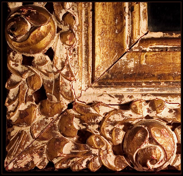
The diagonal line saves it. |
|
 Photographer found comment helpful. Photographer found comment helpful. |
|
|
02/23/2004 10:54:39 PM |
|
| Photographer found comment helpful. |
|
|
02/23/2004 10:30:41 AM |
yeah nice choice of shot. I would crop a bit from the left and bottom though to fill the frame (no pun intended)
|
|
| Photographer found comment helpful. |
|
|
02/21/2004 08:23:19 AM |
|
| Photographer found comment helpful. |
|
|
02/21/2004 05:37:03 AM |
|
Nice and simple, I lke it. The light seems to be coming from the side though, it feels a little off-kilter to me. :) |
|
| Photographer found comment helpful. |
|
|
02/20/2004 10:36:30 PM |
|
you should frame this (ha!) |
|
| Photographer found comment helpful. |
|
|
02/20/2004 05:46:17 PM |
|
| Photographer found comment helpful. |
|
|
02/20/2004 03:18:28 PM |
|
I love this photo, just something simple and symmetrical that keeps in interesting. |
|
| Photographer found comment helpful. |
|
|
02/20/2004 11:47:11 AM |
|
Nice composition and closeup. Others might have shot the entire frame and lost the impact of it's texture and details. |
|
| Photographer found comment helpful. |
|
|
02/20/2004 06:53:39 AM |
|
I really like the composition of this image...great subject! One of my favorites! |
|
| Photographer found comment helpful. |
|
|
02/19/2004 06:19:59 AM |
|
Graphically wonderful - very intriguing. From a sense of blance, perhaps the roundels have been taken too far toward edge of frame, and the positioning of the edge of that frame within your frame is maybe too blatant, or perhaps simply too close not to feel constricted. There's an odd sense of not neing able to work out the three dimensionality of the wood, too. seems to dwell more on the shapes, and the composition than the texture - can't work out what's going on with the lighting - it seems to be coming from two different and opposed directions at the same time. |
|
| Photographer found comment helpful. |
|
|
02/18/2004 07:16:43 PM |
|
Wonderful old frame. Love your crop, light and the colors. |
|
| Photographer found comment helpful. |
|
|
02/18/2004 10:38:35 AM |
|
I like this shot. Good idea and composition. It seems maybe just a bit too bright, or contrasty. Very nice for textures. |
|
| Photographer found comment helpful. |
Home -
Challenges -
Community -
League -
Photos -
Cameras -
Lenses -
Learn -
Help -
Terms of Use -
Privacy -
Top ^
DPChallenge, and website content and design, Copyright © 2001-2026 Challenging Technologies, LLC.
All digital photo copyrights belong to the photographers and may not be used without permission.
Current Server Time: 06/28/2026 03:56:14 AM EDT.