| Image |
Comment |
| 06/18/2003 12:48:06 PM |
Back Pocketby scab-labComment: This is good, funny, and original. The image is crisp, it's not showing more than what is needed to be shown, keeping the photos as the main focus of the image. There may be a little blur on the top left of the red shirt but it's not really distracting. Great shot. 8 |
 Photographer found comment helpful. Photographer found comment helpful. |
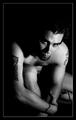
| 06/18/2003 12:35:29 PM |
Ink For Lifeby byetkoComment: The pose is interesting, although not a fan of having the knee cropped out. The tonal range of the skin is good, and the shadowed face is interesting, but I think the shadow of the face onto the shoulder seems a little off - had the shadow covered the entire shoulder maybe, but it just seems odd as is. The dark areas do provide a nice broody feel to the image that I like. As the title of the shot is 'Ink for Life' I would have liked to have seen more of the ink, as it is the tats on the shoulders are half obscured by shadow and are more of an addition than the main focus, which the title kinda suggests. |
| Photographer found comment helpful. |
| 06/18/2003 12:19:34 PM |
BodyScapeby photogooComment: The colors are appealing. I can certainly see the effect you are trying to achieve - the body's form appearing like a mountain range, the sheet as a desert or sea, but I think perhaps a soft focus may have helped more than the grain. In some ways I like the grain, it gives an aged feel to it, but in others I feel it's too harsh for an otherwise sensual shape. The left area is a little too harshly lit and the definition of the curve is a little lost because of it. Overall I think it's quite an intriguing image. |
| Photographer found comment helpful. |
| 06/18/2003 12:12:49 PM |
Inside & Outby hughletherenComment: I like it! It's a good pic AND it's funny and original. Perhaps having your head in the same position as the x-ray may have helped relate the two, but I like it as it is. |
| Photographer found comment helpful. |
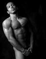
| 06/18/2003 12:01:36 PM |
In all simplicity.by DrJOnesComment: The first thing I notice, other than the 'buns' is the complimentary color of the background and skin tone. I like the gradient color in the background too, I think it works better than a solid plain color. The skin tone is good and even with shadows highlighting the appropriate areas of the human form. The only negative is the slightly over-exposed area on the left shoulder. The perspective is interesting and I'm not sure if I like it or not. It's certainly different and that could be why the image works, but it also looks kinda weird to the eye. Overall I really like the shot and applaud you for being bold enough to take a pic like this! 9 |
| Photographer found comment helpful. |
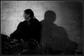
| 06/18/2003 11:54:12 AM |
meby heidaComment: This is a really great, powerful black and white image. It conveys a lot of emotion. The tonal range is good and the dark areas help set the mood. I like it a lot. 9 |
| Photographer found comment helpful. |
| 06/18/2003 11:49:39 AM |
braceletby imagesloyolaComment: Great shot and tastefully done. The lighting really works well to enhance the texture of the skin, as well as the muscles, and adds some mystery to the shadows. It's a really great image of the human form. The thigh seems a little out of place tonally with the rest of the image as there seemed to be a light-to-dark gradient down to that point, but it's not overtly distracting. The bracelet is a nice touch. On the whole I really like the shot and could definitely see it hanging on a wall. |
| Photographer found comment helpful. |
| 06/14/2003 04:24:19 PM |
"DOG WORLD"by melissartsComment: I like the silhouette and the fact that he is looking toward the light. The odd slant of the horizon is in some ways interesting and in others kinda off-putting, I cant really make up my mind if I like it or not. The image itself is a little small and you could afford to go as big as you can or the rules allow so as to get as much detail in as possible. The right side of the sky is a little over-exposed and blown out, using levels or curves in an editing program may have helped some. With a little tweaking I do see an image like this being on the cover of a dog magazine. |
| Photographer found comment helpful. |
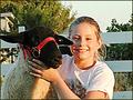
| 06/14/2003 04:19:09 PM |
4-H Projects Newsby sherryk471Comment: The image looks a little blurry and out of focus, probably due to camera shake from being taken handheld. The resolution also seems a little low, suggesting to me that it was possibly taken with a low-end camera. If that is the case then it is usually best to take shots with the highest possible resolution. I do like the light on her face and the side of the sheep, though. Another possible reason for the focus problem could be the dark face of the sheep compared to the bright face of the girl. The composition is good, although maybe a little extra space on the side of the sheep so it doesnt look like his ear is cropped off would have worked good too. |
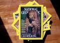
| 06/14/2003 04:06:05 PM |
National Geographicby ashwinComment: I'm not sure this was quite the intent of the challenge. Then again, I suppose I could see something like this on a yearly review maybe. I do like the lighting, though, the shaft of light highlighting the magazines almost feels like reading them is a guilty pleasure and someone has opened a door into a dark room where the view is trying to read them. |
Home -
Challenges -
Community -
League -
Photos -
Cameras -
Lenses -
Learn -
Help -
Terms of Use -
Privacy -
Top ^
DPChallenge, and website content and design, Copyright © 2001-2025 Challenging Technologies, LLC.
All digital photo copyrights belong to the photographers and may not be used without permission.
Current Server Time: 08/04/2025 06:38:35 PM EDT.