| Author | Thread |
Comments Made During the Challenge  |
|
|
06/16/2003 10:44:00 PM |
|
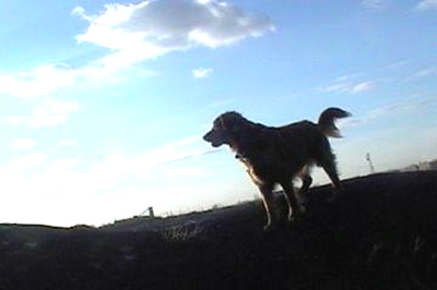
I like the silhouette of the dog in the in the light. The only distraction for me is the focus, which is not quite sharp. |
|
 Photographer found comment helpful. Photographer found comment helpful. |
|
|
06/16/2003 08:51:24 PM |
|
Nice job (and screw the "landscape" comments). 7 |
|
| Photographer found comment helpful. |
|
|
06/16/2003 03:57:20 PM |
|
I like the drama inherent in this photo. The diagonal lines seem to imply action. The dog's sillhouette works for me, though the whole image seems quite blurry. |
|
| Photographer found comment helpful. |
|
|
06/16/2003 01:10:39 AM |
|
I dont like the angle on this shot as the dog's legs gets lost in the dark ground and I also think if you're intent was to get a silouette of the dog, that he/she should be even darker with less detail than what appears in the pic now. That would also help the blown out sky. |
|
| Photographer found comment helpful. |
|
|
06/15/2003 12:17:00 PM |
|
Sky too bright -- dog & land too dark. Doubt that this would be chosen for a cover. |
|
| Photographer found comment helpful. |
|
|
06/14/2003 04:24:19 PM |
|
I like the silhouette and the fact that he is looking toward the light. The odd slant of the horizon is in some ways interesting and in others kinda off-putting, I cant really make up my mind if I like it or not. The image itself is a little small and you could afford to go as big as you can or the rules allow so as to get as much detail in as possible. The right side of the sky is a little over-exposed and blown out, using levels or curves in an editing program may have helped some. With a little tweaking I do see an image like this being on the cover of a dog magazine. |
|
| Photographer found comment helpful. |
|
|
06/14/2003 04:05:10 PM |
|
This shot loses points for looking like it was taken in 2 seconds. I dont think it gives off a professional feel worthy of a mag cover. Colors in the sky are a bit oversatureated... |
|
| Photographer found comment helpful. |
|
|
06/13/2003 05:56:57 PM |
dramatic angle works for this shot, but I'm afraid that the lack of detail in the dog is unappealing. The lower left is really too bright. If you were trying for a silhouette on the dog, there is too much detail for it to work. however, not enough detail to work as a regular shot either. focus also looks a bit soft, which could be because of the harsh lighting.
|
|
| Photographer found comment helpful. |
|
|
06/12/2003 11:19:01 PM |
|
| Photographer found comment helpful. |
|
|
06/12/2003 07:00:02 PM |
|
Pretty sky...but the lighting on the dog isn't very complimentary, the partial silhouette shows a few of the dog's features, so it doesn't work as either a good look of the dog or a good silhouette. The sharpness seems low. Back to the lighting...the sun pretty much washed out the sky in that area. 5 Rob the Swash |
|
| Photographer found comment helpful. |
|
|
06/11/2003 09:45:51 PM |
|
I'm afraid the overall image is just weak and has serious contrast issues. The clouds on the left are quite blown out, while the ground and the dog itself are way too dark. I'll admit that this isn't the easiest kind of scene to get properly exposed... practice makes perfect! :) |
|
| Photographer found comment helpful. |
|
|
06/11/2003 09:24:37 PM |
|
Looks like a great dog (although I think most dogs are great). I think that this image would be greatly improved with better focus and lighting on the subject and the foreground. |
|
| Photographer found comment helpful. |
|
|
06/11/2003 08:36:07 PM |
|
No issue with your basic subject, but the dog is difficult to see due to lighting which would make it less a good candidate for a cover photo. Cropping would be possible with this shot to fit cover format, but colours being as they are might make copy placement difficult. Seems a bit blurry. |
|
| Photographer found comment helpful. |
Home -
Challenges -
Community -
League -
Photos -
Cameras -
Lenses -
Learn -
Help -
Terms of Use -
Privacy -
Top ^
DPChallenge, and website content and design, Copyright © 2001-2026 Challenging Technologies, LLC.
All digital photo copyrights belong to the photographers and may not be used without permission.
Current Server Time: 06/30/2026 03:41:37 AM EDT.