| Image |
Comment |
| 06/20/2005 07:42:20 PM |
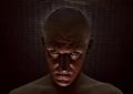
Need a light?by graphicfunkComment: Bet you had fun with this one. :)
Nice fire capture and a horrifying (perhaps you? LOL) devil. Lighting and color work well. The positioning of the head and the way you framed this makes for a nice composition.
The fingers look a little funky but overall this is a good picture. Now, to get someone "lighted", do you have to be physically present and do you take VISA? |
 Photographer found comment helpful. Photographer found comment helpful. |
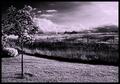
| 06/20/2005 07:36:41 PM |
A Storm Comethby sbeaumontComment: Almost a surrealistic landscape that makes the viewer perk up and take notice. Great tonal range and the composition is made stronger with the placement of the small tree on the left in the foreground. For a lot of fine detail the clarity is pretty good.
The lighting and tree are wonderful but not quite enough to carry the whole composition. The image needs some balencing agent on the right like a giant billowing cloud in the background, a horse or other farm animal in the foreground or an impatient partner looking at their watch and asking, "Honey, aren't you done yet?" LOL
The bright white sign near the center of the image is a distraction in this otherwise fine picture. |
| Photographer found comment helpful. |
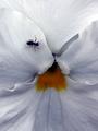
| 06/20/2005 07:28:07 PM |
opening into petit darknessby kenboComment: Nice that you filled the whole frame with your flower macro (pansy is it?). Decent detail in the small detail at the center.
Obviously you will be beat up over submitting a flower to a darkness challenge but you are already know that so should not be surprised.
On the technical side tere are a cople suggestions for improvement. Shallow depth of field (DOF) is always a problem with macro images. The ant is not in very good focus. That is either because the DOF is too shallow or the ant was movign a little during the exposure. It is difficult to tell which it might be but might be a slow shutterspeed. You might have considered another shot without the ant in it.
For a macro the focus is still soft. They are always best with razor sharp focus. The color and/or contrast in this image is weak. Both should be beefed up to give the image more visual impact. There is great detail in the leaves that is crying to be brought out. |
| Photographer found comment helpful. |
| 06/20/2005 05:10:42 PM |
asleep on the jobby BeetleComment: One of the most creative thoughts for this challenge. The image quality is excellent and the use of lighting to highlight what you are trying to imply works very, very well. You have the man brightly lighted yet you can still see very fine detail in the dark areas of the refrigerator.
Very nice job! |
| Photographer found comment helpful. |
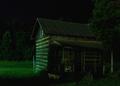
| 06/20/2005 05:08:14 PM |
Country Shadowsby rayg544Comment: The lighting angle on the building is the strength of this image. For low lighting conditions the overall clarity and quality of this image is very good.
Don't know if the greenish lighting color is the result of actual conditions or the effect of post processing but it does not matter. It is effective adds a lot of viewer interest to the image. Even the porch in complete shadow, which normally would be an error, seems to work with this image to give it a surrealist quality that is appealing. |
| Photographer found comment helpful. |
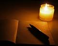
| 06/20/2005 05:03:08 PM |
Lost in thought...by ankit0621Comment: Looks like writer's block to me. Looks like a candle I have on my desk. LOL.
Decently setup image. Content and composition are fine. The blank page opened is a nice touch. Focus is generally good.
It is doubtful viewers will have any problem seeing how it meets the challenge topic.
There are a couple technical issues to consider. Though in color this image really only has one color and because of the nature of this challenge you might want to try B&W to see how that looks. Generally speaking cameras record low light objects with a yellow hue and it doesn't really look all that good even when it is accurate. :)
Focus is centered on the candle which might confuse viewers considering this for a "darkness" challenge. That also gives makes the foreground part of the image out of focus. It could be that way to support your image theme,but generally viewer's do not like out of focus intents in the foreground and vote them lower. You might consider a wider depth of field or centering the focus on the pen to see what that looks like.
The candle flame is also overexposed which usually does not work but seems to be OK in this image. |
| Photographer found comment helpful. |
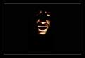
| 06/20/2005 03:52:11 PM |
the darkness withinby aplomb76Comment: This is a very interesting composition. The facial expression is ominous and the lighting has just the right angle and harshness to support your purpose very well. The lighting around the back of the head to keep the head defintion from getting lost in the background is both effective and adds interest to the image. The way you use subtle color is inspired. The hint of red in the face is perfect.
A couple technical items may hold down the score slightly. It appears that the eyes are not level. If this is intentional then you need have the head tilted more to exaggerate the effect and make it plainly visible to viewers. If not then make sure the eyes are absolutely level.
The background netting should be level as well. The two areas where it is pulled upward slightly draws the eyes away from your subject and acts as a distraction.
The minor shadows on the right and left of the subject that show on the background netting will yield a higher score for this image if they were even.
That being said... this is one of the most creative images in this challenge and should do very well. Kudos to you for such a great shot. |
| Photographer found comment helpful. |
| 06/20/2005 03:40:34 PM |
From withinby vlad_lazinComment: This uses a common technique applied in many, many images in this challenge.
It has four technical flaws that will hold down its score.
First, it does not have a true black point. Giving it a black border makes that very obvious even to the casual viewer. That should be corrected. Your black background should be just as black as your border.
Second, the face is not level. When something is close to but not actually level it acts as a distraction to most viewers. That is true in this case. The image should be rotated counterclockwise perhaps as much as two or three degrees. It is vey obvious. If this were done intentionally then you need a stronger angle (more than 15 degrees) to be effective.
Third, the image has a mottled unfocused look that will be interpreted by most voters as a poorer quality image even if it were intentional.
Four, the area below the lower lip is overexposed and will make most voters feel this is a lower quality image and not an intentional artistic statement. |
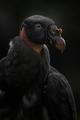
| 06/20/2005 03:32:16 PM |
Enemy Withinby moodvilleComment: Vultures are always great fodder for a darkness theme. Yours is an exceptionally high quality image and should finish high in the scoring. Clarity and technical quality is far, far above average. Composition is excellent.
There will probably be some voters that think you are shoehorning this image into this challenge and it is really an outtake from your birds entry. That would be too bad but some folks surely will think like that. You should not be surprised.
The only minor technical flaw is that it appears to be overly smoothed in the lower chest and lower wing of the bird. This could be from noise reduction being aplied but it is not bad.
|
| Photographer found comment helpful. |
| 06/20/2005 03:25:57 PM |
The Closetby CEJComment: You applied the technique of a solid black background to convey a sense of darkness correctly.
Like many entries this one is very low contrast. In this case it might be better if you applied autocontrast or other color/contrast adjustments to bring out the red, yellow and blue in the mask face. You could still leave some shadow on the ears to relate to the theme, but those colors are just too good to be muted. |
| Photographer found comment helpful. |
Home -
Challenges -
Community -
League -
Photos -
Cameras -
Lenses -
Learn -
Help -
Terms of Use -
Privacy -
Top ^
DPChallenge, and website content and design, Copyright © 2001-2025 Challenging Technologies, LLC.
All digital photo copyrights belong to the photographers and may not be used without permission.
Current Server Time: 08/17/2025 04:59:03 PM EDT.