| Image |
Comment |
| 04/08/2003 08:28:44 PM |
Different colorby DamitrielComment: You have made good use of color in this image and it meets the challenge well. Everything looks nice and sharp and the exposure looks good. I definitely can�t find anything seriously wrong with this photo. Looking at it there was something that wasn�t quite right for me and I couldn�t figure it out. After thinking about it for a while I think that it might be the camera angle. I wonder how this one would look if the camera was closer to the ground. I think this is a good effort but it just doesn�t move me. I gave it a 5.
Greg
|
 Photographer found comment helpful. Photographer found comment helpful. |
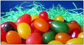
| 04/08/2003 01:11:12 PM |
Wooden Crayolasby PlaceboComment: I think this picture meets the challenge well but it could use a little more work. I think all you really need is some post processing to really make this one pop. I would start with adjusting the color and brightness so that the background isn�t so drab. The whole picture appears to be a bit underexposed and the colors aren�t as bright as they could be. I would suggest upping the contrast about 5 or 10% and upping the saturation 5% or so. You can also play around with setting a white point from the background. Finally I would add a bit of USM to sharpen it up a little more and I think you will have a very good picture here.
As it is now I gave it a 4.
Greg
|
| Photographer found comment helpful. |
| 04/08/2003 12:46:25 PM |
In the laboratoryby eikidigiComment: When I first loaded this picture all I could think was wow. I had to think a while to come up with anything at all to say. It certainly meets the color challenge. To me it almost looks like all those plastic pieces are embedded in pink cake frosting! While I don�t usually like very harsh lighting I think it works here. If you had soft lighting I don�t think you would have gotten those cool bright spots on the surface of the pink material. The pattern of all the plastic pieces pretty much drives my eyes crazy, it is difficult for me to focus on anything. You might go over the picture with a mild USM as some of the edges appear to be soft, I think this might be due to the harsh lighting. You have a cool idea here but it isn�t exactly my cup of tea. I gave it a 5.
Greg
|
| 04/08/2003 12:38:11 PM |
Easter Bunny Droppingsby RuchartComment: I think this is a good subject since Easter is on it�s way. It meets the challenge well but there are a few things that I think keep this from being a really outstanding photo for me. I would like to see a little bit of the �grass� in the foreground that is in sharp focus. Also I think you could stand to have a bit more depth of field here. I know that with macro-type pictures like this DOF can be a really difficult thing to achieve but I am a bit bothered by the grass in the background being so out of focus. The other thing that I think could be improved on is the lighting. The lighting here looks harsh and unnatural to me. I think the picture would look much better if you used soft lighting by putting something in front of your light sources to diffuse the light some. It is amazing what a difference soft lighting can make in a photo like this. The exposure seems to be close but it might be nice to have it maybe 1/3 of a stop or so brighter. You might also decrease the contrast a tad and up the saturation a very small amount. I gave this picture a 4.
Greg
|
| Photographer found comment helpful. |
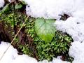
| 04/08/2003 12:30:38 PM |
Spring is tryingby nitro102Comment: I do think this picture meets the challenge well and I like what it says to me, that there is still green underneath the snow. However, I find the subject not to be the most interesting one I have seen this week. The brown twig crossing the left side of the frame is distracting for me and there isn�t really enough here to hold my attention for very long. The exposure and depth of field look good here but the focus looks a bit soft. Maybe just a little bit of USM would sharpen it up nicely. I think it is a good idea, but it needs a little something more. I gave it a 5.
Greg
|
| Photographer found comment helpful. |
| 04/08/2003 12:18:05 PM |
Valentine's Day Stockby mcraelComment: This photo shows effective use of color and is very appropriate for the challenge this week. The composition is not bad, but possibly could be made to be more interesting. Something about the bright area in the center of the top of the picture doesn�t work for me. I am not sure if it is just too bright or if it has to do with the lines of the leaves in that region of the image. The other thing that I might change if it were my photo is the lighting. The light appears to be a tad harsh, especially on the lid of the candy box. The specular on the front edge of the box it a bit much for my taste. I also don�t like the way the glittery flecks in the paper of the box are reflecting so much light. I think this picture would have looked very nice using available or natural light. You might be able to construct some simple diffusers for your light sources to improve this as well. I think this is a good effort and I gave it a 5.
Greg
|
| Photographer found comment helpful. |
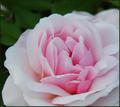
| 04/08/2003 12:10:10 PM |
Louise's Roseby sherComment: I like the color and composition of this photo but the first thing that caught my eye was that light spot on the top left corner of the image. The DOF looks to be well done and the lighting is nice and soft giving an overall soft �feel� to the petals. This is a fairly common subject in the DPC challenges so a winning rose picture must be very exceptional. After all I think we have all seen some stunning rose photos which makes it more difficult to score well with this subject. I think you have done a good job with this one and aside from that bright spot I don�t see anything that I would change. Good work, I gave it a 5.
Greg
|
| Photographer found comment helpful. |
| 04/08/2003 12:04:21 PM |
Sister Locksby lauraedwComment: I like the composition here a lot. The hair color works very well with the blue background making this a very effective entry for the color challenge. The exposure looks good and everything appears to be in sharp focus. There looks to be a bit of a hot spot on the top lady�s forehead but this is a very minor issue. Overall I think this is a good picture and I think it will do well this week. I gave it a 6.
Greg
|
| Photographer found comment helpful. |
| 04/08/2003 11:42:39 AM |
velocità itilianby cq107Comment: I like your choice of subject for this photo and I think color is definitely the primary element here. I do, however, think that the composition isnâ��t as strong as it could be. I find myself wondering why you cropped this picture the way you did. It shows too much to be an abstract but it leaves me wanting to see more as a picture of a car. I would either crop it a lot tighter or show a lot more if it were my picture. The other things might use a little work are the hot-spots and focus. Overall the picture appears to be somewhat soft, maybe a little USM might fix this. The hot-spots on the car take away from the picture for me, I know they are difficult to avoid but you might be able to get rid of them by slightly underexposing and then lightening the picture up in post processing. Also if a flash was used it might help to try ambient light, though this doesnâ��t always solve the problem. I gave this one a 4.
Greg
|
| Photographer found comment helpful. |
| 04/08/2003 11:02:28 AM |
Bunchby BukiosComment: I like this picture, the composition is very nice and I really like your use of depth of field. It would be nice if all of the tips of the pencils were in sharp focus but it is not really a big issue for me. Just from playing around with the picture on my screen I think it might be a little better if you cropped some of the negative space away from the bottom of the picture and added more to the top. The only other thing that I would suggest would be to adjust the color some. It might just be my screen but there seems to be a slight red cast to the wood in the pencils. Maybe they were actually like that. I gave this one a 6.
Greg
|
| Photographer found comment helpful. |
Home -
Challenges -
Community -
League -
Photos -
Cameras -
Lenses -
Learn -
Help -
Terms of Use -
Privacy -
Top ^
DPChallenge, and website content and design, Copyright © 2001-2025 Challenging Technologies, LLC.
All digital photo copyrights belong to the photographers and may not be used without permission.
Current Server Time: 08/21/2025 01:11:45 AM EDT.