| Author | Thread |
Comments Made During the Challenge  |
|
|
04/12/2003 07:53:57 PM |
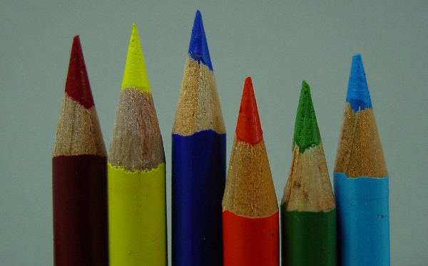
Very in focus, sharp and direct! The crop could be tighter though. Nice shot.
|
|
 Photographer found comment helpful. Photographer found comment helpful. |
|
|
04/12/2003 02:22:09 PM |
|
Nice crisp photo... but would be heaps better with some lighting... |
|
| Photographer found comment helpful. |
|
|
04/12/2003 02:11:58 PM |
IMHO a white background would have donde better.
|
|
| Photographer found comment helpful. |
|
|
04/11/2003 12:56:42 AM |
|
very nice. glad you didn't step from in size order. nice touch. |
|
| Photographer found comment helpful. |
|
|
04/10/2003 04:07:44 PM |
|
looks a bit grey, needs come more contrast. Nice idea. |
|
| Photographer found comment helpful. |
|
|
04/10/2003 10:35:47 AM |
|
| Photographer found comment helpful. |
|
|
04/10/2003 02:30:26 AM |
|
This shot looks like it needs some better lighting. In my opinion, it is essential that this background comes out as a crisp white, so taht the colors contrast effectively with the white. Using a solid white background and a more powerful light would increase the impact of the colors in this shot by a lot. Some post-processing to brighten and increase contrast could help as well, but the adjustments would be more effective if they were made in the process of shooting. |
|
| Photographer found comment helpful. |
|
|
04/09/2003 09:58:41 PM |
|
a familiar idea, and you've managed to capture a lot of detail of the pencils, but the picture could use a greater exposure to really brighten up the colours! |
|
| Photographer found comment helpful. |
|
|
04/09/2003 11:13:20 AM |
|
Nice idea. Needs better contrast. |
|
| Photographer found comment helpful. |
|
|
04/09/2003 03:27:14 AM |
|
| Photographer found comment helpful. |
|
|
04/08/2003 09:57:31 PM |
|
I think you could expose it a little more. Maybe some levels adjustments in photoshop would enhance this picture greatly. |
|
| Photographer found comment helpful. |
|
|
04/08/2003 02:09:50 PM |
|
| Photographer found comment helpful. |
|
|
04/08/2003 01:11:12 PM |
I think this picture meets the challenge well but it could use a little more work. I think all you really need is some post processing to really make this one pop. I would start with adjusting the color and brightness so that the background isn’t so drab. The whole picture appears to be a bit underexposed and the colors aren’t as bright as they could be. I would suggest upping the contrast about 5 or 10% and upping the saturation 5% or so. You can also play around with setting a white point from the background. Finally I would add a bit of USM to sharpen it up a little more and I think you will have a very good picture here.
As it is now I gave it a 4.
Greg
|
|
| Photographer found comment helpful. |
|
|
04/08/2003 09:59:13 AM |
|
A good idea but the lighting lets this down - it is very flat and the white(?) background has been underexposed so much to come out grey. This would be a good use of the exposure compensation features of your camera if it has any. |
|
| Photographer found comment helpful. |
|
|
04/07/2003 07:51:51 PM |
|
Little dark but interesting |
|
| Photographer found comment helpful. |
|
|
04/07/2003 05:52:32 PM |
|
A little under exposed I think, and try using Levels to correct the colors. |
|
| Photographer found comment helpful. |
|
|
04/07/2003 05:06:35 PM |
|
Subject needed more light. (Check your monitor calibration maybe?) |
|
| Photographer found comment helpful. |
|
|
04/07/2003 04:46:17 PM |
|
A little too dark. Saturation could have been increased a little. |
|
| Photographer found comment helpful. |
|
|
04/07/2003 04:17:34 PM |
|
Should be a little brighter. May have looked better with a different color (darker) background. |
|
| Photographer found comment helpful. |
|
|
04/07/2003 10:15:45 AM |
|
| Photographer found comment helpful. |
|
|
04/07/2003 06:36:44 AM |
|
This could probably have done with being brightened a little. |
|
| Photographer found comment helpful. |
|
|
04/07/2003 04:11:55 AM |
|
There is no white balance in this shot. Why? |
|
| Photographer found comment helpful. |
|
|
04/07/2003 01:26:00 AM |
|
why are the colors so dull and dark? great focus, but the lighting and saturation really are below the potential this photo had . . . |
|
| Photographer found comment helpful. |
Home -
Challenges -
Community -
League -
Photos -
Cameras -
Lenses -
Learn -
Help -
Terms of Use -
Privacy -
Top ^
DPChallenge, and website content and design, Copyright © 2001-2026 Challenging Technologies, LLC.
All digital photo copyrights belong to the photographers and may not be used without permission.
Current Server Time: 06/28/2026 11:21:46 PM EDT.