| Author | Thread |
|
|
04/18/2003 06:09:51 PM |
Greetings from the Critique Club!
I concur with all of the compliments below!
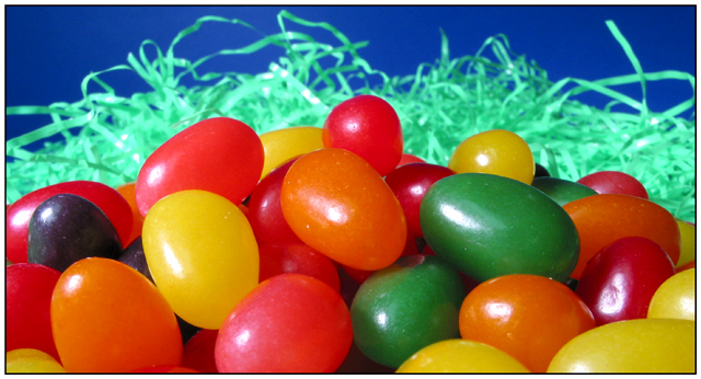
This is a fun image, made even more enjoyable with your clever title. What strikes me most is the point of view, right in front of the jelly beans, which gives us an up close and personal look at them. the grass and background help to enhance the colors and texture of the candies.
The point of view is original and gives a feeling as if we are peeking in at these jelly beans, or studying them extra carefully.
The title is clever, but the image can only go so far to connect with and communicate it. A few technical things might enhance your image and how it fits with the title. First, it looks like your focus is just a tad off, giving the jelly beans a spurious sharpness. The depth of field is great, and the grass and blue background do much in giving this image its pizzazz.
The lighting seems a bit harsh, even if the intention was for these candies to look as if they were in the sun. More interesting light might really enhance the feel and mood of this photo, though the current lighting is very nice for bringing out the bright colors.
This is an engaging image that I really enjoy. I hope you keep up the good work!
David |
|
Comments Made During the Challenge  |
|
|
04/13/2003 11:57:34 PM |
|
|
|
04/13/2003 02:49:39 PM |
|
|
|
04/11/2003 12:48:26 PM |
|
My original vote on this shot was high. My second round of looks dropped it way down. Now it's back somewhere in the middle ... I just can't decide if I like this composition, etc... The reflections are a bit distracting - why not bounce the light instead of direct? Did you want that effect? |
|
 Photographer found comment helpful. Photographer found comment helpful. |
|
|
04/11/2003 12:26:09 PM |
|
Picture appears dark and doesn't bring the colors out very well. Otherwise, this would have been a great shot. |
|
|
|
04/10/2003 07:40:40 PM |
|
These jelly beans look good enough to eat...love the brilliant colors! |
|
|
|
04/10/2003 04:40:28 PM |
|
|
|
04/09/2003 06:25:28 PM |
|
|
|
04/09/2003 11:21:52 AM |
|
|
|
04/09/2003 10:55:56 AM |
|
Mmm I love these, I could eat them all day. You have a nice colorful pile here, looks good. The lighting is a little harsh on the surfaces but not blown out at all so it isn't that bad, I like it. |
|
| Photographer found comment helpful. |
|
|
04/08/2003 11:27:51 PM |
|
Nice idea, good color, lighting seems okay, focus is okay, good idea for the challenge too. |
|
| Photographer found comment helpful. |
|
|
04/08/2003 10:16:30 PM |
|
I like the diffrent levels if color |
|
|
|
04/08/2003 06:37:40 PM |
|
| Photographer found comment helpful. |
|
|
04/08/2003 01:33:45 PM |
|
|
|
04/08/2003 12:38:11 PM |
I think this is a good subject since Easter is on it’s way. It meets the challenge well but there are a few things that I think keep this from being a really outstanding photo for me. I would like to see a little bit of the “grass” in the foreground that is in sharp focus. Also I think you could stand to have a bit more depth of field here. I know that with macro-type pictures like this DOF can be a really difficult thing to achieve but I am a bit bothered by the grass in the background being so out of focus. The other thing that I think could be improved on is the lighting. The lighting here looks harsh and unnatural to me. I think the picture would look much better if you used soft lighting by putting something in front of your light sources to diffuse the light some. It is amazing what a difference soft lighting can make in a photo like this. The exposure seems to be close but it might be nice to have it maybe 1/3 of a stop or so brighter. You might also decrease the contrast a tad and up the saturation a very small amount. I gave this picture a 4.
Greg
|
|
| Photographer found comment helpful. |
|
|
04/08/2003 12:48:47 AM |
|
Not an original idea, but it is the way you do it that sets this image above the others. The deep blue far-background is a great choice. Nice touch to exclude anything blue prominent in the foreground. |
|
| Photographer found comment helpful. |
|
|
04/07/2003 05:37:32 PM |
|
|
|
04/07/2003 10:38:08 AM |
|
Light is bit strong, but pretty and I love the title..lol |
|
| Photographer found comment helpful. |
Home -
Challenges -
Community -
League -
Photos -
Cameras -
Lenses -
Learn -
Help -
Terms of Use -
Privacy -
Top ^
DPChallenge, and website content and design, Copyright © 2001-2026 Challenging Technologies, LLC.
All digital photo copyrights belong to the photographers and may not be used without permission.
Current Server Time: 06/28/2026 08:41:15 PM EDT.