|
|
|
Showing 911 - 920 of ~1142 |
| Image |
Comment |
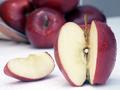
| 01/06/2003 02:58:29 PM | $1.29 lb.....WOW!by OnieComment: I didn't get this when I saw it as a thumbnail... now looking at it, I see the diamond in the.. apple... hehehehe? GREAT idea, very appropriate for the challenge, and I love the title. The picture isn't maybe as appealing as it could be, I don't care for the white bottom or the lighting but it's a great idea, and I love your use of DOF. Nice job... -7- |
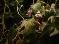
| 01/06/2003 02:54:21 PM | Stranger In A Strange Landby BadPiggComment: Not sure what I'm supposed to be looking at here which is bothersome, also the lighting could have been much better. To me this photo is not appealing composition wise, or anything else. There are a few major problems here, I'm just trying to let you know for next time. First of all the lines lead your eyes everywhere but to your subject, must of them lead right off the page. Also it looks like you attempted to light the subject, to draw attention to it, but everything else detracts from it. The cropping is not overall appealing here, and I don't care for the colors either. I would have suggested using possibly a bright colored subject to go where that brown thing is, because he is too dull against the background. My eyes are drawn more to the pink birdhourse and pink thing above it, and the bright colored snake then anything else. I don't think you achieved what you were going for which is a shame cause it might have been very interesting. A different angle might have helped, but I'm not sure what other suggestions to make. I hope this short critique helps... |
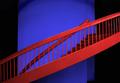
| 01/06/2003 02:19:24 AM | Lead Me Upstairs -- David Grayby Dallas_TXComment: I think this would have fit the title better if you had a women leading a guy up the stairs. Just a personal though. great picture though, I live the direction lines, and the colors. Great job. But I just don't know if it fits the challenge.... oh well... I'm giving it an 8 anyway :-) |
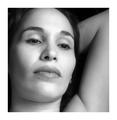
| 01/03/2003 04:12:11 PM | sea of loveby lmhrComment: I don't think the border suits the photo, it is too brash for this beautiful soft looking woman. Gorgeous ligthing, and great focus, nice subject, and lovely cropping. Great use of contrast and black and white, she almost looks like a porcelin doll! Beautiful job. At first I put this at 9 because of the border, but I think I'm going to overlook the border, and base it off the picture, which to me is a good 10. Congrats! and good luck! |
| 01/03/2003 04:08:19 PM | A Dogs Lifeby togtogComment: At first I didn't get it, I thought you were making a comment on the guy. Now I do :-) it's a dog's point of view, which is interesting. However the photo itself is not extremely attractive to me. The contrast is the firs thing that gets me, as everything looks pretty much the same grey. Also this angle is not particularly flattering. I would have suggested cropping more off the left side, maybe to the other side of the far doorway? |  Photographer found comment helpful. Photographer found comment helpful. |
| 01/03/2003 04:04:38 PM | Me, Myself and Iby byetkoComment: I think the border you added detracts from the photo. The lighting seems much too harsh on the right side of your face. Would have liked to have seen the whole ear, and your head, maybe ending with more white background might have been neat. Good job on having a solid background. I'm not sure if I care for the contrast on this photo or not. Your hair helps. Love the way you have even the tips of the hair in the picture. | | Photographer found comment helpful. |
| 01/03/2003 04:00:32 PM | michaelby SatelliteSpeckComment: Excellent use of black and white here. Very interesting cropping, I think it works pretty well. Excellent detail and lighting, except that you lose just a bit due to shadows on the ear. Otherwise a very nice overall portrait. Nice job. | | Photographer found comment helpful. |
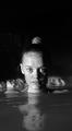
| 01/03/2003 03:57:45 PM | The Blue Lagoonby arnitComment: Very cool and imaginative... her eyes are really intense looking! I love the shadows you used here. I think I would have liked a little less black space at the top, and it would have been nice to see her entire reflection possibly... originally had you at a 7, now I'm putting you at an 8. Great job! |
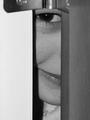
| 01/03/2003 03:54:51 PM | Eye See You!by timj351Comment: Great use of contrast here! Really a very striking picture! I love the placement of the lips and the eye. Only thing that bothers me is the very bottom between the two posts... Not sure whats there... but it detracts slightly from the photo... Still a solid 9! Nice job. |
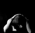
| 12/30/2002 06:40:50 PM | Pressure (A Self Portrait)by tbarnbyComment: Great idea! Love the fact you used a solid black background on this photo, however the lighting leaves something to be desired for this photo. the left side is extremely bright, and the right is very dark, which might have worked if you were shooting from a different angle, but for this one, I don't think it worked. The detail you can see in your hair on the left side is terrific but the details on your right arm are totally lost due to the lighting. Love the way you can just see one nipple though, which is kind of teasing. Nice to see some male nudity of a good looking guy, instead of always having female nudes on here ;-) I think I would have tried to leave a little room at the bottom with some black, and maybe a little less at the top. Also I think this would have been better if you had made him parallel to the bottom, with your left elbow not just slightly being cut off. Good luck! |
|
Showing 911 - 920 of ~1142 |
Home -
Challenges -
Community -
League -
Photos -
Cameras -
Lenses -
Learn -
Help -
Terms of Use -
Privacy -
Top ^
DPChallenge, and website content and design, Copyright © 2001-2025 Challenging Technologies, LLC.
All digital photo copyrights belong to the photographers and may not be used without permission.
Current Server Time: 08/26/2025 12:27:48 PM EDT.
|