| Author | Thread |
|
|
01/13/2003 11:55:32 PM |
|
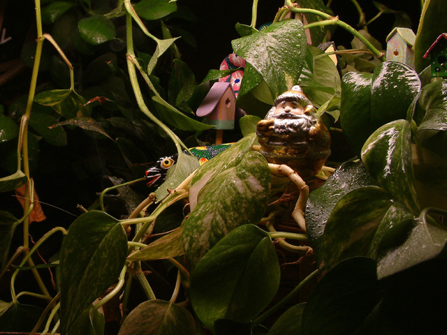
My first thoughts on this are that it seems too dark and it has good focus. The lighting seems a bit harsh in the center while the outer edges are too dark. That does help lead the eye to the center, but once I get there I have a hard time making out anything. There are too many little things competing for attention. I think it would work better to have one brightly colored object to contrast with all the foliage. Perhaps a little red sailboat or fish or something else that would seem totally out of place. I would also even out the lighting and diffuse it to avoid the glare on the water droplets. Placement of the (is it santa?) is good in the frame. This was a tough challenge! |
|
 Photographer found comment helpful. Photographer found comment helpful. |
Comments Made During the Challenge  |
|
|
01/10/2003 05:37:27 PM |
|
A lot of thought went into this one and it paid off. This is a really neat photo. It's a cutsey rather than a "wow" but I really like it. Nice humor and I needed that. I'd give you an 8 just for the lift it gave me. PTL |
|
| Photographer found comment helpful. |
|
|
01/10/2003 01:52:58 PM |
|
This complies very well with the challenge and is technically well executed. The focus is quite good. IMHO the composition is overcrowded, and the abundance of elements becomes too distracting. There are at least 6 of them in focus, not counting the complicated foliage background, and I think 2 would have been more than enough. |
|
| Photographer found comment helpful. |
|
|
01/09/2003 09:55:59 PM |
|
nice lighting... focus on the man could be sharper though... and I would like to see more of the yellow eyed figure in back |
|
| Photographer found comment helpful. |
|
|
01/07/2003 08:43:06 PM |
|
|
|
01/07/2003 04:13:23 PM |
|
very nice work! I like the soft lighting and the mysterious feel of this shot... good work :) - setzler |
|
| Photographer found comment helpful. |
|
|
01/07/2003 10:21:34 AM |
|
creepy for some reason, but also cool..... |
|
|
|
01/07/2003 09:50:07 AM |
|
light used gives a deep forest feel to this shot and the crop accentuates the feeling...good job. |
|
| Photographer found comment helpful. |
|
|
01/06/2003 07:06:30 PM |
|
O.K. I see the silly figurines in and amongst the Wandering Jew, but that seems fairly "normal" to me. (Yes, I'm strange!!!) Overall, a bit dark, but the elf doesn't look like he could stand it any brighter. 6 Swash |
|
| Photographer found comment helpful. |
|
|
01/06/2003 02:54:21 PM |
|
Not sure what I'm supposed to be looking at here which is bothersome, also the lighting could have been much better. To me this photo is not appealing composition wise, or anything else. There are a few major problems here, I'm just trying to let you know for next time. First of all the lines lead your eyes everywhere but to your subject, must of them lead right off the page. Also it looks like you attempted to light the subject, to draw attention to it, but everything else detracts from it. The cropping is not overall appealing here, and I don't care for the colors either. I would have suggested using possibly a bright colored subject to go where that brown thing is, because he is too dull against the background. My eyes are drawn more to the pink birdhourse and pink thing above it, and the bright colored snake then anything else. I don't think you achieved what you were going for which is a shame cause it might have been very interesting. A different angle might have helped, but I'm not sure what other suggestions to make. I hope this short critique helps... |
|
|
|
01/06/2003 12:34:35 AM |
|
I like the lighting and the clarity in this photo. |
|
| Photographer found comment helpful. |
Home -
Challenges -
Community -
League -
Photos -
Cameras -
Lenses -
Learn -
Help -
Terms of Use -
Privacy -
Top ^
DPChallenge, and website content and design, Copyright © 2001-2026 Challenging Technologies, LLC.
All digital photo copyrights belong to the photographers and may not be used without permission.
Current Server Time: 06/29/2026 05:25:20 AM EDT.