| Image |
Comment |
| 06/15/2003 10:38:11 PM |
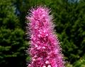
Lawn and Garden Magazineby DianaComment: Personally I do not consider magazines to be in a horizontal shape... thats just me though. This photo is soooo centered... it really isn't very attractive that way. It's a nice macro though... You definitely could have easily cropped this to a vertical, and satiated the voters that way as well.
|
 Photographer found comment helpful. Photographer found comment helpful. |
| 06/15/2003 10:32:50 PM |
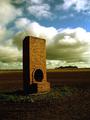
Rural Australiaby Girl from OZComment: G'day!! This is great. Very pretty scene, lovely sky, absolutely beautiful. What is that thing? I love Australia! I spent 6 months there on exchange my Junior year in highschool, it rocked! I think moving a little bit, and putting the main part not so in the middle might have helped but it's not imperitive. I really like this shot, so I've decided to award it my third -10- of the challenge! Congrats and good luck! |
| Photographer found comment helpful. |
| 06/15/2003 10:23:49 PM |
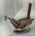
Bird Watcher's Digestby TerryGeeComment: WOW! This is a totally awesome photo! Really well done. I would have liked to have seen it a little more vertical leaving room for some type but in this case it's not too important. Fabulous catch here... that bird is going to have a tasty treat. Do you know what kind of bird it is? Whats really cool about this photo is that there are no distracting background elements... you managed to get it on a very plain and simple background which is awesome! How close were you to this little guy? Congrats on a great photo, I'm giving you my second -10- for the challenge! Good luck! |
| Photographer found comment helpful. |
| 06/15/2003 08:01:19 PM |
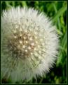
The Gardenerby JonatanComment: This is a great photo of a dandelion... but something makes me question whether a gardener would want to have this particular plant in their garden. This is a weed, and although we often think it's pretty or interesting... it is still a weed. I guess I'm questioning whether a magazine called the gardener would ever want to have a weed on the front cover, especially one that so easily spreads the seeds for more weeds. It is a cool photo though. |
| Photographer found comment helpful. |
| 06/15/2003 07:59:20 PM |
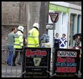
The Big Issueby agwrightComment: Wow there is a lot going on in this photo... it makes me want to know what is happening and what the heck is Berties. It's very square, I think it might have been nice to give it a little more room at the top to allow for type, and also to make it more vertical and magazine like. All I can say is this is really interesting... can't say more, since I have no clue what is happening. LOL |
| Photographer found comment helpful. |
| 06/15/2003 07:57:01 PM |
Sailing Magazineby alanfreedComment: Very bright, colorful boat, the kind I'm sure they'd like to have on the front of their magazine. This is a nice photo... I think I might have liked it if you had zoomed in a little more, putting type over the top of the sail wouldn't have been a problem, and since the main part of the photo is the boat and not the surroundings it just might have made it more interesting. |
| Photographer found comment helpful. |
| 06/15/2003 07:50:06 PM |
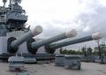
AARPby d95vetteComment: Personally I do not consider magazines to be in a horizontal shape... thats just me though. Not sure how this relates to AARP, but then again I don't read the magazine. This is an interesting shot... is it some kind of a battle ship or something and are those canons? Very interesting. This might have looked cool in black and white too.
|
| 06/15/2003 07:47:26 PM |
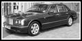
Top Gearby trishComment: Personally I do not consider magazines to be in a horizontal shape... thats just me though. Nice car... and I like the angle you shot it at... not straight on from the front or the side, which is nice. Some of the glare and the background kind of bothers me. Why did you choose to put this picture in black and white? Just curious. I think that the border was uncalled for, most magazines don't have borders.
|
| 06/15/2003 07:44:10 PM |
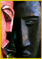
National Geographicby magnetic9999Comment: Nicely done. I could definitely see this as the cover of National Geographic. :-) I think I would have liked it with a more solid background if possible. Whatever is behind it, seems kind of distracting to me... not horribly though. I kind of like the bright spot behind the one masks eye. The yellow for NG looks a little off but it's not a big deal. The lighting here is pretty good. Overall this is a solid photo... I'd like it better with a little less of a distracting background but it's still an 8 from me :-). Good luck! |
| Photographer found comment helpful. |
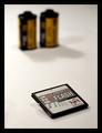
| 06/15/2003 04:00:55 PM |
Photoworld Magazine: Is digital taking over?by auiComment: I like the way you propped up the CF card... I think it looks a lot better that way than just lying flat. I'm not sure I care for the way that the film canisters are soo far back in the photo... I guess there is a little too much empty space for my taste. I also have to wonder why you picked to put them so far back, that I'm not sure where the type would go. This is a nice photo, but I think it could be improved for a magazine cover. Thats just me though. |
| Photographer found comment helpful. |
Home -
Challenges -
Community -
League -
Photos -
Cameras -
Lenses -
Learn -
Help -
Terms of Use -
Privacy -
Top ^
DPChallenge, and website content and design, Copyright © 2001-2025 Challenging Technologies, LLC.
All digital photo copyrights belong to the photographers and may not be used without permission.
Current Server Time: 08/24/2025 05:01:08 PM EDT.