| Author | Thread |
|
|
07/18/2006 10:12:57 AM |
|
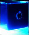
Love the concept. I don't quite get the sense of the digital taking over. The title gives me the sense of something stronger. The photo feels like “digital in the forefront.” Still made me shed a tear for film though. |
|
Comments Made During the Challenge  |
|
|
06/17/2003 11:26:20 AM |
|
|
|
06/17/2003 11:17:29 AM |
|
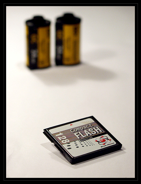
Very Good: the images are simple and convey a "message." The only draw back is the position of the objects: they need to be in lower right of image to leave room for magazine title at top and article list in side bar at left. |
|
 Photographer found comment helpful. Photographer found comment helpful. |
|
|
06/17/2003 09:55:20 AM |
|
nice use of shadows, and nice clean composition. good work. |
|
| Photographer found comment helpful. |
|
|
06/17/2003 07:57:00 AM |
|
Great idea, excellent use of DOF to actually add to the meaning and good use of white space. 8 |
|
| Photographer found comment helpful. |
|
|
06/17/2003 07:19:33 AM |
|
Excellent, I would like to see the film case a bit closer, too much white space between subjects. I like the concept and the lack of clutter very much. |
|
| Photographer found comment helpful. |
|
|
06/16/2003 03:10:05 PM |
|
great DOF, I wish there was a little more colour going on though, or maybe its just the heaviness of the border, which I think really takes it away from what ought to be an a magazine cover. |
|
| Photographer found comment helpful. |
|
|
06/16/2003 08:00:25 AM |
|
Very imaginative studio shot. DOF is perfect. Great lighting. 10 |
|
| Photographer found comment helpful. |
|
|
06/15/2003 06:25:31 PM |
|
Awesome. Very crisp and photo-journalistic. |
|
| Photographer found comment helpful. |
|
|
06/15/2003 04:00:55 PM |
|
I like the way you propped up the CF card... I think it looks a lot better that way than just lying flat. I'm not sure I care for the way that the film canisters are soo far back in the photo... I guess there is a little too much empty space for my taste. I also have to wonder why you picked to put them so far back, that I'm not sure where the type would go. This is a nice photo, but I think it could be improved for a magazine cover. Thats just me though. |
|
| Photographer found comment helpful. |
|
|
06/15/2003 04:00:30 PM |
|
I think, though the message is obvious here, it's not stated in a very aesthetically pleasing way. Too much empty space. |
|
| Photographer found comment helpful. |
|
|
06/14/2003 06:37:48 AM |
|
Your idea is great. What could be improved is the focus on the films in the back. I think your DOF is just a little too shallow. |
|
| Photographer found comment helpful. |
|
|
06/13/2003 08:46:02 PM |
|
Great idea. I think you could've really got a little more creative and got some more color involved. The concept is very very good. It's not a bad photo, but it needs a little more bite |
|
| Photographer found comment helpful. |
|
|
06/13/2003 06:10:42 PM |
|
Simple but effective - an 8 for the idea for me |
|
| Photographer found comment helpful. |
|
|
06/13/2003 04:29:27 PM |
|
Good idea. Good cropping for magazine. Lighting could be a little better. |
|
| Photographer found comment helpful. |
|
|
06/13/2003 02:41:07 AM |
|
good use of rule of thirds. and having ONLY the subject in focus, instead of the entire image. I can tell you know a bit about photography. Good compostion as well. |
|
| Photographer found comment helpful. |
|
|
06/13/2003 12:57:23 AM |
|
Good idea. I think there's too much space between the CF card and the film for a mag. cover.... The CF card should be even MORE dominant then it is, and the film rolls a little less blurry. |
|
| Photographer found comment helpful. |
|
|
06/12/2003 11:45:05 PM |
|
*laughs* A lovely choice of subject for a digital photo challenge. I like the way you balance the photo, and also the tight focus that makes the film look blurred, 'phasing out' in more than one sense. Good one! |
|
| Photographer found comment helpful. |
|
|
06/12/2003 04:33:24 PM |
|
I'm surprised we didn't see more photography covers in this challenge. Nicely composed and choice of subject matter. |
|
| Photographer found comment helpful. |
|
|
06/12/2003 10:04:58 AM |
|
Good subjet, well done. Maybe too "minimalistic" for a magazine cover, but i like it so. |
|
| Photographer found comment helpful. |
|
|
06/11/2003 05:37:31 PM |
|
great photo and idea ... except i don't really care for the border. |
|
| Photographer found comment helpful. |
|
|
06/11/2003 01:27:06 PM |
|
Great concept, but to work as a magazine cover, you might have to rethink your placement of the rolls of film in proximity to the disk. I know it may seem like I'm being too picky, but when I look at the shot, the first thing I'm thinking of is "would this work as a magazine cover?" Once you add the words that appear on any magazine cover, it might not work as it is. However, I do like the shot a lot, especially since you created something that fits neatly into your article title. |
|
| Photographer found comment helpful. |
|
|
06/11/2003 01:23:45 PM |
|
10. Great shot, conveys a message as well as being technically well done and visually appealing. Congrats! |
|
| Photographer found comment helpful. |
|
|
06/11/2003 12:05:46 PM |
|
Good pic. clear, simple but with message.. =) |
|
| Photographer found comment helpful. |
|
|
06/11/2003 10:44:20 AM |
|
nice compostion and idea. maybe you should try to correct white more IMO. |
|
| Photographer found comment helpful. |
|
|
06/11/2003 04:33:09 AM |
|
while i understand the DOF creates a very good effect in this shot, i feel it would be much nicer if the films and the CF card are nearer, or at least looks near in the photo. 6 |
|
| Photographer found comment helpful. |
Home -
Challenges -
Community -
League -
Photos -
Cameras -
Lenses -
Learn -
Help -
Terms of Use -
Privacy -
Top ^
DPChallenge, and website content and design, Copyright © 2001-2026 Challenging Technologies, LLC.
All digital photo copyrights belong to the photographers and may not be used without permission.
Current Server Time: 06/28/2026 09:04:10 PM EDT.