| Author | Thread |
Comments Made During the Challenge  |
|
|
06/17/2003 06:00:37 PM |
|
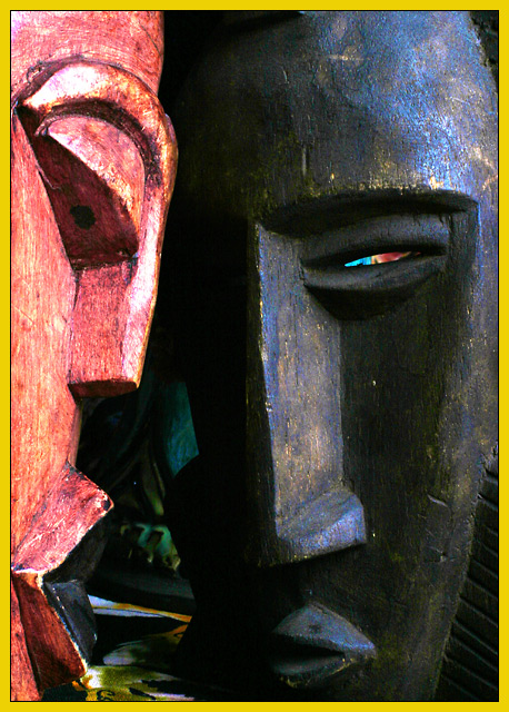
Finally! A National Geographic entry that actually LOOKS like a National Geographic cover. Great job. The color showing up behind the right eye is a little distrating but overall this is one of the better pictures for this challenge. |
|
 Photographer found comment helpful. Photographer found comment helpful. |
|
|
06/17/2003 01:44:19 PM |
|
I like this. Seems as if extraneous color (inbetween the faces and in the eye of the black) could have been minimized the photo might have worked better, just the red and black masks. |
|
| Photographer found comment helpful. |
|
|
06/17/2003 10:46:48 AM |
|
Interesting - modern and yet the art is primitive in style. Nice bright highlight through the eye. 8 |
|
| Photographer found comment helpful. |
|
|
06/16/2003 03:39:46 PM |
|
Yes. This really could be on Nat'l Geographic. Lighting, clarity and composition really work here. I want to read this article! 10 |
|
| Photographer found comment helpful. |
|
|
06/15/2003 07:44:10 PM |
|
Nicely done. I could definitely see this as the cover of National Geographic. :-) I think I would have liked it with a more solid background if possible. Whatever is behind it, seems kind of distracting to me... not horribly though. I kind of like the bright spot behind the one masks eye. The yellow for NG looks a little off but it's not a big deal. The lighting here is pretty good. Overall this is a solid photo... I'd like it better with a little less of a distracting background but it's still an 8 from me :-). Good luck! |
|
| Photographer found comment helpful. |
|
|
06/15/2003 06:37:15 PM |
|
Now THIS I like. I would hang these masks on my own wall. These rock. |
|
| Photographer found comment helpful. |
|
|
06/13/2003 09:32:50 PM |
|
great photo! i love the shadows and light and the crop is perfect! that littls bit of color behind the eye of the mask really sets the tone for the pic...it looks wicked! definitely a Nat. Geo. cover...well done! |
|
| Photographer found comment helpful. |
|
|
06/13/2003 08:38:01 PM |
|
The border is a little off in terms of color. The picture is right on. great work |
|
| Photographer found comment helpful. |
|
|
06/13/2003 04:51:03 PM |
|
I'll give you that. I can see that on the cover. Cool. |
|
| Photographer found comment helpful. |
|
|
06/13/2003 07:55:24 AM |
Can almost see this as a Nat. Geo cover.
Nice shot. |
|
| Photographer found comment helpful. |
|
|
06/13/2003 12:55:16 AM |
|
OK finally, this looks like a magazine. Great job. 9. You are the winner so far. :) |
|
| Photographer found comment helpful. |
|
|
06/12/2003 05:02:04 PM |
|
The eye disturbs me, else I would have rated it 9 or 10 |
|
|
|
06/12/2003 09:53:25 AM |
Probably one of the best covers for "national geo" in this challenge, in my opinion.
What is in (or comes out) the eye of the black mask?
Well Done |
|
| Photographer found comment helpful. |
|
|
06/12/2003 12:19:53 AM |
This looks just like NG...good job...
JB |
|
| Photographer found comment helpful. |
|
|
06/11/2003 06:00:14 PM |
|
nice art like this one the one eye is a little distracting |
|
| Photographer found comment helpful. |
|
|
06/11/2003 05:56:16 PM |
First thing that struck me was how bright the left face is, which would make it harder to place copy across it (though not impossible); a different crop or angle might have helped with this.
As far as the magazine goes, I could see this on the cover, yes. It's interesting and ethnic-feeling.
LIghting at the top seems slightly bright. |
|
| Photographer found comment helpful. |
|
|
06/11/2003 04:42:10 PM |
|
| Photographer found comment helpful. |
|
|
06/11/2003 12:21:11 PM |
|
Interesting shot, but the border ruins it, IMHO. I like the juxtaposition of the masks. Good composition. |
|
| Photographer found comment helpful. |
|
|
06/11/2003 03:24:19 AM |
|
| Photographer found comment helpful. |
Home -
Challenges -
Community -
League -
Photos -
Cameras -
Lenses -
Learn -
Help -
Terms of Use -
Privacy -
Top ^
DPChallenge, and website content and design, Copyright © 2001-2026 Challenging Technologies, LLC.
All digital photo copyrights belong to the photographers and may not be used without permission.
Current Server Time: 06/28/2026 09:24:09 PM EDT.