| Image |
Comment |
| 06/09/2008 07:42:31 PM |
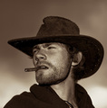
Lone Rangerby StructorComment: Wonderful tones and lighting on this 'cowboy' portrait. Great focus and wonderfully sharp details! It REALLY projects the sense of the ol'west. And I have to say the pose and look of your model REALLY channels Clint Eastwood from The Good, The Bad, & The Ugly. The sepia tones give it a look and feel of a classic western movie. This ain't no six-shooter this has a 9 fired on it:-) Great job! |
 Photographer found comment helpful. Photographer found comment helpful. |
| 06/08/2008 11:52:02 PM |
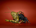
spiderhopper_edit.jpgby yankoComment: Wow! The addition of the red backdrop adds a bold vibrancy to the final composition - a grand departure from the drab browns & grey backdrop in the original. The addition of the reflection was a nice touch for it helps "ground" the image -rather then it looking like it is floating in the air. The colors, tones, and contrasts in the insects are much more dynamic and vibrant in the final composition. Super job on the editing - love how you can clearly see the black hairs sticking up and out on the spiders head. |
| Photographer found comment helpful. |
| 06/06/2008 11:31:05 AM |
Day 01by Dirt_DiverComment: The editing really helped capture the feel and punch of the "Got Milk" ads. Love what the desaturation did to this composition overall. It has an ol' tyme posterboard feel/mood to it. Also the reddish tones in the skin now vanish in the final product such that the skin tones are now more even and one notices the milk mustache all the more. Nice job in 'thickening' the mustache too. |
| Photographer found comment helpful. |
| 06/06/2008 11:18:46 AM |
2-june 08. before&after. a cowby rozComment: Very nice Post Processing! You did a wonderful job in the removal of the blueish tones that dominated the original. Now we can enjoy the deep black tones of the cow's fur as well as the wonderful highlights that illuminate it's fur (the gleam in the cow's coat just increases visual appeal). The original had flat contrast were one really could not make out much detail at all. And wow! Now we can see the cow's eye and even the bumpy texture on the nose. Excellent job in pulling out details that were lost in the original. |
| Photographer found comment helpful. |
| 06/06/2008 11:13:15 AM |
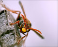
1-june 08. before&after. paper waspby rozComment: The PP really helped bring us closer to your main subject such that we can now enjoy (except for those who are queasy around bugs:-) ) all the details/texture & colors of this paper wasp. The uncropped original had the insect surrounded by too much of it's environment. So much so that it lost some of it's status as THE main focus. Here you bring us closer and thus your subject fills the frame and captures our attention more readily. Love the contrasts and richer tones in this one for they are more dynamic than the original |
| Photographer found comment helpful. |
| 06/06/2008 11:03:16 AM |
spiderflower_edit.jpgby yankoComment: Increasing the contrast really helped make the spider pop off the yellow flower more (you can really make out some nice details on the spider). The original had some flat contrasts and some tones. The PP helped increase the visual appeal by increasing the contrast between the two main subjects and the tones are richer. Darkening the background behind the flower also helps it to pop visually. Hmmm, tis a shame that you could not ask the spider to pose in a different position - if the spider's direction was flipped the other way the orientation/direction of the spider's legs would nicely mimic the orientation/direction of the center pedals. |
| Photographer found comment helpful. |
| 06/06/2008 10:57:26 AM |
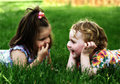
You can pick your friends and you can pick your nose but you cant pick your friends noseby timfythetooComment: Love the improved contrast and richness of tones in this After photo. Title is cute and makes one smile when paired with the image - ahhh, childhood:-) Back to the improvements to the photo - again love the improved contrast because now the highlights/tones in the both girls hair, especially the fair haired one, really stand out. Now I am very curious, I am going to have to google boutrellis magic glass to see exactly what it does in the prossessing phase. The photo has strong bones with the original composition, the PP just brings out the details and makes this one shine. |
| Photographer found comment helpful. |
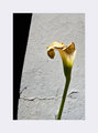
| 06/02/2008 12:52:04 PM |
IMG_1902-Lily-afterby sfaliceComment: Oh, really nice minimalistic shot! I too like the off-centered look of the composition. Cropping it down really created visual interest. Darkening the shadow and having the deep shadow appear on the far left hand side of the composition increased the visual impact for I think of a 'stage curtain' being pulled off to one side to reveal this aging lily. The crack in the wall also serves to draw the eye to the dying flower (not to mention it can also be symbolic in imagery of death/dying/broken). Nice going with increasing the contrast in the wall so that the rough texture pops out nicely! Hmmm, a nice contrast with the elements that symbolize of aging/death/decay/erosion would be to select the stem of the lily and boost brightness/contrast and/or saturation/color lvls so that the green is more evident. The juxtaposition of green being a symbol for renewal and the other symbols of aging/decay would make for an interesting visual composition. You have a nice clean minimalistic photo here and thin black line would help the photo pop a bit more off of the white border. |
| Photographer found comment helpful. |
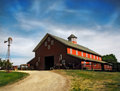
| 05/31/2008 05:37:46 PM |
Afterby timfythetooComment: Wow the after composition has alot of visual punch. The clouds take on a magical sort of errie feel in this composition. The red hues on the side of the barn are a bright almost candy apple red - tis really pops nicely. The original the color hue is darker - flatter in contrast. The after has the barn in greater brightness/contrast. The color hues are also richer and thus the visual appeal increases because of it. And I did not notice the bull at the entrance to the barn in the original. He fades a bit too much into the backdrop. But in this after image, you notice him more because the differances in brightness/contrasts. There is more sheen to his coat and the horns are whiter and brighter. Good job in removing the tree branches on either side of the composition - they would have been distracting elements adding nothing to the composition overall. |
| Photographer found comment helpful. |
| 05/31/2008 05:28:53 PM |
paralax addressed.jpgby wehrmacherComment: First off I love that in the original shot you composed it such that you have the hot pink orchids are exposed nicely and thus they pop off the dark backdrop. When one can, starting off with a good composition really helps to lessen what work one needs to do the improve it:-) The textures of the petals pop more in this one than the original -sharpening? brightness/contrast?. You did a fine job in widening the shot so that in this composition the flowers are more center composed in the shot. I do like what you did with the after but I find that the original has a greater appeal because I like the way the flowers seem to be climbing up the left side; like that of a vine adorning a wall. Sometimes an off-center or off-side main subject with 'some' negative space can be appealing as well as a center composed image. |
| Photographer found comment helpful. |
Home -
Challenges -
Community -
League -
Photos -
Cameras -
Lenses -
Learn -
Help -
Terms of Use -
Privacy -
Top ^
DPChallenge, and website content and design, Copyright © 2001-2025 Challenging Technologies, LLC.
All digital photo copyrights belong to the photographers and may not be used without permission.
Current Server Time: 08/19/2025 08:03:40 PM EDT.