| Image |
Comment |
| 05/07/2007 08:27:07 AM |
Day 7 - Sunriseby bdennyComment: Interesting tones in the sky here (sort of yellowish). I think skies work best in B&W when they are dramatic, and sunsets tend to be subtle. Slight variations in color often don't come through, or come through as uneven gradients. Here, the sky is okay, but what was probably a strong feature of the color version gets underplayed in the conversion. The water plays a bit better, but the image is a dark overall (possibly to save the sky). I might have leveled this, cropped a bit off the top, and upped the exposure and contrast. |
 Photographer found comment helpful. Photographer found comment helpful. |
| 05/07/2007 08:18:41 AM |
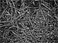
wired.jpgby UrfaKComment: This is sort of chaotic, so it appeals to that side of me. There isn't a clearly defined subject to speak of, and I find myself wanting to pick a point to look at but not being able to. Interesting. |
| Photographer found comment helpful. |
| 05/07/2007 08:11:15 AM |
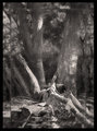
DAY 7. B&W. brackenby rozComment: I'm not sure why you don't like this (other than that you're hyper-critical of your work). It's an interesting take on the subject, with nice highlights and dark tones throughout, and lots of interesting patterns. Visually it's appealing to me. But no, I don't care for the border here, either ;)
P.S. You can tell PS to save your editing steps, either in a separate document or in a text file (or both); you can cut and paste that list in the description and save yourself the work of a separate image upload if you want to (I'm told it's also useful for verifying challenge entries, but as I've never placed high enough to be asked, I can't testify to that myself)! |
| Photographer found comment helpful. |
| 05/07/2007 08:05:35 AM |
Day 3: Shots Suckby Blue MoonComment: You have a good eye, and for me you achieved what you set out to do very effectively. What's particularly interesting to me here is the use of the word "shot." With the title, and even starting in your narrative, I thought you were referring to a photograph (ie, a photographic "shot"). It took me awhile to get it; I assumed one kind of shot over the other given the context of where I read it. Anyway, I like the "shot" and what you've done with it.
/edited for typo/ Message edited by author 2007-05-07 08:06:17. |
| Photographer found comment helpful. |
| 05/07/2007 06:14:49 AM |
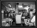
Dinerby AliciaComment: Nicely seen, shot and processed. I love images that take the ordinary and make me look at it. I've been in tons of diners, but I'm not sure I've ever "seen" one in the way you've shown it to me. The contrast and tones here work well in bringing the diner across as subject. Nice. |
| Photographer found comment helpful. |
| 05/07/2007 05:56:41 AM |
5by mia67Comment: This is the reason I should stick to shooting things and not doing portraits. Wonderful, great expression, tonal range and lighting are great, as is the clarity. Really nice. |
| Photographer found comment helpful. |
| 05/07/2007 05:53:04 AM |
Day-7by SandyPComment: Great sharpness for a moving image; you stopped time! I love the gradient in the sky, and little groups of people here and there. If it were me, I might straighten it up and try a bit more contrast, but I might not, too :) |
| Photographer found comment helpful. |
| 05/07/2007 05:49:44 AM |
DAY 7. B&W. bush scene .by rozComment: I'm working hard at B&W, too; I did about ten conversions over the past three days (after I decided to join this challenge) and have not posted a single one (I have posted others, obviously). I agree there are better ways to convert than in RAW; I have links to about ten different methods somewhere, just pm me if you want them. The alien skin film filter plugin is nice for seeing what can be achieve quickly (and for conversions in advanced or expert editing). For this image, the border isn't for me (it competes too much with the image). I think the image itself is not half as bad as you think. There's some interesting lighting, and good angles and lines. A bit more contrast (as nick suggested) would probably help to give it a bit more impact. I like your work, Roz! |
| Photographer found comment helpful. |
| 05/07/2007 05:17:34 AM |
Day 6 - Bridgeby meneleComment: I like this, and the subdued tones work for me here; at points the greys almost look painted, which is a nice effect. I see some jaggies (possibly from sharpening) in a beam on the right by the windows; angles are tough for sharpening, but otherwise the processing looks good. |
| Photographer found comment helpful. |
| 05/06/2007 02:23:44 PM |
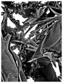
BananaTreeEmbraceby UrfaKComment: I fall in the "liking it" group here, I guess. There's a lot to see, the tones are great, and everywhere you look the image is visually interesting. I like see the trees and not the forest sometimes, and this image is an invitation to do that for me. |
| Photographer found comment helpful. |
Home -
Challenges -
Community -
League -
Photos -
Cameras -
Lenses -
Learn -
Help -
Terms of Use -
Privacy -
Top ^
DPChallenge, and website content and design, Copyright © 2001-2025 Challenging Technologies, LLC.
All digital photo copyrights belong to the photographers and may not be used without permission.
Current Server Time: 07/20/2025 10:32:14 PM EDT.