| Image |
Comment |
| 09/08/2007 07:55:27 PM |
Fly with The Royal Navyby TiNComment: Good font choice, I like the gradient/transparency you used as well. This reminds me of a WWII - like image, but with a modern helicopter. |
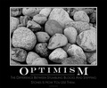
| 09/08/2007 07:53:36 PM |
|
 Photographer found comment helpful. Photographer found comment helpful. |
| 09/08/2007 07:52:19 PM |
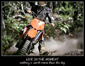
Stop bureaucracyby hajekaComment: For me, this isn't all that motivational, but I think this is a fun photo to look at. I think the b&w works well. |
| Photographer found comment helpful. |
| 09/08/2007 07:51:38 PM |
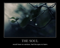
The Soulby whiteroomComment: I like the tie in between your image and your sub heading. for me, I would have like to see the header itself a bit larger and more kearning between the letters. |
| Photographer found comment helpful. |
| 09/08/2007 07:50:14 PM |
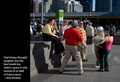
laughterby boysetsfireComment: Not sure how motivational this is, although the people in your image do look like they are having fun. |
| Photographer found comment helpful. |
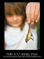
| 09/08/2007 07:49:26 PM |
This Too Shall Passby njsabsComment: Lol - I like your sub-heading. It made me chuckle. Cute image and fun poster. Nicely done. |
| Photographer found comment helpful. |
| 09/08/2007 07:48:42 PM |
|
| Photographer found comment helpful. |
| 09/08/2007 07:48:09 PM |
|
| Photographer found comment helpful. |
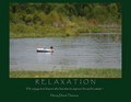
| 09/08/2007 07:46:30 PM |
Relaxationby L1Comment: For me, I wish the letter size on your header were larger and perhaps force justified along the length of the photo. I think it would give your poster a greater impact overall. I liike the green border. Good color choice. |
| Photographer found comment helpful. |
| 09/08/2007 07:42:45 PM |
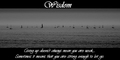
Wisdomby evaComment: For me, I think if the header were larger and have that nice cursive "W" hanging into the photo itself. Also, the mis-spelled word deters from the overall impact. The photo itself seems a little flat against the starkness of the black & white text, but I like the long, almost panoramic look. |
| Photographer found comment helpful. |
Home -
Challenges -
Community -
League -
Photos -
Cameras -
Lenses -
Learn -
Help -
Terms of Use -
Privacy -
Top ^
DPChallenge, and website content and design, Copyright © 2001-2025 Challenging Technologies, LLC.
All digital photo copyrights belong to the photographers and may not be used without permission.
Current Server Time: 06/28/2025 12:08:54 AM EDT.