| Image |
Comment |
| 01/01/2003 03:57:55 PM |
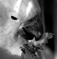
mmmm good stuffby CreativeFlyPhotoComment: Great framing, I love the claw/talon (I lack the proper terminology) at the bottom. Excelent shot. Lighting might have been better without the two stripes, but it's easily overlooked. 8 |
 Photographer found comment helpful. Photographer found comment helpful. |
| 01/01/2003 03:56:27 PM |
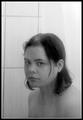
Bathroom Mirror Realityby lisaeComment: I think a tighter crop would help, although I think you might be leaving a wider shot in order to simulate an entire bathroom mirror with your shot. I think the title is vital to the shot, as alone I don't think it's particularly impressive in terms of expression or portraiture, however, if I think of it as you actually looking into a bathroom mirror suddenly it all starts to fit and seems to capture a look of dull self-evaluation that strikes me as very real. Although I could just be reading into it way to far. 8 |
| Photographer found comment helpful. |
| 01/01/2003 03:50:48 PM |
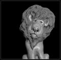
J O S Hby brandonarbiniComment: Well.. the shot does a nice job of capturing that statue/figurine (the framing, contrast, focus and everything work well) but that's really all it does is show us a figurine, straight on with a black background. Forgive my bluntness, but I'm not personally inclined to consider that to be very valueable. 3 |
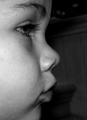
| 01/01/2003 03:47:09 PM |
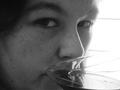
untitledby shedonistComment: The glass she is drinking out of has an abstract feel to it, but it doesn't seem to fit the feel of the rest of the photo, and it ends up being distracting instead (at first I couldn't figure out what it was). I like the bright background and the darker face, and the tight close up works well here... there's just something about that wine glass that seems like it almost worked but didn't. Maybe it's just that it obstructs the mouth, which is so vital to facial expression. But that's just me. = ) 6 |
| Photographer found comment helpful. |
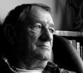
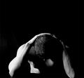
| 01/01/2003 03:44:02 PM |
Introspectionby PtmanComment: the bookshelf behind is somewhat distracting. I'm tempted to say I'd have cropped out the right side past his face, but I do like having the extra space, it'd just be better if there were nothing there. Of course I understand this was probably unavoidable. It looks like the light is a little bit harsh as well. I do like the expression and the pose in general. It's a good shot. 7 |
| Photographer found comment helpful. |
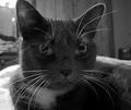
| 01/01/2003 03:40:06 PM |
Chloeby mcmurmaComment: The way the whiskers (especially the ones above the eyes) are much more illuminated than the rest of the face is really distracting to me here and it really takes away from my personal enjoyment of the shot. The focus is great here, and aside from barely clipping that right ear off the framing is great as well. An impressive shot. 7 |
| Photographer found comment helpful. |
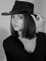
| 01/01/2003 03:37:31 PM |
Amber Brkich of Survivor II: Australiaby alanfreedComment: Great framing. Because the shirt is completely black, the arm reaching across her chest is impossible to see, and I think that gives the shot a somewhat awkward feel. However, I do really like how the hand is holding the hat, so I don't think the pose is all bad, but I think some contrast between the arm and the rest of the shirt would help. 7 |
| Photographer found comment helpful. |
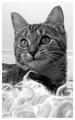
| 01/01/2003 03:33:34 PM |
Liliby JackoComment: It'd be better off without the fluffy stuff at the bottom of the frame, otherwise I like the framing and the shot in general. 6 |
| Photographer found comment helpful. |
| 12/30/2002 02:31:37 PM |
|
| 12/30/2002 12:43:01 AM |
|
Home -
Challenges -
Community -
League -
Photos -
Cameras -
Lenses -
Learn -
Help -
Terms of Use -
Privacy -
Top ^
DPChallenge, and website content and design, Copyright © 2001-2025 Challenging Technologies, LLC.
All digital photo copyrights belong to the photographers and may not be used without permission.
Current Server Time: 08/25/2025 08:42:16 AM EDT.