|
|
|
Showing 261 - 270 of ~332 |
| Image |
Comment |
| 11/18/2002 03:26:00 PM | Boundby muckpondComment: Great message and perfect b/w shot too! Maybe a little bit out of focus? No, if I think a little longer the blur is suitable for your shot... Perfect 10 to me - nds |
| 11/18/2002 02:09:00 PM | You've Got Mailby RackatComment: Hehe, very creative - respect! But personally I don't like is as an photo. Nevertheless good luck for the challenge, other voters think different... Voted 6 (for creativity) |
| 11/28/2002 02:11:00 PM | City Traffic by ndsComment: Yippee!!!! :-) Sorry for answering so late. As my brother (stephan) told you already, I was a few days on holiday. Thanks a lot for all your comments on my shot and for your congratulations on the ribbon. I am very surprised at getting first place, but I like the feeling and I could become accustomed to it ;-). The plane was not flying, all you wanted to know you can read in the photo details. If there are more questions, please feel free to ask me here. Sorry also to the runners-up, that I have 'stolen' your ribbon with such a cheap trick... ;-) @ PTLParsons I didn't crop this shot, and I have no other version, where you can see the wings. Sorry, but I decided to use a vertical composition. I think, that the lines of the building thereby are much more impressive, because they are leading the eye better to the main subject. |
| 11/18/2002 02:48:00 PM | |  Photographer found comment helpful. Photographer found comment helpful. |
| 11/18/2002 01:56:00 PM | 1 / 0 , The Binary Paradigmby jjbeguinComment: Creative and nice idea ;-) But IMHO the shot doesn't look very interesting. I don't like the background (parquet) and the lighting. Maybe the other voters think completely different... 5 (for creativity) - nds |
| 11/13/2002 06:19:00 PM | Texture of....by fotofrogComment: I really like your shot, highly interesting texture! IMHO it would be a little better with more DOF and without the shadow area on the left side. Good luck, nds |
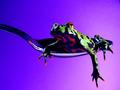
| 11/13/2002 06:03:00 PM | It's a Frog Eat Frog Worldby RackatComment: Lovely frog and great shot, one of my favourites this week! IMHO it would be better with a less colourful or black background. This could highlight the nice colours of the frog, especially his red 'fingertips'. The colourful background is a little bit distracting from this detail. Nevertheless I voted 10. Good luck - nds |
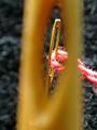
| 11/11/2002 03:34:00 PM | Needles and Threadby falveyComment: Nice idea, I like your shot. IMHO too much empty space on the left side. I would have cropped a little different. Good luck, nds |
| 11/11/2002 03:43:00 PM | Dancing Leafby JEMComment: Nice shot. I like the composition and the shadow too. IMHO it would be better with a less distracting background color. Good luck, nds | | Photographer found comment helpful. |
| 11/13/2002 06:09:00 PM | Clash by dadas115Comment: WOW; what a lucky shot! Or is it a planned setup? I'm highly interested in the story behind this shot and I'm waiting for your photo details... Good luck, nds |
|
Showing 261 - 270 of ~332 |
Home -
Challenges -
Community -
League -
Photos -
Cameras -
Lenses -
Learn -
Help -
Terms of Use -
Privacy -
Top ^
DPChallenge, and website content and design, Copyright © 2001-2025 Challenging Technologies, LLC.
All digital photo copyrights belong to the photographers and may not be used without permission.
Current Server Time: 08/23/2025 03:55:17 AM EDT.
|