| Image |
Comment |
| 06/15/2006 11:26:57 PM |
Cliff and cloudy night IIby MadMan2kComment: Hey there from the Critique Club
Camera Work/Technical: I like your focus, including a great depth of field that goes beyond the clouds and nicely exposes the stars in focus. I also like the time of exposure here, catching the ever so slight drifting of the clouds.
Lighting: You did a very nice job in an often difficult, low light condition. You were able to keep the stars and the cloud highlights from losing detail, while also capturing a long enough exposure to paint a very nice red coloring on the cliff.
Composition/Content: This is the one area that I do believe that the original was better. This one is interesting from a minimalist viewpoint, but I find myself feeling like the cliff was accidentally chopped off. I'd really like to see more of it, as the color complements the sky very nicely.
My Opinion: The two shots are vastly different in content and execution. I, against the opinion of the voters, do not see this one as far superior to the original. Rather, I believe that this one scored pretty close to its deserved potential, whereas the initial entry was actually much better than the voters gave it credit.
Eric
|
 Photographer found comment helpful. Photographer found comment helpful. |
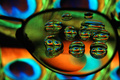
| 06/15/2006 01:07:01 AM |
Eyes IIby banmornComment: Hey there from the Critique Club
Camera Work/Technical: Your clarity and focus is much, much better than your original entry. Your contrast in this one is also better than the original.
Lighting: In the original, your lighting looked a little flat and hazy. In this one you did a nice job overcoming that.
Composition/Content: This is where I believe the voters scored you lower for this entry. This one seems a bit more crowded with the droplets too close together. The other entry seems a bit more relaxed with the droplet spacing more spread out.
My Opinion: I believe that everything except the composition is better than your original. Unfortunately, the composition was crowded just enough to pull your score down.
Eric
|
| Photographer found comment helpful. |
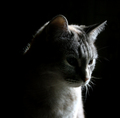
| 06/15/2006 12:54:39 AM |
High Contrast Challenge: infernal catby dragonladyComment: Hey there from the Critique Club
Camera Work/Technical: I see the main focus is one the eye that is in shadow, leaving the bright light a bit soft. I'd like to see that reversed, and even a slightly deeper depth of field.
Lighting: Your lighting is the main strength of this image. You did a very nice job with limited highlights to create a great low key image.
Composition/Content: I like the composition that you chose here. It has a nice centered profile feel to it that really works for this image.
My Opinion: This one is hands down better than the original entry. The first one lost the feeling of a photograph. This is a nice animal portrait, even though I am not a cat person. Well done.
Eric
|
| Photographer found comment helpful. |
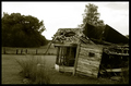
| 06/13/2006 10:15:33 PM |
Dreamin' of Home IIby rayg544Comment: Hey there from the Critique Club
Camera Work/Technical: Very nice technical work with this image. The ghosting is more effective here with a better play into the image. This feels better than the standing position in the original.
Lighting: The lighting is also better in this image. The side of the building was a bit blown in the original. Not so here. I also like the individual lights that you captured.
Composition/Content: This is where I really like the original. Sure, you took the pole out of your head, but the track played an integral part of the last image. It served well to pull the viewer deep into the image.
My Opinion: I like it, but I still prefer the original. This is a better shot from a technical standpoint, but the composition of the original is better. That is where the voters noticed, I believe.
Eric
|
| Photographer found comment helpful. |
| 06/13/2006 07:19:30 PM |
Hot Damn ! II (Beverage)by 3eyedcrowComment: Hey there from the Critique Club
Camera Work/Technical: Great focus and very interesting death of field. The quality of this exposure is far better than the original submission. Your choice of ISO 100 produced a much better result.
Lighting: Again, much better than the original. I do think I would prefer the bottle behind the flaming glass to give the label a little light boost.
Composition/Content: While the composition is very similar, the details of the content are much more evident in this capture, thus producing a better image.
My Opinion: I think that this one is better than the voters credited you for. Your lighting change alone is worth more than the small score change they gave you.
Eric
|
| Photographer found comment helpful. |
| 06/13/2006 06:55:19 PM |
The Santa Maria Revisitedby timfythetooComment: --Trading Post Comment--
This shot is awesome! There is nothing more or less that I would do to it. Sorry there isn't more critique to offer, but this one is great just the way it is. It really is sitting there with some other great images...right up there where it should! Great work! |
| Photographer found comment helpful. |
| 06/13/2006 06:31:27 PM |
A Famous Irishby PascalComment: Hey there from the Critique Club
Camera Work/Technical: Excellent! Your crisp focus adds to the dramatic feel of this capture. I would like to see the depth of field just a little deeper as the Gui on the left side of the image appears a little soft.
Lighting: Out of the many image strengths, lighting is your strongest here. Wonderful job capturing the perfect amount of each label to capture interest and hold onto the viewer's eye.
Composition/Content: I prefer the composition of the original entry more, but everything else about this one is better. This composition is not bad, by any means, but I like the full frame feeling of the original.
My Opinion: Excellent job improving on a great idea. This may even be one of the most improved in this entire challenge. Wonderful work!
Eric |
| Photographer found comment helpful. |
| 06/13/2006 06:21:08 PM |
T A M A R Aby PhilosComment: Hey there from the Critique Club
Camera Work/Technical: The eyes are beautiful and crisp, but the rest of the image is a bit too soft. I do like images with the angelic blur, but I think that this one is a bit overdone. I am not sure if it was the post-processing or the extremely shallow depth of field, but there is a bit too much of it. It looks like a neat image layer with a mask over the eyes and mouth.
Lighting: Your lighting is pretty nice. Almost everything is nicely exposed with all elements evenly lit. I would like to see that hair lit a little more. Just a little detail was lost there.
Composition/Content: I do prefer this offset composition to the original, more centered composition. You captured a very nice expression that she will love for years.
My Opinion: The coloring and post-processing were better in the original. The composition and lighting in this one was much better. A combination of the two would have probably pushed the top 10.
Eric
|
| Photographer found comment helpful. |
| 06/13/2006 05:49:04 PM |
Box in the Sky [ reflections without mirrors II reshoot]by gocComment: Hey there from the Critique Club
Camera Work/Technical: Wonderful focus. The windows and corners are all very crisp and make for one of this image's major strengths.
Lighting: The lighting was a bit too harsh for this image. Looking at your settings, I think that it would have helped if you had cranked that aperture down a bit.
Composition/Content: The composition of this image is much stronger and better that the original submission. The lines and corners of the windows work very well to bring the viewer's eye up and into the frame, as well as hold interest.
My Opinion: While it is a far cry from the original, it is far better. Studying both images closely, I can't even make a relation between the two. However, this is a greatly improved image that scored pretty close to its potential.
Eric
|
| Photographer found comment helpful. |
| 06/13/2006 05:38:21 PM |
No Trespassingby esdarbyComment: Hey there from the Critique Club
Camera Work/Technical: I like the strong, crisp focus, as well as the deep depth of field that keeps each part of the image in focus. I do prefer the duotone conversion, but you lost some of the shy detail.
Lighting: The sky is pretty harsh and overpowering in this version. I believe that a graduated natural density filter or a soft light gradient layer in post processing would have helped this one out a great deal. You lost some of the valuable detail in your highlights and your shadows. Your first one was lit better.
Composition/Content: I prefer this landscape orientation and composition as opposed to the square crop of the original. The fence you included on the left of this image helps pull the eye around the frame and the openness gives more of a sense of freedom in the outdoors.
My Opinion: As is, the original submission is better. With slight lighting adjustments, I think this one would have easily pressed in to the 6 range of scoring.
Eric
|
Home -
Challenges -
Community -
League -
Photos -
Cameras -
Lenses -
Learn -
Help -
Terms of Use -
Privacy -
Top ^
DPChallenge, and website content and design, Copyright © 2001-2025 Challenging Technologies, LLC.
All digital photo copyrights belong to the photographers and may not be used without permission.
Current Server Time: 08/14/2025 09:44:26 AM EDT.


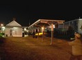


![Box in the Sky [ reflections without mirrors II reshoot]](https://images.dpchallenge.com/images_challenge/0-999/504/120/Copyrighted_Image_Reuse_Prohibited_341499.jpg)