| Author | Thread |
|
|
08/01/2006 01:37:23 AM |
|
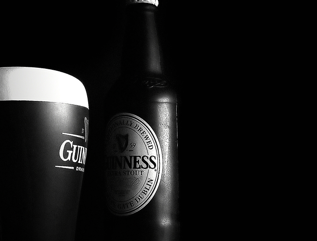
Paschalis, thanks for your comment on my beach entry and I thought I would give you one in return. The only thing I would really change is that I would turn the bottle alittle bit forward to read the title alittle better. I really like the processing on this image too. Thanks again joe. |
|
 Photographer found comment helpful. Photographer found comment helpful. |
|
|
06/13/2006 06:31:27 PM |
Hey there from the Critique Club
Camera Work/Technical: Excellent! Your crisp focus adds to the dramatic feel of this capture. I would like to see the depth of field just a little deeper as the Gui on the left side of the image appears a little soft.
Lighting: Out of the many image strengths, lighting is your strongest here. Wonderful job capturing the perfect amount of each label to capture interest and hold onto the viewer's eye.
Composition/Content: I prefer the composition of the original entry more, but everything else about this one is better. This composition is not bad, by any means, but I like the full frame feeling of the original.
My Opinion: Excellent job improving on a great idea. This may even be one of the most improved in this entire challenge. Wonderful work!
Eric |
|
| Photographer found comment helpful. |
Comments Made During the Challenge  |
|
|
06/12/2006 11:57:07 PM |
|
The crop is a bit too tight at the top but this sure is a fantastic study in lighting. I wish the Guiness was turned slightly to the right so I can read a bit more of it ;) This would make a great advertisement don't you think? |
|
| Photographer found comment helpful. |
|
|
06/12/2006 09:25:24 PM |
|
Just a touch more detail in the label area of the bottle would be nice. 6 |
|
| Photographer found comment helpful. |
|
|
06/11/2006 08:48:26 PM |
|
Nice dark picture for a nice dark beer. |
|
| Photographer found comment helpful. |
|
|
06/10/2006 12:31:29 AM |
|
Wonderful strong tones and still tells a story. |
|
| Photographer found comment helpful. |
|
|
06/09/2006 12:27:50 AM |
|
Excellent composition, really like the contrast, wish the top of the bottle were in the frame though. Still get a 7 for this challenge - nice second take! (Hey, I'm a sucker for a good stout!) |
|
| Photographer found comment helpful. |
|
|
06/08/2006 07:10:20 PM |
|
Interesting with this light and discreet show of the brand. I kind of miss the top of the bottle. |
|
| Photographer found comment helpful. |
|
|
06/08/2006 06:44:05 PM |
|
Mmmm Guinness... mmmm ok so you get a 6 just for taking a picture of beer! LOL actually, no, you get a 6 because I like the setup and light. Only one thing: you cropped the top of the bottle. Might look better with it. |
|
| Photographer found comment helpful. |
|
|
06/06/2006 04:57:19 PM |
|
| Photographer found comment helpful. |
|
|
06/06/2006 02:34:25 PM |
|
Love the tones, good control of dark tones and placement. |
|
| Photographer found comment helpful. |
|
|
06/06/2006 10:20:44 AM |
|
excellent tones, nice and crisp too. a bit of an odd crop...i like it. :) |
|
| Photographer found comment helpful. |
Home -
Challenges -
Community -
League -
Photos -
Cameras -
Lenses -
Learn -
Help -
Terms of Use -
Privacy -
Top ^
DPChallenge, and website content and design, Copyright © 2001-2026 Challenging Technologies, LLC.
All digital photo copyrights belong to the photographers and may not be used without permission.
Current Server Time: 06/30/2026 05:54:35 PM EDT.