| Author | Thread |
|
|
06/13/2006 05:49:04 PM |
Hey there from the Critique Club
Camera Work/Technical: Wonderful focus. The windows and corners are all very crisp and make for one of this image's major strengths.
Lighting: The lighting was a bit too harsh for this image. Looking at your settings, I think that it would have helped if you had cranked that aperture down a bit.
Composition/Content: The composition of this image is much stronger and better that the original submission. The lines and corners of the windows work very well to bring the viewer's eye up and into the frame, as well as hold interest.
My Opinion: While it is a far cry from the original, it is far better. Studying both images closely, I can't even make a relation between the two. However, this is a greatly improved image that scored pretty close to its potential.
Eric
|
|
 Photographer found comment helpful. Photographer found comment helpful. |
Comments Made During the Challenge  |
|
|
06/10/2006 12:09:00 AM |
|
Well seen and very well handled. |
|
| Photographer found comment helpful. |
|
|
06/09/2006 05:18:31 PM |
|
the blown out parts look awesome on this particular image |
|
| Photographer found comment helpful. |
|
|
06/07/2006 02:47:55 PM |
I couldn't find your original (I did look!), so I'll comment/vote on it's own merit.
I like the angle and reflection. The box works well, but the reflection looks a bit blown out. |
|
| Photographer found comment helpful. |
|
|
06/06/2006 12:24:12 AM |
|
Hard to get the exposure just right with this sort of image. The reflections off the centre part are just a little blown IMO. |
|
| Photographer found comment helpful. |
Home -
Challenges -
Community -
League -
Photos -
Cameras -
Lenses -
Learn -
Help -
Terms of Use -
Privacy -
Top ^
DPChallenge, and website content and design, Copyright © 2001-2026 Challenging Technologies, LLC.
All digital photo copyrights belong to the photographers and may not be used without permission.
Current Server Time: 07/01/2026 07:47:44 AM EDT.

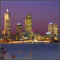

![Box in the Sky [ reflections without mirrors II reshoot]](https://images.dpchallenge.com/images_challenge/0-999/504/1200/Copyrighted_Image_Reuse_Prohibited_341499.jpg)


