|
|
|
Showing 521 - 530 of ~1242 |
| Image |
Comment |
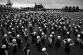
| 05/17/2007 04:15:14 AM | Dominanceby JasComment: Hey there from the Critique Club
Camera Work/Technical: Nice, just as all your comments have mentioned.
Lighting: Very strong and very well-lit.
Composition/Content: I think it fits quite well, even though you and some of your voters do not. I feel the action, and I like the approach that you took to this one.
My Opinion: Nice shot and a nice score to match. Well-cone.
Thank you for the opportunity to provide a critique on your entry,
Eric
|  Photographer found comment helpful. Photographer found comment helpful. |
| 05/17/2007 04:09:31 AM | Zulu Warriorby rosslComment: Hey there from the Critique Club
First of all, welcome to the wonderful world of DPC. I think that you'll really like what you find here. An average of 5.333 is a pretty strong place to start, and it leaves a great deal of room for improvement.
Camera Work/Technical: It looks like you had to rely too heavily on flash here, thus giving the image a very flattened look. I understand that night time photography can be pretty difficult.
Lighting: Your lighting is a bit flat. It almost looks like your camera was pointed down when shot this one, as the legs and feet are better lit than his face or torso.
Composition/Content: I'd like to see the entire fore in this one. I think that backing away a bit to loosen up the composition would help out some. That may also help even out your flash a bit as well.
My Opinion: Nice work meeting the challenge, and I look forward to more entries, as well as seeing your overall average climb. Again, welcome and keep shooting.
Thank you for the opportunity to provide a critique on your entry,
Eric
| | Photographer found comment helpful. |
| 05/17/2007 04:07:54 AM | Zulu Warriorby rosslComment: Hey there from the Critique Club
First of all, welcome to the wonderful world of DPC. I think that you'll really like what you find here. An average of 5.333 is a pretty strong place to start, and it leaves a great deal of room for improvement.
Camera Work/Technical: It looks like you had to rely too heavily on flash here, thus giving the image a very flattened look. I understand that night time photography can be pretty difficult.
Lighting: Your lighting is a bit flat. It almost looks like your camera was pointed down when shot this one, as the legs and feet are better lit than his face or torso.
Composition/Content: I'd like to see the entire fore in this one. I think that backing away a bit to loosen up the composition would help out some. That may also help even out your flash a bit as well.
My Opinion: Nice work meeting the challenge, and I look forward to more entries, as well as seeing your overall average climb. Again, welcome and keep shooting.
Thank you for the opportunity to provide a critique on your entry,
Eric
|
| 05/17/2007 03:57:21 AM | Oh yeah, they played baseball too...by good_hamComment: Hey there from the Critique Club
Camera Work/Technical: Very nice use of your depth of field. This does an excellent job of nicely isolating your subject, which I might add, is the most important part of any game. Without the beer man, I'd have to get up far too many times.
Lighting: I'd like to see this one lit better. Perhaps a little more exposure would have helped out here. I use a very bright monitor, and everything looks a bit dark here.
Composition/Content: Nice rule of thirds use. This really helps pull the eye up and into the frame. The heads at the bottom of the screen are fairly distracting, yet understandable.
My Opinion: Nice work, but it appears that this isn't exactly what the voters were looking for. Nice job thinking out of the box to capture a different side of the action.
Thank you for the opportunity to provide a critique on your entry,
Eric
| | Photographer found comment helpful. |
| 05/17/2007 03:49:13 AM | What else would you do on a Saturday morning......by dougi555Comment: Hey there from the Critique Club
So, what is there that I could possibly add here other than I think your horizon may be tilted a hair? I do see that corinne also added a silly comment to yours as well. I am left to assume that the word 'sport' means something totally different in her native language. I do like this capture a lot! It is my absolute favorite in this challenge, closely followed by this one:

Notice that corinne left a really original comment there as well. You did a fantastic job with every aspect of this image (save the slight tilt that I think I see). You were far underscored with this one, but duotone images are often overlooked on DPC. Still, fantastic work, and I look forward to more.
Thank you for the opportunity to provide a critique on your entry,
Eric
| | Photographer found comment helpful. |
| 05/17/2007 03:24:59 AM | A Crash Back to Realityby mistchild2008Comment: Hey there from the Critique Club
Camera Work/Technical: I think that you overexposed this one just a bit. The white on the vehicle, as well as the pants and the lady's nose look a little hot to me. I think that taking the exposure down just a touch would have also added a more dramatic feel to the image.
Lighting: As I mentioned above, a little too bright. The brightness of the image makes a bit difficult to look at. This is a tough one to manage the light to begin with. The bright sun on the white, along with the harsh white of the vehicle makes it really hard.
Composition/Content: I do like your content, but perhaps not for this challenge.
My Opinion: I think that this one would have been better for a different challenge. Nice work, and I look forward to much more of your work.
Thank you for the opportunity to provide a critique on your entry,
Eric
|
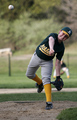
| 05/17/2007 03:00:06 AM | Determinationby brownsmComment: Hey there from the Critique Club
Camera Work/Technical: While not nearly the superiority of much of your work, the technical aspects of this image is pretty strong. I like the crisp, clean focus on the player, and the depth of field makes this one pop nicely.
Lighting: I think that your lighting is reversed. The background is a little too bright, thus making the subject look a little too dark.
Composition/Content: The background is a bit too busy for my liking. I'd like to see it with out the outfielder and the passing truck on the left side. I do like the inclusion of the ball, as well as the entire form of the player.
My Opinion: Even with the mild flaws, this is a nice image. Again, not nearly the strength of the work you normally produce, but still pretty nice.
Thank you for the opportunity to provide a critique on your entry,
Eric
| | Photographer found comment helpful. |
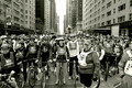
| 05/17/2007 02:52:34 AM | come join usby Car54Comment: Hey there from the Critique Club
Camera Work/Technical: Very nice! Awesome depth of field and terrific lines. I like really like the perspective and vanishing point that you captured. It is especially nice from the ground-level point of view that this was snapped from. It so cool that, with the first glance, it appears that everyone is looking at the camera, as if expecting the shot.
Lighting: While the sky looks a bit hot, all your subject appear nicely lit. This also adds some nice contrast, as well as finishing out a strong tonal range for the overall image.
Composition/Content: Again, wonderful. I am not quite sure how much corrine was drinking before she added her silly comment, but I am guessing it was a LOT. Perhaps the word 'sport' means something much different in her native tongue. This meets the challenge very nicely, and your score reflects that nicely.
My Opinion: This is a very nice and very strong score, but I fell that it is still far too low. This one should have slid up there into the top ten, maybe even the top 5. The image is a very solid entry.
Corrine, lay off the liquor.
Thank you for the opportunity to provide a critique on your entry,
Eric
|
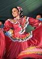
| 05/17/2007 02:32:29 AM | Baile De Cinco De Mayoby SheryllComment: Hey there from the Critique Club
First off, congrats on your best scoring entry to date. It always nice to up that best score and see a new image sitting at the top of the profile page. Also, thanks a ton for including such detailed information. I think that you did a nice job considering the image that you started with. Nice work with the post-processing. I think a 5.5 is a very strong score for this particular entry. More clarity would have certainly drawn a better score.
Thank you for the opportunity to provide a critique on your entry,
Eric
| | Photographer found comment helpful. |
| 05/17/2007 02:14:30 AM | The Save!by Harmakis7Comment: Hey there from the Critique Club
First off, congrats on your best scoring entry to date. It always nice to up that best score and see a new image sitting at the top of the profile page.
Camera Work/Technical: While I like the spray and the action that you captured here, but your shutter speed is far too slow for this type of shot. This needs at least 1/250, maybe even quicker. All the motion gives the appearance that most of the frame is out of focus.
Lighting: Your lighting is very nice and very even. I do like the ice being just a bit overexposed. It really adds to the action of the image.
Composition/Content: Your composition is a little tight for this type of shot. With goalie shots, its nice to see the all of his equipment. Nice job catching the pads, but chopping off the stick seems more accidental than an intentional composition. Its also better to include the puck, unless of course your buddy let it fly through the 5 hole.
My Opinion: 5.4 is a pretty solid score for what you captured here. With a quicker shutter and a better composition, this one would have done much better for you. Again, congrats on a new top score. I look forward to more.
Thank you for the opportunity to provide a critique on your entry,
Eric
|
|
Showing 521 - 530 of ~1242 |
Home -
Challenges -
Community -
League -
Photos -
Cameras -
Lenses -
Learn -
Help -
Terms of Use -
Privacy -
Top ^
DPChallenge, and website content and design, Copyright © 2001-2025 Challenging Technologies, LLC.
All digital photo copyrights belong to the photographers and may not be used without permission.
Current Server Time: 08/11/2025 05:51:09 PM EDT.
|