| Image |
Comment |
| 01/21/2004 12:10:27 PM |
|
 Photographer found comment helpful. Photographer found comment helpful. |
| 01/21/2004 11:18:46 AM |
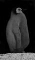
Patent Penguinby wwjdwithcaComment: Its too underexposed. This kind of has a dark artsy feel to it, which I like. I don't feel that's a good quality in the photojournalistic world of magazines like NG. It's a little too much like a mug shot. |
| Photographer found comment helpful. |
| 01/21/2004 11:16:46 AM |
|
| Photographer found comment helpful. |
| 01/21/2004 10:40:09 AM |
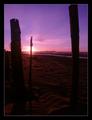
Traveler Magazine - Floridaby RiderGalComment: This is a nice photo. Unfortunately it looks like the camera couldn't properly handle the color or its been overprocessed. The sky has lots of problems. The guy at the bottom should've been posed a little different. Something to show his arms a little more. No offense, but he looks like he has no arms nor a neck. The idea is really good, I think you just need to perfect the details a bit. |
| Photographer found comment helpful. |
| 01/21/2004 10:36:14 AM |
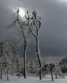
The effect of cold on spider websby pcodyComment: Exceptional composition on this one. My only liitle minor beef on this one is that it looks just a little oversharpened. I'm curious to know if you could've gotten a greater depth of field on this one. You'll have to take a 9 on this one. This is a remarkable photo. |
| Photographer found comment helpful. |
| 01/21/2004 10:06:51 AM |
Cold Weather Eagle by zimmanjComment: This is good. Its a little bit small, but good. Good color and excellent exposure. The steam (I think its steam) in the background is a good touch. |
| 01/21/2004 09:55:13 AM |
Overhauling Historyby mbardeenComment: I really like this photo. The one thing I'd like to see different, and this is getting a little picky, is having the guys on both sides of the frame. I think it would be a little more balanced of a picture. This is really good the way it is, but in my eyes, it's what makes the 9 become a 10. Nice work at any rate. |
| Photographer found comment helpful. |
| 01/21/2004 09:50:16 AM |
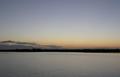
Getawayby roy204Comment: Great colors. I like the sky colors but am a little disappointed that the foreground details were discarded at their expense. It is a nice shot still, just looks like you could've used a neutral density filter to darken the sky and but keep more of the foreground details. The sand patterns if more visible would really add some life to the bottom of this photo. |
| Photographer found comment helpful. |
| 01/21/2004 09:45:10 AM |
|
| Photographer found comment helpful. |
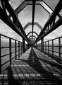
| 01/21/2004 06:43:21 AM |
Geometry by kuarkComment: Congrats! I have mixed feelings about the new guys getting ribbons. On the one hand its good to see new people winning. On the other hand, there were already enough good people to compete with before you guys got here. Just kidding. Good find and good shot. |
| Photographer found comment helpful. |
Home -
Challenges -
Community -
League -
Photos -
Cameras -
Lenses -
Learn -
Help -
Terms of Use -
Privacy -
Top ^
DPChallenge, and website content and design, Copyright © 2001-2025 Challenging Technologies, LLC.
All digital photo copyrights belong to the photographers and may not be used without permission.
Current Server Time: 08/06/2025 11:52:26 PM EDT.