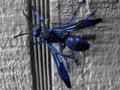
Polistes Azureus Fallacia (Southwestern Blue Wasp)by
AnachroniteComment: Critique Club for Polistes Azureus Fallacia by Anachronite
Composition - I don't know if I ever get sick of looking at insect macros. They seem far more interesting to me than flower macros. I found this an interesting shot, and as I put in my comment during voting, it does not look real. Obviously it isn't as you said. The most noticeable thing regarding the composition is the line that runs under the wasp is distracting to the picture. It is not distracting that it is there, it distracts by making the photo look like it isn't truly horizontal. Putting the line paralell to the frame or at a far more substantial angle I think would've helped this some. I don't believe it is a change that would make or break the photo. Other than that, the general composition is pretty good.
Background - The background itself is pretty good. The line is the only point of note. It isn't like you could ask the bug to land a certain way. What you see is what you get with bugs as far as I'm concerned.
Camera Work - The DOF is really shallow as it is with most macros. This one looks like it might be a little more so than normal as the background might be 1/4" further away than the subject and is quite out of focus. This I find a little troubling. The focus on the wasp is pretty good for the most part. Overall I think the camera work is a little better than fair, or maybe the post-processing of the pic has hurt what we see.
Post-Processing - The biggest issue of this picture to me. I don't like the desaturation of all the colors. It is very unnatural looking. It does make the blue stand out better, but to what end? The only end I see is: to be bluer. Perhaps desat on all the other colors was the only way to make the yellow(or whatever color) on the wasp blue. The feet of the bug being so blue makes them look like they don't belong with the picture, like this subject was just PS'ed onto this background. I am inclined to think that this was sharpened substantially by the hard lines of the insect being pretty crisp and the dull lines of the building remaining pretty dull.
Overall - As much as I've criticized the things in this pic, I really kind of like it. I think there might be a good solid photo that this image evolved from. Even blue, I think this wasp is an interesting subject. It is harder to make something real look fake, than make something fake look real. I'm not fond of the idea of using PS to make a not-blue shot, turn to blue with a couple mouse clicks to make it worthy of the Blue challenge. But on the flip side, it was done legally and in your defense, you told us that it was by the title. Unfortunately Latin is not one of my strong points or I would've been able to affirm what I already suspected. - Inspzil