| Image |
Comment |
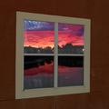
| 01/29/2003 04:52:44 AM |
Reflection of days endby togtogComment: Excellent. Great colors, nice concept and well shot. The one thing I don't like is the difference in colors on the top 2 panes on the bottom outside corners. I think this one should be up there in the rankings though. Nice shot. - Inspzil |
 Photographer found comment helpful. Photographer found comment helpful. |
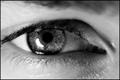
| 01/28/2003 05:42:42 AM |
Window to the Soulby SharQComment: I don't care for this pic. It's too close and not appealing either, part of which may be the too close. I knew someone would do this for this challenge - Inspzil |
| 01/28/2003 05:40:19 AM |
City Windowsby nathaliedooComment: This really looks like an illustration. I think the red side looks good. The yellow side though maybe should've been 2 tone a little more or something to make the windows stand out more. - Inspzil |
| Photographer found comment helpful. |
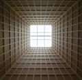
| 01/28/2003 05:34:18 AM |
SkyLightby myqylComment: Cool picture. I love the lines and pattern of this picture a lot. Centered is good too for this shot. great Job |
| 01/28/2003 05:29:23 AM |
All the Shapesby DennisFComment: Very cool arraw of shapes. Doesn't look like the nicest day out. Good job cropping most of that out though. Sometimes no sky is better than white sky - Inspzil |
| Photographer found comment helpful. |
| 01/27/2003 11:24:39 AM |
Seventeenby emorgan49Comment: Critique Club by Inspzil
Composition - Touching tribute emorgan. General composition is ok. I'm not sure how fitting this is for the challenge, but I think it mostly fits. I'd like to see this picture from a few more feet back. I think that the tree shouldn't go to the end of the frame on the right. I like the sky color of this shot. I understand the tribute, but I don't think the general composition of this photo is very appealing to most people. There really isn't anything to WOW anyone. I don't mean any offense by this, it is just not something that I want to see. It's very sad, I know.
Photography - The picture is slightly out of focus. This was probably the biggest reason for the low score. The DOF looks good and the exposure was good, which isn't that easy to do when the sun is in that position. It could've used a little more dramatic lighting somehow. That is a difficult thing to do outside unless you have all day to spend waiting for just the right moment
Processing - You may have been able to sharpen this further with PS. Colors all look pretty true but it wouldn't hurt to boost the saturation a little.
Overall - This picture is unfortunately not terribly interesting to most viewers. It is a very real, sad, and emotional tribute to those people who were involved with this individual. It was not badly taken but could've been clearer. I wish I had something better to tell you emorgan, but this is what I'm seeing. Good luck in future challenges - Inspzil |
| Photographer found comment helpful. |
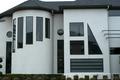
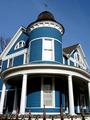
| 01/27/2003 05:53:55 AM |
The Blue Houseby boyte1Comment: Great color. I like the angle and the top of the fence showing as well. - Inspzil |
| Photographer found comment helpful. |
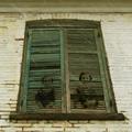
| 01/27/2003 05:51:43 AM |
Souvenirby lionelmComment: Great capture (assuming this is real and not a PS trick). Very interesting subject. I think you could've done something a little more creative with the crop though, depending on the quality of the building - Inspzil |
| Photographer found comment helpful. |
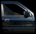
| 01/27/2003 05:49:04 AM |
Custom Tintby spidermanComment: I don't like the oversaturated color of this pic. The rest of the door under the window really isn't adding to this pic so I might have tried to focus on the window. Cool web btw. - Inspzil |
| 01/27/2003 05:46:54 AM |
|
Home -
Challenges -
Community -
League -
Photos -
Cameras -
Lenses -
Learn -
Help -
Terms of Use -
Privacy -
Top ^
DPChallenge, and website content and design, Copyright © 2001-2025 Challenging Technologies, LLC.
All digital photo copyrights belong to the photographers and may not be used without permission.
Current Server Time: 08/15/2025 06:15:43 PM EDT.