| Author | Thread |
|
|
02/11/2003 10:08:33 PM |
Thanks mygyl for your comments, it's certainly means a 1000 words to me. I will take good advantage of your point of view! Also, thank you for your time!
Nathalie |
|
|
|
02/11/2003 09:48:43 AM |
~ Critique Club Comment ~
Note : I don't think I can do 1000 words, but I'll do my best :)
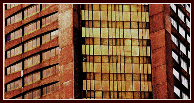
Composition : I'm a big fan of strong, geometric lines and there are plenty of them here. My 1 small nitpick is that on the left side the dark line competes with the border. It seems to add more weight to that side and throws the balance a little off. But that's just to my eye.
Exposure / Lighting : There is a nice even distribution of light here. I like the fact that the darker walls to the right have the brighter windows.
Focus : No issues here.
Post Processing : As many of the comments you received pointed out, it certainly has a "painted" feeling to it. While I am more of a fan of photos looking like photos, you did not go overboard with it to the point of being more digital art then photo, but you certainly flirted with the line. I'm also not a big fan of borders, but you did yours very well (with the exception of that line on the left).
Challenge / Wow : Clearly meets the challenge. "Wow" is in the eye of the beholder and clearly you Wow'd some folks here. For me, the grain got in the way (but what do I know :)
My opinion : While I loved the lines, I wasn't bowled over the grain. I know it was intentional and artistic. But it just didn't work for me. |
|
 Photographer found comment helpful. Photographer found comment helpful. |
Comments Made During the Challenge  |
|
|
02/02/2003 10:00:31 PM |
|
nice colors and textures! |
|
| Photographer found comment helpful. |
|
|
02/02/2003 02:23:48 PM |
|
I love it! Great work. It's getting very late at night where I am, so I'm too tired to elaborate, but I'm giving this 10! |
|
| Photographer found comment helpful. |
|
|
02/02/2003 01:11:22 PM |
|
| Photographer found comment helpful. |
|
|
01/31/2003 02:24:25 PM |
|
Interesting color, and repeating shapes, but it looks like an old industrial building, not a "city" building. In this case, I think I would have preferred a more centered composition, especially if all of the windows on the right side were white - it would seem more balanced that way to me. |
|
| Photographer found comment helpful. |
|
|
01/31/2003 01:22:06 PM |
|
| Photographer found comment helpful. |
|
|
01/30/2003 12:10:35 PM |
|
How would this look with a vertical frame, instead of horizontal? The grainy/contrasty look reminds me of a "retro" look, like during hte 70's or something. |
|
| Photographer found comment helpful. |
|
|
01/29/2003 07:55:23 PM |
Very nice composition and color - even border already. You did not permit yourself to get out of hand with the LOOSE permissive DPC rules for this challenge. High mark.
JEM |
|
| Photographer found comment helpful. |
|
|
01/29/2003 08:26:39 AM |
|
really nice painterly effect. |
|
| Photographer found comment helpful. |
|
|
01/28/2003 11:58:31 AM |
|
| Photographer found comment helpful. |
|
|
01/28/2003 05:40:19 AM |
|
This really looks like an illustration. I think the red side looks good. The yellow side though maybe should've been 2 tone a little more or something to make the windows stand out more. - Inspzil |
|
| Photographer found comment helpful. |
|
|
01/28/2003 01:42:40 AM |
This is intresting. It actually looks alike a drawing. I think I like it.
|
|
| Photographer found comment helpful. |
|
|
01/27/2003 05:09:08 PM |
|
| Photographer found comment helpful. |
|
|
01/27/2003 09:49:07 AM |
|
This looks very grainy to me, not sure if this is what you wanted to achieve. Interestimg shot. |
|
| Photographer found comment helpful. |
Home -
Challenges -
Community -
League -
Photos -
Cameras -
Lenses -
Learn -
Help -
Terms of Use -
Privacy -
Top ^
DPChallenge, and website content and design, Copyright © 2001-2026 Challenging Technologies, LLC.
All digital photo copyrights belong to the photographers and may not be used without permission.
Current Server Time: 06/29/2026 09:57:20 AM EDT.