| Image |
Comment |
| 02/01/2003 05:07:54 AM |
|
 Photographer found comment helpful. Photographer found comment helpful. |
| 02/01/2003 05:06:38 AM |
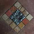
14 Squaresby DennisFComment: Neat colors. Reminds me of a tile pattern. Cool center tile though. - Inspzil |
| 02/01/2003 04:58:34 AM |
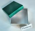
Meet Spot, my pet square.by SonifoComment: I don't get it. The composition is not saying anything to me here. That or it's a very unusual die. Would make games much less interesting. - Inspzil |
| Photographer found comment helpful. |
| 02/01/2003 04:56:52 AM |
|
| 02/01/2003 04:56:10 AM |
|
| 02/01/2003 04:48:35 AM |
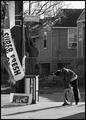
The Intersection of Humanity and Right Nowby mjcecilComment: Critique Club by Inspzil
Composition - The first thing that comes to my attention about this photo is that it has a very photojournalistic look to it. The slight graininess of the pic, black and white and candid, all contribute to my initial thought. The young lady is little further from center than I'd prefer to see but no harm done. Maybe standing back a few feet would have been better. The stuff hanging on the pole and falling off the pole are indicative of the area she's from and also goes a little deeper I think regarding man vs. nature. The houses in the background provide us with some nice texture and her shadows gives some depth. The other shadow that cuts the corner off is a bit distracting but there isn't much to do about that. Composition is everything in this shot. I think this is a great candid.
Photography - This looks like it might've been a little tricky to expose. And I think you hit the nail on the head. The long shadows indicate the sun is pretty low and bright. The slightly darker exposure adds to the mood of this photo a lot. The higher ISO adds the little bit of grain to this photo and it looks great adding to the photojournalistic quality of this pic.
Processing - Desaturating was a great idea. Good choice
Overall - I'm not sure what people were thinking on this one. I'll read the other comments after I'm done. I think this is very well composed and shot. I mentioned a couple of minor things compositionally, but I think this is a great pic. The choice of street names to use is great. The title is clever and well thought out IMO. It definitely meets the challenge. I enjoyed critiquing this photo and I'm glad you shared it. Good job with this one. - Inspzil
|
| 01/31/2003 01:22:04 PM |
All Sides Equal...by DavenitComment: Not wild about the composition, but I can't argue that this is definitely a clear, sharp and well taken photo - Inspzil |
| 01/31/2003 01:19:57 PM |
Looking Throughby PaigeComment: the mood is definitely helped by the choice of black and white. Good composition. Nice sharp photo. - Inspzil |
| Photographer found comment helpful. |
| 01/31/2003 01:13:34 PM |
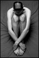
My preciousssby RefractedComment: Make this clearer, even if just the hands, and I think it gets a ribbon. - Inspzil |
| Photographer found comment helpful. |
| 01/31/2003 01:08:51 PM |
No Squaresby SeekerComment: Definitely original. Looks like a floor tile pattern for a very modern house. I like the idea and I think it was pretty well put on film so to speak. Nice shot - Inspzil |
Home -
Challenges -
Community -
League -
Photos -
Cameras -
Lenses -
Learn -
Help -
Terms of Use -
Privacy -
Top ^
DPChallenge, and website content and design, Copyright © 2001-2025 Challenging Technologies, LLC.
All digital photo copyrights belong to the photographers and may not be used without permission.
Current Server Time: 08/16/2025 06:15:11 PM EDT.