| Author | Thread |
|
|
02/01/2003 04:48:35 AM |
Critique Club by Inspzil
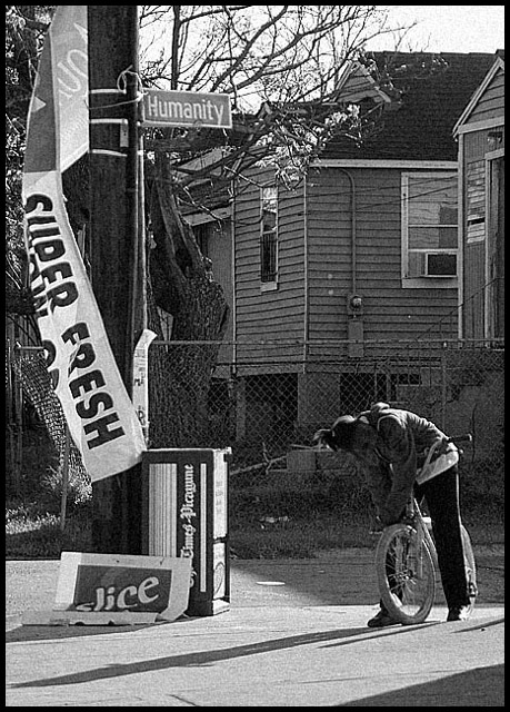
Composition - The first thing that comes to my attention about this photo is that it has a very photojournalistic look to it. The slight graininess of the pic, black and white and candid, all contribute to my initial thought. The young lady is little further from center than I'd prefer to see but no harm done. Maybe standing back a few feet would have been better. The stuff hanging on the pole and falling off the pole are indicative of the area she's from and also goes a little deeper I think regarding man vs. nature. The houses in the background provide us with some nice texture and her shadows gives some depth. The other shadow that cuts the corner off is a bit distracting but there isn't much to do about that. Composition is everything in this shot. I think this is a great candid.
Photography - This looks like it might've been a little tricky to expose. And I think you hit the nail on the head. The long shadows indicate the sun is pretty low and bright. The slightly darker exposure adds to the mood of this photo a lot. The higher ISO adds the little bit of grain to this photo and it looks great adding to the photojournalistic quality of this pic.
Processing - Desaturating was a great idea. Good choice
Overall - I'm not sure what people were thinking on this one. I'll read the other comments after I'm done. I think this is very well composed and shot. I mentioned a couple of minor things compositionally, but I think this is a great pic. The choice of street names to use is great. The title is clever and well thought out IMO. It definitely meets the challenge. I enjoyed critiquing this photo and I'm glad you shared it. Good job with this one. - Inspzil
|
|
Comments Made During the Challenge  |
|
|
01/26/2003 11:20:11 PM |
|
nice black and white photo |
|
|
|
01/26/2003 08:12:16 AM |
|
Nice shot, but looks very grainy. |
|
|
|
01/26/2003 01:45:24 AM |
|
Interesting feel to this photo. Raw, rough. You succeeded in achieving that effect. The super fresh banner really demands my attention - kind of takes away from the humanity street sign. Not sure what the purpose of the biker is. 6 md |
|
|
|
01/24/2003 12:49:21 AM |
|
sorry, I don't get the meaning. . . Nice b&w, nice and sharp. |
|
|
|
01/23/2003 03:01:14 PM |
|
I like the gritty alley feel of this foto. The abused fence, the draped signage, the long shadows, the hunched over figure in front of stairs and the grey shadowed homes are among the visual elments that call my attention. A welcome change of vibrant reality edge street photography as opposed to clinical studio shots. Very good vision and quick reflexes. |
|
|
|
01/22/2003 10:27:11 PM |
|
there is a lot of noise in this picture. i really like the composition though. it is quite telling of the situation and neighborhood at hand. good catch |
|
|
|
01/22/2003 10:10:06 PM |
|
Wonderful. I feel this would have done well in a challenge like photojournalism as well! |
|
|
|
01/21/2003 11:17:11 PM |
|
Sad moving photo. Wish I could have seen the child's face a bit more. |
|
|
|
01/21/2003 08:52:54 PM |
|
Cool photo, makes me miss Metairie seeing the newspaper box in the photo =o) Can't help myself I love the photo, it's a 10... |
|
|
|
01/21/2003 06:13:24 PM |
|
Interesting shot. Too bad the person in the shot clothes are so similar to skin color (seems grainy, too). Most everything else looks crisp and clear. 7 Swash |
|
|
|
01/21/2003 05:38:59 PM |
|
Excellent. Nice and grainy. |
|
|
|
01/21/2003 11:45:29 AM |
|
Just a little dark but says a lot. The shadow of the guy on the bicycle seems to say it all. Great shot. Worth an 8. |
|
|
|
01/21/2003 04:18:01 AM |
|
|
|
01/20/2003 01:41:40 PM |
|
This is an interesting shot. I don't know why. |
|
|
|
01/20/2003 11:47:53 AM |
|
Moving and humbling photo. The street name brings to mind the phrase "man's inhumanity to man". Total conent is excellent and black/white gives it the proper tone. Good depth and clarity. |
|
|
|
01/20/2003 10:17:29 AM |
|
Interesting sign - I like the b&w but I would have liked the pic better without the bike |
|
Home -
Challenges -
Community -
League -
Photos -
Cameras -
Lenses -
Learn -
Help -
Terms of Use -
Privacy -
Top ^
DPChallenge, and website content and design, Copyright © 2001-2026 Challenging Technologies, LLC.
All digital photo copyrights belong to the photographers and may not be used without permission.
Current Server Time: 06/28/2026 04:34:46 PM EDT.