|
|
|
Showing 9281 - 9290 of ~9584 |
| Image |
Comment |
| 06/16/2005 06:20:44 PM | Hungry birdby RUEDISCHMUTZComment: Nice shot - A little too much glare on the white feathers (IMHO), but still a looker. :-) 6. |  Photographer found comment helpful. Photographer found comment helpful. |
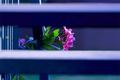
| 06/15/2005 04:36:30 PM | View From The Stairsby joyinlightComment: * Greetings from the Critique Club *
First of all, let me say that I think your entry perfectly meets the Challenge. You've used a naturally occurring obstacle (the slats of a blind) to bring the viewers' focus to the flowers visible.
I like the colors you've chosen and the post-processing effort to ismaintain this color bias. The blues offset the purples & magenta tones of the flowers quite nicely.
The crop is also quite good (IMHO). You manage to provide enough of an "overall"appearance through the available sightholes, so that it only accents the emphasis you obviously planned.
I think one thing that actually detracts from your entry is the almost surreal illusion of color broadcast from outside. Your post-processing emphasizes the blues & purples, but almost leaves out the other colors completely. While this can be an artistic choice, I'm not sure (IMHO) that it works in this particular instance. I think you have more than enough depth and composition to support the work without relying on simple tricks. (Please don't get me wrong, I think this is still a very strong entry & shot on its own.) I am just trying to convey the feeling that this particular image brings to my mind.
All interpretations are just that... individual interpretations. And you'll have to come to grips with the fact that (and trust me, I'm still kicking and screaming!), that it's YOUR OPINION that matters most. Oddly enough, when an artist feels strongly enough about his/her work, then the quality shines through in ways that even the artist didn't anticipate.
I'm no expert, but I think overall you have a very nice shot. The lighting & cropping are good. It meets the challenge very well. And I like the fact that it's a "pleasant" image that lies beyond the borders of the window slats.
Just my 2 cents...
Jimmy
|
| 06/15/2005 02:54:17 PM | boy's aspirationby les0910Comment: * Greetings from the Critique Club *
First of all let me say that it is a beautiful shot. I think it meets the Naturally Framed Challenge quite well.
As far as the composition goes, I think it's right on the money. You really get the feel for being up in the tree next to the boy. The blurred leaves in the top foreground (IMHO) are a nice touch. It adds to the "natural framing" around the boy.
And as far as the clarity goes, I think you did a very nice job ensuring that the main subject (boy) is quite well focused - with the exception of a few spots on his jeans. The bark of the tree limbs & tree trunk are also pretty defined. That one branch in the right hand portion of the screen that's blurred is a bit of a distraction though.
The expression on the boy's face is great! Also the soft "pure new person" feel that his skin tones have really add to the innocence of the image.
I think you could have easily oversaturated this shot in processing, but you didn't. The somewhat muted tones work very well and provide a nice balance of tones throughout the shot.
The lines are good too (with the exception of that wayward limb). Your crop draws my eyes first up the boy's body to his head & eyes, then back down to his shoes (for whatever reason). They're cute sandals, but I'm not sure why my eye continued to travel down there (unless it has to do with the fact that the subject is toward the top of the crop. I'm not exactly sure whether I feel that it is a good or bad thing - just an observation.
One other observation - I wish his diaper/in-between potty training undies weren't visible. I'm sure this is a minor thing, but I imagine that the boy would like them to NOT be visible later in life when his mother is showing off this pic! LOL
All in all, I think this is a very nice shot. It has a very soft and warm feel of purity and family. Both great qualities for a portrait shot! Good job!
Just my 2 cents...
Jimmy
| | Photographer found comment helpful. |
| 06/15/2005 08:30:11 AM | | | Photographer found comment helpful. |
| 06/14/2005 07:10:48 PM | The Hobbitby CalliopeKelComment: Very cool... Nice composition, representation, and placement of the ring. I'm impressed - not to mention a HUGE fan of LOTR! :-) | | Photographer found comment helpful. |
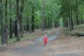
| 06/14/2005 04:52:07 PM | Wheres Homeby therooComment: * Greetings from the Critique Club *
First of all let me say that I remember this image from the Decisions Challenge vividly. That fact alone should tell you that it certainly evoked an emotional response from me. I scored it a 7. (And regardless of the emotion, isn't that what we're really here to do?)
There were several things that were distractions for me. The focus of the overall image seemed a bit off. The composition and colors are great - don't get me wrong - but the lack of detail in both the subject (child) and the surroundings (trees & leaves) detracted from the overall statement.
I think this met the challenge quite well and in a very unique way... I think what you depicted here was clearly indecision. I could literally hear the various options running through the poor kid's head. It evoked an immediate sense of empathy - as we've all been lost before in one sense or another.
This image did lack the *pizzazz* or *pop* that could really make it speak to the viewer, I think mainly due to the fact that most of the elements are OOF. The colors are good (although I think they could be turned up a bit - along with the contrast). Reducing the backlighting might also bring more detail to the viewer. I'm not very adept at layering, but I think that some "glow" of layered images might also add to the depth of the shot - as long as the initial image is very crisp & clean.
One other thing that I notice is that I'm not sure the shot is actually straight - the horizon seems a hair (one or two pixels) off. I'm constantly amazed at how much of an impact this slight correction can make - you don't think that such a small degree of alteration could make a difference, but in reality it really does.
All in all, a very good idea, extremely well composed, and perfectly meets the challenge (IMHO). I do think you could further improve on it with some additional post-processing work.
Nice job!
Just my 2 cents...
Jimmy Message edited by author 2005-06-14 16:56:44. |
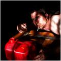
| 06/14/2005 04:40:06 PM | Her Last...by danderson107Comment: * Greetings from the Critique Club *
First of all, I remember this entry from the Decisions Challenge vividly. That should validate any concerns you may have about it evoking an emotion - because it certainly did with me instantly.
This may sound a bit odd, but I found the model's completely non-plussed expression to be wonderful, but it was juxtaposed to her obviously excited breast. The nudity didn't bother me at all - I found it to be both tastefully done and appropriate, given the subject matter. I think that the image might have been even more powerful without showing the erect nipple. (That may be getting a bit too graphic for the Critique Club, but I'm just going with my basic impressions...)
I really like the blood pooled by the razorblade - that was a nice and realistically validating element to the shot. I did notice however, that it was very neat. I wouldn't think this is actually the case in an actual suicide attempt (and I've seen a few - they're quite messy usually). It did make the artistic statement of blood and gore quite nicely though, without being overly grotesque.
The focus and lighting were my main issues with the shot. The composition was superb and it definitely met the challenge completely. There is a certain degree of graininess to the model's appearance that is a little distracting (however, I understand that that may have been an artistic choice - it just didn't work for me). IMHO, I thought the shot was exceptionally well-thought-out and composed. I think you could have cut down on some of the glare from the lighting (however, again, I think this may have been a conscious choice to create a "harsh" scene - it just didn't work for me).
You did a beautiful job of creating an atmosphere and an obvious decision - however untenable some viewers might find the image. Personally, I thought that it perfectly met the challenge and was a very artistic rendition of a very real scenario. There is absolutely no remorse in the model's eyes (which I found to be both intriguing and disturbing).
Well I hope you've found my comments useful. I think you made a very strong entry for the challenge and an uninhibited statement on its own. Very nice work (IMHO).
Just my 2 cents...
Jimmy
| | Photographer found comment helpful. |
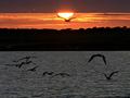
| 06/14/2005 04:03:55 PM | CRW_8891_copy.jpgby andriComment: Nice shot. You've managed to retain the detail on the flying gulls very well. | | Photographer found comment helpful. |
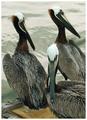
| 06/14/2005 03:58:36 PM | The Pelicansby davidbedardComment: This is a great shot. I love the composition. What really detracts from it though (IMHO) is the glare on the water. I think with some selective processing you could reduce the light & glare on the water and draw the viewers' attention more to the primary subjects. Currently, I think the color of the light on the water and the color of the pelicans' head are too similar - it makes the birds appear to be washed out (when in fact they're not, they're great - it's the water). I think you could desaturate the water and add a gaussian blur to it in several layers to really make the water add to the pic instead of detract. Nice work though. (6) | | Photographer found comment helpful. |
| 06/14/2005 03:54:54 PM | 'dove'by suemackComment: This is so majestic... That's the word that immediately leaps to my mind when I see this image. There's a little too much glare on the dove (IMHO), but the sky and overall colors are superb! The crop really adds to this shot too. Well done. (8) | | Photographer found comment helpful. |
|
Showing 9281 - 9290 of ~9584 |
Home -
Challenges -
Community -
League -
Photos -
Cameras -
Lenses -
Learn -
Help -
Terms of Use -
Privacy -
Top ^
DPChallenge, and website content and design, Copyright © 2001-2025 Challenging Technologies, LLC.
All digital photo copyrights belong to the photographers and may not be used without permission.
Current Server Time: 06/21/2025 11:31:14 PM EDT.
|