| Author | Thread |
|
|
06/14/2005 04:52:07 PM |
* Greetings from the Critique Club *
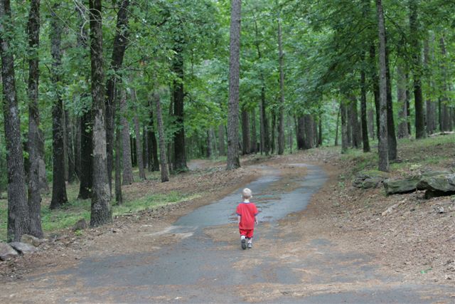
First of all let me say that I remember this image from the Decisions Challenge vividly. That fact alone should tell you that it certainly evoked an emotional response from me. I scored it a 7. (And regardless of the emotion, isn't that what we're really here to do?)
There were several things that were distractions for me. The focus of the overall image seemed a bit off. The composition and colors are great - don't get me wrong - but the lack of detail in both the subject (child) and the surroundings (trees & leaves) detracted from the overall statement.
I think this met the challenge quite well and in a very unique way... I think what you depicted here was clearly indecision. I could literally hear the various options running through the poor kid's head. It evoked an immediate sense of empathy - as we've all been lost before in one sense or another.
This image did lack the *pizzazz* or *pop* that could really make it speak to the viewer, I think mainly due to the fact that most of the elements are OOF. The colors are good (although I think they could be turned up a bit - along with the contrast). Reducing the backlighting might also bring more detail to the viewer. I'm not very adept at layering, but I think that some "glow" of layered images might also add to the depth of the shot - as long as the initial image is very crisp & clean.
One other thing that I notice is that I'm not sure the shot is actually straight - the horizon seems a hair (one or two pixels) off. I'm constantly amazed at how much of an impact this slight correction can make - you don't think that such a small degree of alteration could make a difference, but in reality it really does.
All in all, a very good idea, extremely well composed, and perfectly meets the challenge (IMHO). I do think you could further improve on it with some additional post-processing work.
Nice job!
Just my 2 cents...
Jimmy
Message edited by author 2005-06-14 16:56:44. |
|
|
|
06/08/2005 09:43:36 PM |
|
|
|
06/08/2005 09:43:24 PM |
Originally posted by zamboni:
well this is scary, poor little boy! |
|
|
|
|
06/08/2005 09:43:01 PM |
|
|
|
06/08/2005 09:42:48 PM |
Originally posted by popdeepop:
Thought this was to see Grandma. |
|
|
|
|
06/08/2005 09:41:58 PM |
|
Thank you for your comment, He wasn't far from his family. |
|
|
|
06/08/2005 09:40:55 PM |
Originally posted by ShadowVengance:
thats tragicly sad....I feel sorry for the little guy. You didnt really loose him did you? !?!?!?!? |
|
|
|
|
06/08/2005 09:40:34 PM |
Originally posted by dockode:
I don't feel that the image conveys instantly recognizable decision. Good pic. |
|
|
|
|
06/08/2005 09:39:59 PM |
|
|
|
06/08/2005 09:39:48 PM |
Originally posted by ladymonarda:
In your editing program, I think a little better focus would have strengthened the image. Maybe more cropping from the top and sides would have added a better dimension to the subject of the boy. The contrast of red amongst the green, though, really works. |
|
|
|
|
06/08/2005 09:39:30 PM |
|
|
|
06/08/2005 09:39:01 PM |
Originally posted by ladymonarda:
In your editing program, I think a little better focus would have strengthened the image. Maybe more cropping from the top and sides would have added a better dimension to the subject of the boy. The contrast of red amongst the green, though, really works. |
|
|
Comments Made During the Challenge  |
|
|
06/02/2005 05:06:39 PM |
|
In your editing program, I think a little better focus would have strengthened the image. Maybe more cropping from the top and sides would have added a better dimension to the subject of the boy. The contrast of red amongst the green, though, really works. |
|
 Photographer found comment helpful. Photographer found comment helpful. |
|
|
06/02/2005 12:57:15 PM |
|
that child looks so lost. its very cool. |
|
| Photographer found comment helpful. |
|
|
06/02/2005 01:22:26 AM |
|
I don't feel that the image conveys instantly recognizable decision. Good pic. |
|
| Photographer found comment helpful. |
|
|
06/01/2005 10:07:23 PM |
|
thats tragicly sad....I feel sorry for the little guy. You didnt really loose him did you? !?!?!?!? |
|
| Photographer found comment helpful. |
|
|
06/01/2005 05:37:14 PM |
|
Thought this was to see Grandma. |
|
| Photographer found comment helpful. |
|
|
06/01/2005 12:41:01 PM |
|
well this is scary, poor little boy! |
|
| Photographer found comment helpful. |
Home -
Challenges -
Community -
League -
Photos -
Cameras -
Lenses -
Learn -
Help -
Terms of Use -
Privacy -
Top ^
DPChallenge, and website content and design, Copyright © 2001-2026 Challenging Technologies, LLC.
All digital photo copyrights belong to the photographers and may not be used without permission.
Current Server Time: 06/29/2026 05:12:16 AM EDT.