| Image |
Comment |
| 04/26/2005 03:13:46 PM |
Zuni Butterflyby GeneralEComment: Original piece and ad design. Many probably won't get the name play on the musical group. The silver needs to be more brilliant and there needs to be more contrast. Placement and Comp are excellent. |
 Photographer found comment helpful. Photographer found comment helpful. |
| 04/26/2005 03:06:56 PM |
|
| Photographer found comment helpful. |
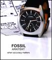
| 04/26/2005 02:49:46 PM |
Arkitektby sbeaumontComment: Funny tag line. Needs capital letters.... Very ice composition. I like how you left room on the bottom for more or different text, This ad would be a good starting point and after some text (I.E. content and font) revisions, would work for me |
| Photographer found comment helpful. |
| 04/26/2005 02:38:20 PM |
|
| Photographer found comment helpful. |
| 04/26/2005 02:38:01 PM |
Go Aheadby StrikeslipComment: Nice composition and text placementI think a Deeper DOF would have solved the crispness problem I see. (maybe more contrast too) |
| Photographer found comment helpful. |
| 04/26/2005 02:35:32 PM |
midas jewellersby naomikComment: Such a nice job. Great placement, nice detail too. (If you overlook the misspelling) Everything stands out well. |
| Photographer found comment helpful. |
| 04/26/2005 02:33:08 PM |
Defining Beautyby arnitComment: This is such a great photo and I believe that I recognize arnit's model.(whose skill I greatly admire) However, I don't get the sense that its an ad for jewelery. Maybe for skin lotion. Technically its perfect. but I don't believe it would sell the bling/bling. |
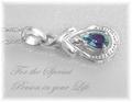
| 04/26/2005 02:30:54 PM |
For that special someoneby trainComment: I like the Comp here but it doesn't jump out at me.Crisper shot of the piece and a different color font would make this a very,very nice entry. |
| 04/26/2005 02:28:54 PM |
Diamonds Foreverby kevrobertsonComment: Very origianl and I llike the way you used the shape to place the text. Great dof but the peice itself needs to be crisper as it is what you're trying to sell. |
| Photographer found comment helpful. |
| 04/26/2005 02:27:10 PM |
|
| Photographer found comment helpful. |
Home -
Challenges -
Community -
League -
Photos -
Cameras -
Lenses -
Learn -
Help -
Terms of Use -
Privacy -
Top ^
DPChallenge, and website content and design, Copyright © 2001-2025 Challenging Technologies, LLC.
All digital photo copyrights belong to the photographers and may not be used without permission.
Current Server Time: 08/10/2025 01:47:41 PM EDT.