| Author | Thread |
Comments Made During the Challenge  |
|
|
05/01/2005 11:02:23 PM |
|
Great presentation. Very nice lighting and background. |
|
 Photographer found comment helpful. Photographer found comment helpful. |
|
|
05/01/2005 07:30:21 PM |
|
A very appropiate font to match the subject. Something gives the illusion that the type has a tilt and climbs up to the right. However, this is very minor in consideration of the well composed image. Bumping up. |
|
| Photographer found comment helpful. |
|
|
05/01/2005 06:00:16 PM |
|
| Photographer found comment helpful. |
|
|
05/01/2005 12:52:54 PM |
|
LOL, I actually really like this. |
|
| Photographer found comment helpful. |
|
|
05/01/2005 12:04:34 AM |
|
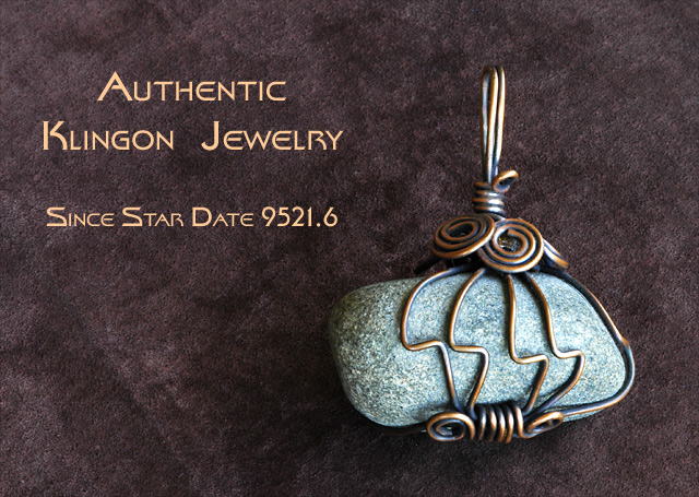
LOL, well another trekker on DPC, cool. Authentic, that i'd have to see! Cool shot, although there really is nothing 'special' about it unfortunatly. I'd loved to see a very hard 'Klingon Empire' themed setting with the jewel (metal, rust, red, dirty...). 6 |
|
| Photographer found comment helpful. |
|
|
04/30/2005 03:36:49 PM |
|
Not only stylish, but doubles as a battle-axe. |
|
| Photographer found comment helpful. |
|
|
04/30/2005 02:32:00 PM |
|
Very creative, love the concept. Pendant is out of focus slightly on the top, and the background is a little distracting |
|
| Photographer found comment helpful. |
|
|
04/30/2005 03:46:45 AM |
|
nice one well thought out. 7 |
|
| Photographer found comment helpful. |
|
|
04/30/2005 12:14:48 AM |
|
Nice background and beautiful peice of jewelry. 8 |
|
| Photographer found comment helpful. |
|
|
04/29/2005 11:17:55 PM |
|
Unique ... I wonder what the Romulans are wearing? :) |
|
| Photographer found comment helpful. |
|
|
04/29/2005 11:15:16 PM |
|
Cute idea. I think a bit more saturation might have improved the shot, but great as is. 9. |
|
| Photographer found comment helpful. |
|
|
04/29/2005 10:37:20 PM |
|
Simplicity, nice background, colors complement well. Cool piece of jewelry as well!! 8 |
|
| Photographer found comment helpful. |
|
|
04/29/2005 04:01:50 PM |
|
Perfect text selection, and great originality. |
|
| Photographer found comment helpful. |
|
|
04/29/2005 01:38:46 PM |
|
Enjoy seeing something out of the ordinary. Live long and prosper! |
|
| Photographer found comment helpful. |
|
|
04/29/2005 06:55:56 AM |
|
Nice! Love the star trek addition. The color saturation in the stone is nice. I like the contrast on the gold? the background is a nice addition also 10 |
|
| Photographer found comment helpful. |
|
|
04/28/2005 10:32:16 PM |
|
cool...I can appreciate this! |
|
| Photographer found comment helpful. |
|
|
04/28/2005 04:02:47 PM |
|
| Photographer found comment helpful. |
|
|
04/28/2005 02:12:11 PM |
|
Hahaha. I do like the colors and layout. Great text. 8 |
|
| Photographer found comment helpful. |
|
|
04/27/2005 03:15:21 PM |
|
Good idea, nice to see some humor. |
|
| Photographer found comment helpful. |
|
|
04/27/2005 10:39:55 AM |
|
Nice choice of background material. Interesting jewelry piece. Go Trekkies! ;^) No, I'm not one, but I used to watch the show. I think you've balanced this photo and text very well. The lighting and focus is fine too. Good luck in the challenge. |
|
| Photographer found comment helpful. |
|
|
04/27/2005 09:01:31 AM |
|
| Photographer found comment helpful. |
|
|
04/26/2005 07:06:09 PM |
|
Nice shot, right on topic. |
|
| Photographer found comment helpful. |
|
|
04/26/2005 02:27:10 PM |
|
Nice job. Humorous. Great font but needs a crisper shot of the rock itself. |
|
| Photographer found comment helpful. |
|
|
04/26/2005 01:15:23 PM |
|
Interesting piece. The text in this "advertizement" takes away from the jewelry, though. |
|
| Photographer found comment helpful. |
|
|
04/26/2005 12:56:41 PM |
|
good pic but hate the text. the font is ok, but the placement and sizing is really static and ordinary. i would have asked a graphic design friend to help - or just left it off. |
|
| Photographer found comment helpful. |
|
|
04/26/2005 10:20:38 AM |
|
Not sure about the background color, however well done and very creative. |
|
| Photographer found comment helpful. |
|
|
04/26/2005 05:10:44 AM |
|
| Photographer found comment helpful. |
|
|
04/26/2005 02:29:13 AM |
|
nice advertisment nice jewelry |
|
| Photographer found comment helpful. |
|
|
04/25/2005 08:41:28 PM |
|
Couldn't be any better. Love the text, light, and background. |
|
| Photographer found comment helpful. |
|
|
04/25/2005 07:02:23 PM |
|
This is creative and unusual, but very good..I like the Klingon jewelry too! The background sets off the stone well, the detail is good on the wire wrapping..it is just plain cool..7 |
|
| Photographer found comment helpful. |
|
|
04/25/2005 05:58:35 PM |
* Chuckle *
Quite the unique approach to this challenge.
Design & layout are good, as is the lighting & detail |
|
| Photographer found comment helpful. |
|
|
04/25/2005 01:48:13 PM |
|
Very creative and unique, good job! |
|
| Photographer found comment helpful. |
|
|
04/25/2005 01:38:45 PM |
Composition: Excellent
Lighting: a little glare on metal but not overly so
Color: excellent
Clarity:excellent
Lettering: Fits add perfectly |
|
| Photographer found comment helpful. |
|
|
04/25/2005 01:14:21 PM |
|
Hello Trekkie !! Nice picture ! |
|
| Photographer found comment helpful. |
|
|
04/25/2005 11:18:49 AM |
|
Love the idea. Not sure how many people will get it. I gave it a 7. |
|
| Photographer found comment helpful. |
|
|
04/25/2005 09:57:45 AM |
|
I like it. Nice background too. |
|
| Photographer found comment helpful. |
|
|
04/25/2005 04:53:02 AM |
|
cool! do you also sell klingon batleth's! great job. 8 |
|
| Photographer found comment helpful. |
|
|
04/25/2005 02:58:58 AM |
|
Very creative and pleasant to look at...good luck!! |
|
| Photographer found comment helpful. |
|
|
04/25/2005 02:05:45 AM |
|
Nice photo and humor too. Thanks for th chuckle! |
|
| Photographer found comment helpful. |
|
|
04/25/2005 02:03:46 AM |
|
Cute, I like it. A little high on the brightness, but lighting is a real issue for me as well. |
|
| Photographer found comment helpful. |
|
|
04/25/2005 12:34:50 AM |
|
nice colors...harmony :-) gl with photo... |
|
| Photographer found comment helpful. |
|
|
04/25/2005 12:27:40 AM |
|
very nice...font works with necklace..colors work well together and lighting is nice |
|
| Photographer found comment helpful. |
Home -
Challenges -
Community -
League -
Photos -
Cameras -
Lenses -
Learn -
Help -
Terms of Use -
Privacy -
Top ^
DPChallenge, and website content and design, Copyright © 2001-2026 Challenging Technologies, LLC.
All digital photo copyrights belong to the photographers and may not be used without permission.
Current Server Time: 06/28/2026 09:09:14 AM EDT.