| Author | Thread |
|
|
05/02/2005 12:17:56 AM |
Originally posted by snackwells:
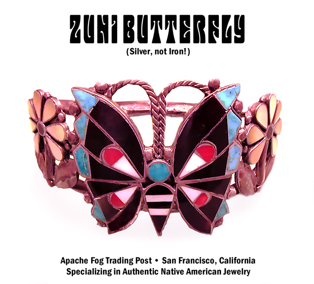
I like the lighting here but it has a pinkish cast to it which may actually reflect the true color of this piece, but appears somewhat odd. I think this works very well for an advertisement. 7 |
Thanks for this and all the other comments. This is probably another case of my red-green color-blindness showing up ... I just don't notice things like a "pinkish cast" in many cases.
I must have an extra space character in the lower type, because it was a centered block according to Photoshop; I guess it could have been a little smaller, but I hate ads which make you get out a magnifying glass to read the phone number or whatever. |
|
Comments Made During the Challenge  |
|
|
05/01/2005 11:51:13 PM |
|
bumping up....I like this much more second time around |
|
 Photographer found comment helpful. Photographer found comment helpful. |
|
|
04/30/2005 05:59:51 PM |
|
great design and eye catching works well 8 |
|
| Photographer found comment helpful. |
|
|
04/30/2005 02:54:05 PM |
|
Background is too harsh for this very detailed piece of jewelry |
|
| Photographer found comment helpful. |
|
|
04/30/2005 07:58:02 AM |
|
interesting piece of jewelry. I had problems getting my white perfect. GL |
|
| Photographer found comment helpful. |
|
|
04/29/2005 11:35:35 PM |
|
Simple and basic ... good job. |
|
| Photographer found comment helpful. |
|
|
04/29/2005 10:35:48 PM |
|
Nice - especially without any shadow. Crisp, clear, good choice of font. Well done. |
|
| Photographer found comment helpful. |
|
|
04/29/2005 04:03:44 PM |
|
Definitely has that "wow" quality to the photo. Excellent job! |
|
| Photographer found comment helpful. |
|
|
04/29/2005 01:39:47 AM |
|
Zuni Butterfly is a little hard to read. Otherwise not an overpowering advertisement. Good though! |
|
| Photographer found comment helpful. |
|
|
04/28/2005 09:04:58 PM |
|
Not a bad picture, but I am not thrilled. |
|
| Photographer found comment helpful. |
|
|
04/28/2005 01:46:21 PM |
|
I love this one. It doesn't shout "creative", it just renders the object skilfully and incorporates simple, effective text and a striking title font that works very well. |
|
| Photographer found comment helpful. |
|
|
04/27/2005 08:41:40 PM |
|
Interesting piece and nice lighting. The upper text might be a little overpowering, but overall a very good ad. |
|
| Photographer found comment helpful. |
|
|
04/27/2005 06:17:49 PM |
|
Nice and sharp. Good ad - the text fits well. Good luck. |
|
| Photographer found comment helpful. |
|
|
04/27/2005 03:57:48 PM |
|
I'm not too sure about the lighting. On my screen this silver looks purple or pinkish. |
|
| Photographer found comment helpful. |
|
|
04/27/2005 01:17:05 PM |
|
i dont like the colors... your silver looks like bronze. nice composition. |
|
| Photographer found comment helpful. |
|
|
04/26/2005 05:55:48 PM |
|
| Photographer found comment helpful. |
|
|
04/26/2005 03:13:46 PM |
|
Original piece and ad design. Many probably won't get the name play on the musical group. The silver needs to be more brilliant and there needs to be more contrast. Placement and Comp are excellent. |
|
| Photographer found comment helpful. |
|
|
04/26/2005 01:00:04 PM |
|
lower text too big. pic and text not centered (even on each other) so alignment seems haphazard. |
|
| Photographer found comment helpful. |
|
|
04/26/2005 03:33:04 AM |
|
nice jewelry and original pieces |
|
| Photographer found comment helpful. |
|
|
04/25/2005 09:15:11 PM |
|
Great choice of lettering for the title! 9 |
|
| Photographer found comment helpful. |
|
|
04/25/2005 04:38:52 PM |
|
I like the lighting here but it has a pinkish cast to it which may actually reflect the true color of this piece, but appears somewhat odd. I think this works very well for an advertisement. 7 |
|
| Photographer found comment helpful. |
|
|
04/25/2005 04:07:27 PM |
Main title font kind of hurts this one in my opinion.
Hard to read, and the caption "Silver, not Iron!" almost doesn't belong in an advertisement in my opinion.
A unique take on this challenge and the photography is good overall. |
|
| Photographer found comment helpful. |
|
|
04/25/2005 12:59:18 PM |
interesting colors and nice jewelry
|
|
| Photographer found comment helpful. |
|
|
04/25/2005 04:58:19 AM |
|
great lighting. nice background. well done |
|
| Photographer found comment helpful. |
|
|
04/25/2005 01:58:54 AM |
|
yeahhhhhhhhhhhhh...someone that used a font that went well with jewelry...gj...9 |
|
| Photographer found comment helpful. |
|
|
04/25/2005 01:56:30 AM |
|
Colour on the silver makes it hard to believe it is silver, but otherwise a very nice photo. |
|
| Photographer found comment helpful. |
|
|
04/25/2005 01:23:30 AM |
|
beautiful piece of jewelry!!!! |
|
| Photographer found comment helpful. |
|
|
04/25/2005 01:09:21 AM |
|
| Photographer found comment helpful. |
Home -
Challenges -
Community -
League -
Photos -
Cameras -
Lenses -
Learn -
Help -
Terms of Use -
Privacy -
Top ^
DPChallenge, and website content and design, Copyright © 2001-2026 Challenging Technologies, LLC.
All digital photo copyrights belong to the photographers and may not be used without permission.
Current Server Time: 07/01/2026 11:00:14 AM EDT.