| Image |
Comment |
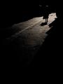
| 05/04/2005 11:35:22 AM |
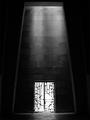
Nuit Américaineby jjbeguinComment: Great shot and title. At first I thought it was a bit too dark, but now i like it for beeing dark and simple, just as it is. Good job. |
 Photographer found comment helpful. Photographer found comment helpful. |
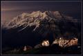
| 05/04/2005 11:33:18 AM |
Mt. Timpanogosby fifieldComment: Awesome picture. While some other entries look like postcards, this one looks almost like a painting. The subject is just beautiful, and so is the sky, with its pink tones. This one has to have a ribbon! 10 |
| Photographer found comment helpful. |
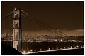
| 05/04/2005 11:30:41 AM |
San Francisco by gaurawaComment: Love this one - it looks like a postcard. Composition is very good and the sepia tone makes it stand out. Good job. |
| Photographer found comment helpful. |
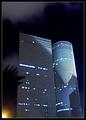
| 05/04/2005 11:29:07 AM |
Geometryby JinjitComment: Great shot and title! The only thing I'm not too fond of is the light in the low left corner. Apart from that, the image is rather appealing, with very good definition/quality and well balanced. |
| Photographer found comment helpful. |
| 05/03/2005 12:14:51 AM |
Springtimeby Tom_RobbrechtComment: Simple yet powerfull image, with an outstanding quality. Great colors and crisp focus. |
| 05/01/2005 08:27:09 PM |
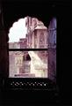
Castle Windowby christinamtoddComment: Very nice framming. I only feel the building and sky are a bit overexposed. Otherwise, nice shot. |
| 05/01/2005 08:22:56 PM |
|
| Photographer found comment helpful. |
| 05/01/2005 08:14:23 PM |
JBby mmckennaComment: Awh, so cute! Lovely expression you've captured. |
| Photographer found comment helpful. |
| 04/30/2005 07:59:40 PM |
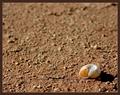
Away From Homeby eruelasComment: Nice shot and nice warm colors. I'm no expert, but I think the shell appears to be very bright in the areas under direct sun light. Also, I think dof could be a litlle longer - the transition between the focused area and the blurred one seems to be to sudden and exagerated (or maybe its just my eyes... lol). Anyway, good job. |
| Photographer found comment helpful. |
| 04/29/2005 07:03:45 PM |
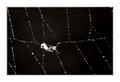
Le Petite Moustiqueby SimonkasprzakComment: Very nice picture, although I feel the main subject is too small (or maybe I just need some glasses...). Anyway, I like the overall feel of the image. What I truly dislike is the large border and believe the picture would be greatly enhanced if you eliminated it. |
| Photographer found comment helpful. |
Home -
Challenges -
Community -
League -
Photos -
Cameras -
Lenses -
Learn -
Help -
Terms of Use -
Privacy -
Top ^
DPChallenge, and website content and design, Copyright © 2001-2025 Challenging Technologies, LLC.
All digital photo copyrights belong to the photographers and may not be used without permission.
Current Server Time: 07/31/2025 10:44:23 PM EDT.