| Image |
Comment |
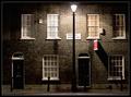
| 05/05/2005 02:01:42 PM |
Roupell Streetby e301Comment: Very nice image and subject. I only wish
1- i could see the street's name (mabye you could have tried a different angle)
2- there was a little more space above the lamp, so i a little more of the wall.
Neverthless, its a simple and pretty elegant shot, with right exposure. Good job 8 |
 Photographer found comment helpful. Photographer found comment helpful. |
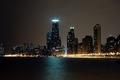
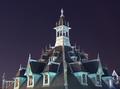
| 05/05/2005 01:50:13 PM |
Dark Cityby Keith ManiacComment: Very nice and clear, neat image. Maybe you could have included a little less water a little more sky, but it's just my opinion. Anyway, great shot.9 |
| Photographer found comment helpful. |
| 05/04/2005 07:27:35 PM |
FONTANA DE LA CASAby bairasComment: You have a nice shot, with a good compostiion. However, it has a too strong reddish tone (maybe reducing the sat and light on red channel would have helped). Also, I would have cropped a little on the left to get rid of most of the blue wall and the tiny lights in the dark area. ANyway, you've managed to capture the flow of the water in a superb way. |
| Photographer found comment helpful. |
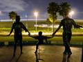
| 05/04/2005 07:18:21 PM |
Statues by Nightby ecdillonComment: Very interestting subject. However, the composition is, I believe, a bit off: the trees appear to "grow" from the heads and the light at the right is way to close to the statue's head (maybe you should have tried another angle). Also, the lights are a bit blown. Finally, i think you could have cropped that black thing at the right and the tiny light emerging from the left, in the sky area. Hope you don't mind my saying these things, but that's what comments are for. Hope this has helped a little. Good luck. |
| Photographer found comment helpful. |
| 05/04/2005 07:08:19 PM |
The show is onby psychephylaxComment: Nice shot, with good white balance. I just feel it is a bit soft, so I would have usmed it a little (more). Good job, though. |
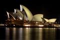
| 05/04/2005 04:28:54 PM |
Southern Crossby storytellerComment: In my opinion, this is the perfect example of a photo that meets the challenge, but is pretty dull and not interesting, and probably won't score so good... Maybe being a bit more creative next time... Anyway, nice try and good luck. 3 |
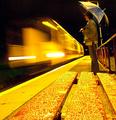
| 05/04/2005 04:09:04 PM |
Night Trainby kevrobertsonComment: I really like this one. Some might say the balance is off, being too yellow, but I kinda like it - gives it strenght and character. Too bad it has a sort of pixelated look- perhaps if your image were a bit smaller, it wouldnt show so much. Nice job. |
| Photographer found comment helpful. |
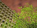
| 05/04/2005 04:06:29 PM |
Empty workplace ?by GabrielComment: At first glance, this seemed to be a very awckward image. After examining this better I ended liking it, for its originaility and vibrant colors. I'm not so sure about your composition though, neither can I tell you anything on how to improve it, Anyway, 7. |
| Photographer found comment helpful. |
| 05/04/2005 04:01:44 PM |
Golden Archesby boomerComment: Amazing composition and subject. It is rather appealing. However, I feel you pushed a bit too much on sharpness and that the gold look seems more like fire look - a little less red would work better, in my opinion. 8 |
| Photographer found comment helpful. |
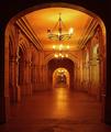
| 05/04/2005 03:58:46 PM |
Architecture Under the Starsby rayg544Comment: I so much like this one. Very interesting subject and good composition. You've managed to create a solid and appealing image. The only thing I have to point out is that it seems to need a slight rotation to the right and perhaps a little crop on the left side. Anyway, good job. 8 |
| Photographer found comment helpful. |
Home -
Challenges -
Community -
League -
Photos -
Cameras -
Lenses -
Learn -
Help -
Terms of Use -
Privacy -
Top ^
DPChallenge, and website content and design, Copyright © 2001-2025 Challenging Technologies, LLC.
All digital photo copyrights belong to the photographers and may not be used without permission.
Current Server Time: 07/31/2025 10:30:02 PM EDT.