| Author | Thread |
|
|
05/12/2005 04:56:33 PM |
|
I like this 'school' of photography that revels in what is, essentially, a banal subject - presenting it in such a fashion that it forces the viewer to reassess its value. Interesting work. Ben |
|
 Photographer found comment helpful. Photographer found comment helpful. |
|
|
05/11/2005 04:05:37 PM |
|
Exceptional and real slice of life. Excellent work as always! |
|
| Photographer found comment helpful. |
Comments Made During the Challenge  |
|
|
05/10/2005 07:05:50 PM |
|
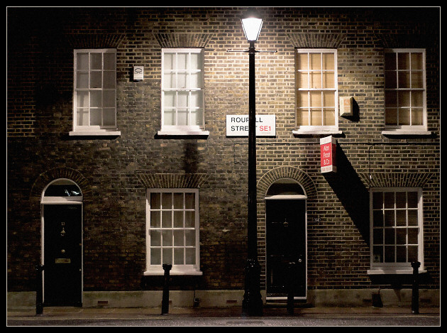
I like this photograph. The tones used are great. Excellent focus. Just one thing bothers me about this night scene. The lamppost in the center of the photograph. It divides it in half, making it look like two photographs to me. Just my opinion. It might have been what you were going for. Good night shot! |
|
| Photographer found comment helpful. |
|
|
05/10/2005 04:51:30 PM |
|
well exposed shot, well done |
|
| Photographer found comment helpful. |
|
|
05/10/2005 02:23:19 PM |
|
I like the simplicity in this photo and the way it fills the frame. I don't like the red sign however. |
|
| Photographer found comment helpful. |
|
|
05/10/2005 10:55:33 AM |
|
nice shot, so many in this challenge have trouble controlling lamp post light, but this one does a great job of not making it washed out. i'm interested to see what you did in post to this one. |
|
| Photographer found comment helpful. |
|
|
05/10/2005 10:50:24 AM |
|
I like the repeating patterns here, howeverI think another point of view - like from the side of the building to give more leading lines would have made this a more intersting shot. The sign is blocked by the lamp and is distracting. The exposure is good, although it could have been sharpened and contrasty a little more to bring out the texture in the bricks and window frames better. My humble opinion... 5 |
|
| Photographer found comment helpful. |
|
|
05/10/2005 07:46:38 AM |
|
I like this - would have preferred it without both signs but it really appeals to me. |
|
| Photographer found comment helpful. |
|
|
05/10/2005 01:27:31 AM |
|
this really feels like late night. i maybe wouldn't have cut off the top of the street light. nice one, though. |
|
| Photographer found comment helpful. |
|
|
05/09/2005 06:34:40 PM |
|
I like this shot a lot, but I would have preferred if the street light hadn't obscured the street name. |
|
| Photographer found comment helpful. |
|
|
05/08/2005 03:56:13 PM |
|
Don't really like the light poll in the middle of the image, although i like its effect... go figure. |
|
| Photographer found comment helpful. |
|
|
05/07/2005 06:03:14 PM |
|
| Photographer found comment helpful. |
|
|
05/07/2005 12:36:48 PM |
|
| Photographer found comment helpful. |
|
|
05/06/2005 10:58:16 PM |
|
this looks like a greeting card, really, makes me want to open it and see what it says inside. |
|
| Photographer found comment helpful. |
|
|
05/06/2005 08:51:36 PM |
|
very interesting shot. I like it. |
|
| Photographer found comment helpful. |
|
|
05/06/2005 02:52:47 PM |
|
Decent shot. I think a "portrait" shot cutting off everything to the right of the lamp post might have been nice, too. |
|
| Photographer found comment helpful. |
|
|
05/06/2005 03:19:16 AM |
|
Nice composition. Is that house for sale. |
|
| Photographer found comment helpful. |
|
|
05/05/2005 11:44:26 PM |
|
| Photographer found comment helpful. |
|
|
05/05/2005 09:30:41 PM |
|
Nice. Interesting subject, good composition. I likey. |
|
| Photographer found comment helpful. |
|
|
05/05/2005 02:17:46 PM |
|
Nice and original. Great setting, must surely run adjacent to Baker Street....wheres Sherlock? |
|
| Photographer found comment helpful. |
|
|
05/05/2005 02:01:42 PM |
Very nice image and subject. I only wish
1- i could see the street's name (mabye you could have tried a different angle)
2- there was a little more space above the lamp, so i a little more of the wall.
Neverthless, its a simple and pretty elegant shot, with right exposure. Good job 8 |
|
| Photographer found comment helpful. |
|
|
05/05/2005 12:32:43 PM |
|
thank you for this picture. the lighting is a little off, but the inspiration cracks the TOP 5 in my opinion. sweet. |
|
| Photographer found comment helpful. |
|
|
05/05/2005 11:52:45 AM |
|
Too bad the view of the road sign is obstructed by the lamp post. |
|
| Photographer found comment helpful. |
|
|
05/05/2005 11:13:17 AM |
|
| Photographer found comment helpful. |
|
|
05/05/2005 10:42:31 AM |
|
A nice image, but it doesn't seem leveled to me for some reason. It looks a bit soft as well, I think the impact would've been stronger had the image been sharper. |
|
| Photographer found comment helpful. |
|
|
05/05/2005 08:03:19 AM |
|
Not good when objects break up words which are the focal point in a photo. Nice light though. Not entirely convinced by composition, and photo is slightly wonky. |
|
| Photographer found comment helpful. |
|
|
05/05/2005 05:57:26 AM |
|
I really like this shot - my vote for a winner. I like the way in which you have removed the yellow colour cast that I would normally expect to see from these types of lamps. Has made me think of a coupe of streets near me that would be worth shooting. |
|
| Photographer found comment helpful. |
|
|
05/04/2005 10:50:44 PM |
|
Very nice. Great color and sharpness. |
|
| Photographer found comment helpful. |
|
|
05/04/2005 10:47:45 PM |
|
Everything is nice and square, and I like that the light pole is off of the center of the frame. |
|
| Photographer found comment helpful. |
|
|
05/04/2005 05:57:37 PM |
|
| Photographer found comment helpful. |
|
|
05/04/2005 03:19:17 PM |
|
A lovely simple picture. As a side note, I think that the light ing looks like a Nick Park film. I keep expecting to see Wallace and Gromit. |
|
| Photographer found comment helpful. |
|
|
05/04/2005 11:18:24 AM |
|
amazing picture, i love everything about it, 10 |
|
| Photographer found comment helpful. |
|
|
05/04/2005 09:07:10 AM |
|
One of my favorites. Excellent work. |
|
| Photographer found comment helpful. |
|
|
05/04/2005 06:14:23 AM |
|
| Photographer found comment helpful. |
|
|
05/04/2005 05:19:53 AM |
|
Nice Photo. Sorry to see that the Council aren't very Photographer friendly. Fancy putting that street sign behind a lampost. 7 |
|
| Photographer found comment helpful. |
|
|
05/04/2005 03:31:56 AM |
|
I love this shot. Everything about it is perfect. I initially gave it a 9 (i rarely give 10s) but I revisited it and tried to find a reason why it shouldn't get a perfect grade. Unable to find anything to convince myself, I've changed the score to 10. This is beautiful. Where is this Roupell St.? |
|
| Photographer found comment helpful. |
|
|
05/04/2005 03:27:03 AM |
|
Nice capture. Too bad you didn't stand a little to the left so the post didn't block the sign. |
|
| Photographer found comment helpful. |
|
|
05/04/2005 03:02:23 AM |
|
Excellent detail and composition. 7 |
|
| Photographer found comment helpful. |
|
|
05/04/2005 12:48:45 AM |
|
Love this building! I don't care for the even number of doors and windows (prefer odd number) but I think the light post helps throw off some of that symmetry which is good 6 |
|
| Photographer found comment helpful. |
Home -
Challenges -
Community -
League -
Photos -
Cameras -
Lenses -
Learn -
Help -
Terms of Use -
Privacy -
Top ^
DPChallenge, and website content and design, Copyright © 2001-2026 Challenging Technologies, LLC.
All digital photo copyrights belong to the photographers and may not be used without permission.
Current Server Time: 06/30/2026 10:19:44 PM EDT.