| Image |
Comment |
| 08/08/2002 04:36:00 PM |
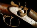
The Interchangeableby spidermanComment: Like the close up, showing the scratches on the wood and metal and the rustiness. Also prefer shots which close up and make an abstract of the picture rather than show the whole item, well, depends what the subject matter is, but for things like this. Nice. |
| 08/09/2002 05:58:00 PM |
|
| 08/10/2002 01:37:00 PM |
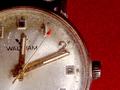
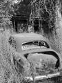
Atom 153by boyte1Comment: Nice shot. Could be a postcard in a toy museum :) |
| 08/07/2002 04:30:00 PM |
Broken childhood memoriesby prodigal havocComment: Love the idea - composition within the frame could be improved - wonder if you could move your position to get rid of the blue house in the background? And to show all of the top of the frame? |
| 08/08/2002 04:38:00 PM |
Still Beautiful...by annelizabethComment: Love the image, but too dark at top left - otherwise would have marked even higher. Beautiful faded pink colour to the rose. |
| 08/08/2002 04:39:00 PM |
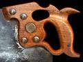
Centenarianby autoolComment: I like the focus on the handle of the tool and the visibility of the wear and tear, and I also love that it only has three main colours, rich bronze, silver and black. I would like a tiny bit more black space at the top of the image. |
| 08/08/2002 04:28:00 PM |
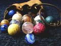
All the Marblesby KathycComment: This is fantastic - I adore the colours and the way you've got low down to take the shot. The only regret is the way the pouch is just clipped at the top and the leather tie at the right. The carpet works well as a background too. It leaves me wishing that I still had my marbles (!) and could play for penny chews! Having now looked regularly at all 7 of my score 9 choices, I have decided that this one is definitely my absolute favourite and am upping my score to a ten. I know it's not perfect, technically, because of the slight clipping at two edges, but I do love it. |
| 08/09/2002 06:03:00 PM |
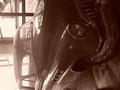
It made me Happyby alexComment: Needs rotating, I know that's obvious but I can't even appreciate this one without twisting my head too far to be comfortable which doesn't make me want to score it highly. Also seems too faded at roof of car end and too dark at front of car end. Sorry! |
| 08/08/2002 04:26:00 PM |
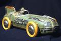
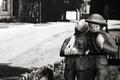
Homeward Boundby connieComment: I really love this, the way that it's a model yet does have an air of reality and grittiness to it. I like the composition too. It just clicks for me. |
| 08/10/2002 01:40:00 PM |
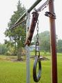
Nobody homeby normwComment: I like this but find the top half of the frame adds nothing (for me) and I'd look at what it's like cropped into a squarer shape, losing some of the top. |
Home -
Challenges -
Community -
League -
Photos -
Cameras -
Lenses -
Learn -
Help -
Terms of Use -
Privacy -
Top ^
DPChallenge, and website content and design, Copyright © 2001-2025 Challenging Technologies, LLC.
All digital photo copyrights belong to the photographers and may not be used without permission.
Current Server Time: 07/31/2025 06:48:38 AM EDT.